
All right, that title is a bit of an exaggeration. I’m not completely sure I’ll never get a tattoo. But given my indecisiveness, fear of commitment, and habitual buyer’s remorse, I can say the odds are very slim. I do, however, own five Maybelline Color Tattoo eyeshadows.

I’m not the first person to consider the Color Tattoos (with a couple of exceptions) some of the best beauty products at the drugstore. They’re cream eyeshadows in adorable, satisfyingly heavy glass pots, and they can be used either on their own or as long-lasting bases for powder shadows. Most of us have heard that cream eyeshadows should be stored upside down (I trust this isn’t a myth…?), but I’d probably never remember to do that if not for the ingenious design of the Color Tattoos. The glass “lid” is actually the pot that holds the product, while the black plastic “bottom” is the screw-off lid. I’ve never encountered another drugstore product packaged in real glass; it feels almost luxurious. The colors all have “edgy” names (tattoos = edgy, dontchaknow), because Maybelline hasn’t realized that few things are more ridiculous than a major cosmetics brand pretending to be streetwise. See also their “Street Art” nail polishes.
The official name of this product is “Eye Studio Color Tattoo 24HR Cream Gel Eyeshadow,” which…whatever. The 24-hour claim mystifies me, as most people wash their faces more than once every 24 hours. I have, however, fallen asleep in my makeup (I know, I know), and the color does stick around until the next morning. Do with that information what you will. I don’t know what the phrase “cream gel” is supposed to signify, but the formula doesn’t feel or look particularly gel-like to me. It’s a cream eyeshadow, Maybelline. Get over yourselves.
Besides, there’s nothing wrong with plain old cream eyeshadows. They’re perfect for the hot, humid weather we’ve been having. My go-to summer eye makeup is Bad to the Bronze and mascara; boom, done. And because they’re so user-friendly and versatile, the Color Tattoos are great starter eyeshadows for yours truly people who are still getting the hang of applying and blending eye makeup. I rarely use a brush with these; smearing them on with my fingers seems most effective, and can be accomplished in a few seconds. But alas, I can’t recommend all the shades wholeheartedly. The five I own vary in quality from sublime (Bad to the Bronze, Tough as Taupe) to workable (Electric Blue, Pomegranate Punk) to utter shit (Audacious Asphalt).
Top row, from left: Pomegranate Punk, Electric Blue. Bottom row, from left: Audacious Asphalt, Tough as Taupe, Bad to the Bronze.

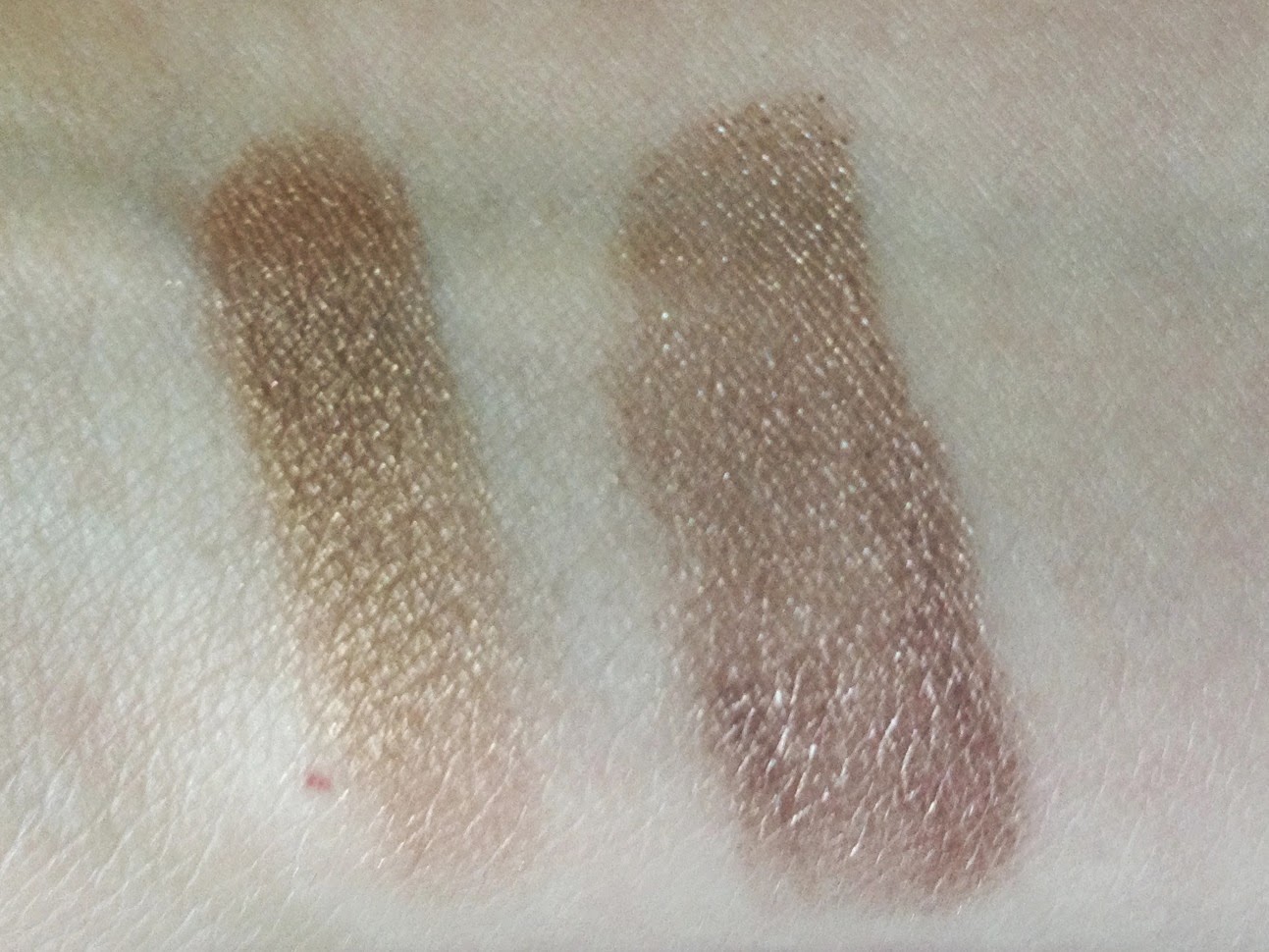
Here are some swatches to give you an idea of the significant textural differences. Left to right: Audacious Asphalt (audacious only in its resistance to blending), Tough as Taupe, Bad to the Bronze, Electric Blue, and Pomegranate Punk. Keep in mind that I bought Bad to the Bronze over a year ago, so it’s not quite as smooth and buttery as it once was. Still going strong, though.
Indoors, indirect natural light:

Indoors, artificial light:

Outdoors, direct sunlight. Don’t mind me, neighbors, I’m just photographing my inner arm.

Bad to the Bronze, which I bought last May to wear to a wedding, is my favorite of the five. Most bronze eyeshadows are too warm-toned for my complexion, but Bad to the Bronze is the coolest bronze I’ve ever seen; in fact, I’d say it verges on taupe. Look how much of it I’ve used!

Swatched with theBalm Seductive to illustrate how cool-toned it is for a bronze. Bad to the Bronze is the one on the right; it looks almost copper next to the yellow-bronze Seductive, which I rarely use.
Though it’s a neutral, Bad to the Bronze is bold and metallic enough that I don’t usually wear it with eyeliner or other eyeshadows. It does look great with purples, though, so I’ll occasionally pair it with NYX Slide On eyeliner in Jewel on my lashlines. And of course, bronze is the perfect complement for a purple or berry lipstick. Here’s a recent FOTD with Bad to the Bronze, Jewel, and MAC Up the Amp lipstick.

Electric Blue is a metallic navy blue that I bought last fall in order to quell my lemming for the NARS Mandchourie eyeshadow duo.

It’s drier and less blendable than I’d like, but it works fine as an outer-corner accent. No comparison swatches for this one, because it’s my only navy eyeshadow, but here’s a FOTD from October, when I had a lot more hair! I’m wearing Electric Blue with theBalm Selfish (the taupe eyeshadow from the Nude ‘tude palette), NARS Coeur Battant blush, and NARS Cinematic lipstick in Last Tango.

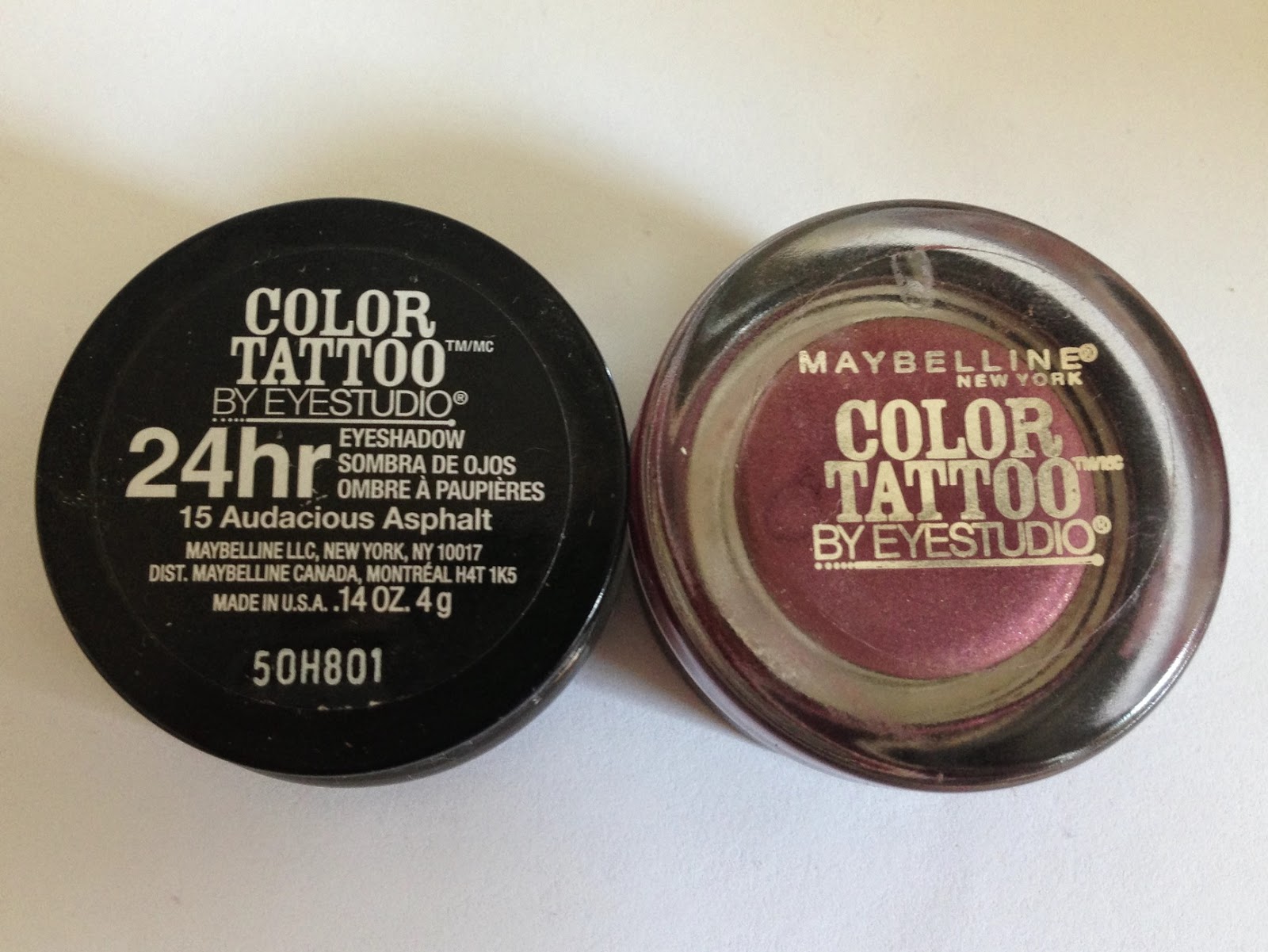
Audacious Asphalt is a sparkly gray with large silver glitter particles.

I bought this one in October while putting together my Halloween costume. I was dressing up as Rachel from Blade Runner, and an xoVain tutorial had recommended Audacious Asphalt for her ’80s-meets-’40s smoky eye. I don’t know why I went out and bought it when I had a beautifully formulated Wet n Wild silver eyeshadow that I’d never found an excuse to use, but there you are. Unfortunately, Audacious Asphalt turned out to be dry, stiff, clumpy, and nearly impossible to apply without cursing. But I kept it, for some reason, and it’s occasionally come in handy as a sparkly accent. I’m not a cyborg full-time, after all, so I’m rarely in the mood for an eyelid completely coated in silver sparkles.
Here’s Audacious Asphalt (left) next to the silver shade from the Wet n Wild Spoiled palette, which also contains a matte fuchsia and a sparkly black. Why did I choose that as my first-ever eyeshadow palette? Why not a nice neutral trio? Once an Edwardian cyborg, etc.

The palette recommends that I use the silver as a browbone shade. Gambit declined, Wet n Wild.
As I mentioned in a recent post, I wore Audacious Asphalt this Independence Day over a base of Tough as Taupe. Closeup for glitter:

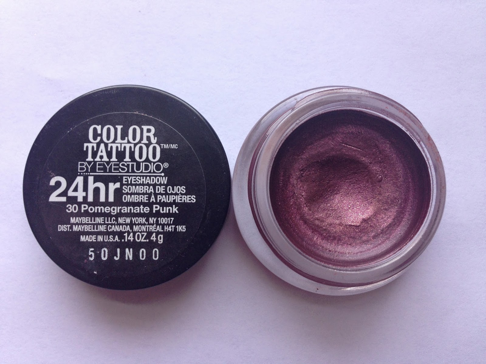
Pomegranate Punk is a reddish plum with gold shimmer.
I seem to be drawn repeatedly to red-based purples; I find that they bring out the green in my eyes. Left to right: NYX Jewel, right-hand shade of NARS Habanera duo, and Pomegranate Punk.

I don’t know how to make this color read anything but “fall/winter,” so I haven’t worn it in several months. Here’s a look from January, though. I’m wearing NARS Mata Hari blush and Maybelline Nude Lust lipstick (?), and I think I’ve used Bad to the Bronze on the inner two-thirds of the lid and Pomegranate Punk on the outer third.

Tough as Taupe is a matte gray-leaning taupe with a delightfully smooth, rich texture.

I almost never wear matte neutral eyeshadows on their own, since they tend to emphasize my dark undereye circles, but I love Tough as Taupe as a layering base for sheerer, lighter colors. It also tones down bright colors, making them more wearable. I bought it to use as a base for NARS Lhasa, but it works just as nicely with non-taupes. From left, here’s Tough as Taupe on its own, then layered under Lhasa, Kiko Infinity Eyeshadow #251, and Topshop Chameleon Glow in Wax + Wane.

And some comparisons: from left, Tough as Taupe, Lhasa, and theBalm Selfish. I need a brownish taupe to replace the nearly extinct Selfish, and I’ve been hearing good things about the new Milani Bella eyeshadows, so I might hunt down Bella Taupe before long…

Here I am wearing Tough as Taupe with the mint green from NARS Habanera as a center-lid accent. Lip color is NARS Sheer Lipstick in Dolce Vita, for which I also need a replacement–I’m down to the barest nub, and have been avoiding finishing it for months because, well, $24. For some reason I resent having to repurchase things, even things I really love.

Finally, an update from the desk of gravity-defying bedhead. This image is saved on my computer as “why.jpg”:

WHY, INDEED.
What are your feelings on Color Tattoos, or tattoos in general? Do you have any of either?

The first and last Color Tattoo I bought was the \”utter shit\”. I've heard so many good things about them, especially about Bad to the Bronze, but I haven't felt like buying another one after my initial disappointment. Instead, I've been collecting L'Oreal Infallibles which have more powdery texture that is ideal to layer over a black base (for this, I use L'Oreal Smolder Liner daily). I did love the weighty glass jar! I did not know I was supposed to store cream eyeshadows upside down. Maybe this is why my Chanel Illusion D'ombre is getting drier by day?! I love the FOTD with Pomegranate Punk. Unfortunately it does not top the last one. I would name it \”Adorable.jpg\”. 😉
LikeLike
Bad luck that Audacious Asphalt was the first one you tried! If that had been my first, I wouldn't have bought any other Color Tattoos, either. But I think Bad to the Bronze really deserves its reputation–it has such a great texture and it works well both on its own and in conjunction with other colors. I forget where I heard about storing cream eyeshadows upside down, but the more I think about it, the less sense it makes. Unfortunately, it seems like cream formulas are going to dry out no matter what you do!And thanks! 😀
LikeLike
I love potted cream products, so the initial launch of the Tattoos had me excited. But after trying a couple, I was kind of disappointed too. I think they're quite slippery on oily/mobile lids and require too much maintenance for something that's packaged as a swipe-and-go product. Having said all that, I picked up the summer LE shade called Shimmering Sea or whatever that's getting a lot of raves lately. If you can find it, I think you need it!
LikeLike
OK, I may have to cave and finally invest in Bad to the Bronze. 😛 I hear so many amazing things about it, and I'm always reading that bronze looks good with blue eyes (not that I really obey any of those eyeshadow colour 'rules', mind you). Also, I feel like it might be possible to actually find it here, where the only colour reliably on display seems to be Bold Gold. I don't think I've ever actually seen the seasonal collections make it here…Anyway, the blue also looks pretty neat – I wonder how opaque across the whole lid you can get it? I tend to find that blue shadows need some amping up, and I'm wondering if that as a base might do the trick…Did you see the pictures for the Fall ones for this year? It looked like there were some jewel-tone-y shades that could be interesting, although I could actually be making *all* of that up. Not that they'll come here anyway, but still, a rogue can drool, right?Full marks for the bed-head look, as usual! 😀
LikeLike
I have relatively dry lids, so I've never had trouble with the formula fading or sliding off, but I can imagine that it would be problematic for oily lids. I haven't seen the LE Color Tattoos in stock anywhere, but I just looked them up online and they're really beautiful! My local CVS is terrible about stocking LE products, but I'll keep an eye out in other drugstores…
LikeLike
Yes, you need Bad to the Bronze! Everyone does. I think bronze would look beautiful with blue eyes, but I've never paid much attention to eyeshadow \”rules\” either. Plus, it's not just about the color of your eyes; it's also about the undertones of your skin, which a lot of eyeshadow articles seem to ignore. Sure, my green eyes would look good if I slapped on some red eyeshadow, but the rest of my face would beg to differ…I've never tried putting the blue across my entire lid, but my sense is that it would take some work to get it to apply evenly. Though if you were covering it with another blue, that might not matter! Worth a try, I'd say.The fall Color Tattoos haven't been on my radar, and a quick Google isn't turning up anything. Though I did come across some photos from fall 2012 and holy wow, that magenta. I think I need some magenta eyeshadow.
LikeLike
Please don't relegate Pomegranate Punk to the fall/winter pile! It looks great on you. I only own Bad to the Bronze, but I agree with what you said in your reply to Syl — everyone needs it. I think I will get the blue one next, and try it as a bold winged liner.
LikeLike
The problem is that Pomegranate Punk doesn't go with many of the lipstick colors I like to wear in the summer (usually corals and bright pinks). But I'm going to take your suggestion as a challenge and figure out a way to do summer pomegranate!I think Electric Blue would actually work better as a liner, since the formula is on the stiff, dense side. You should try it!
LikeLike
[…] an ongoing, if not regular, series. Let’s get better acquainted with a product I wrote about back in 2014 (yikes, those washed-out iPhone 5 photos): Maybelline Color Tattoo cream eyeshadow in Pomegranate […]
LikeLike
[…] Maybelline Bad to the Bronze and theBalm […]
LikeLike
[…] 7. Maybelline Color Tattoos in Audacious Asphalt and Electric Blue […]
LikeLike
[…] payday, a BOGO sale, and $5 in CVS coupons. Plus I wanted to replace my Maybelline Color Tattoos in Audacious Asphalt and Electric Blue, which were stiff, dry, and unblendable even when new. And these are fine replacements; in fact, […]
LikeLike
[…] in color to Bella Rouge. If I were back in my own apartment, I’d compare it with Maybelline Pomegranate Punk and the matte fuchsia from Wet n Wild’s Spoiled Brat palette (swatched here by Makeup […]
LikeLike