
In addition to the Ultra Matte Lip in Trap, I bought three cream products from ColourPop last month. After a few weeks of playing with them, I’m excited to finally write a review! I’ll start with an overview of each item, then post a few looks I’ve put together.
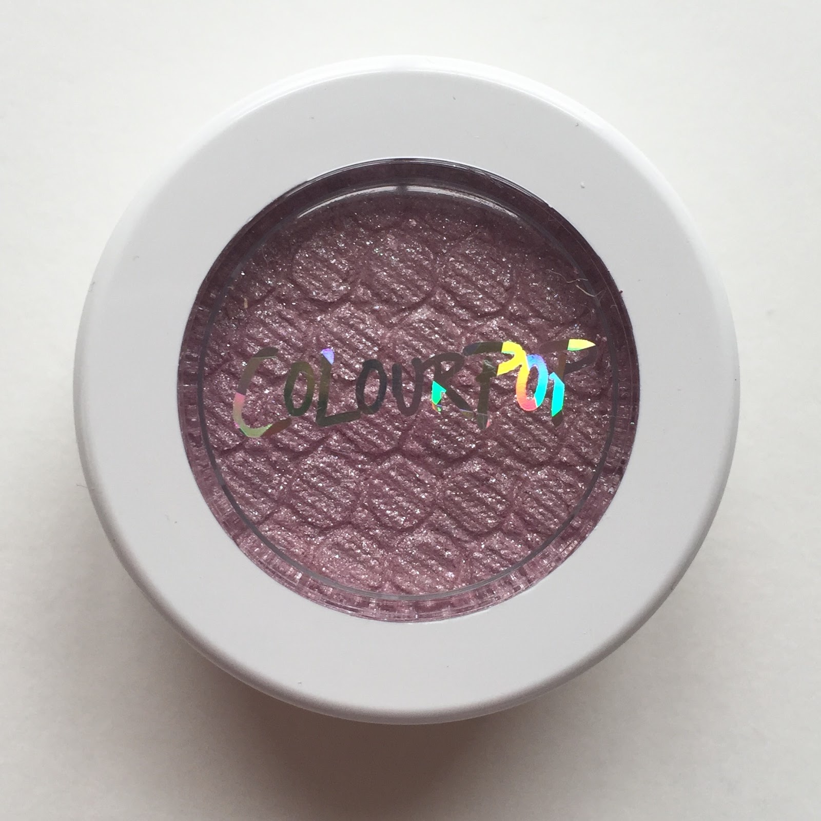
Clockwise from left: Super Shock Cheek in Rain ($8) and Super Shock Shadows in Shop and Eye Candy ($5 each).

L-R, one finger-swipe per swatch: Eye Candy, Shop, Rain.
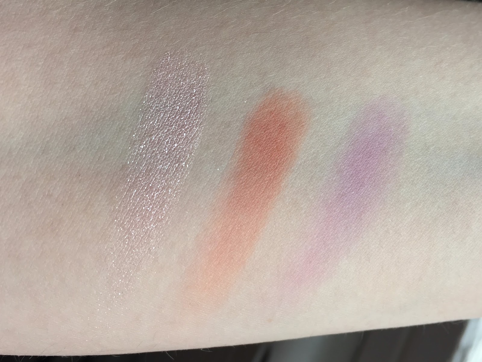
When I ordered Eye Candy, an “ethereal lavender drizzled with tons of pink and silver glitter,” I knew from experience exactly what I would get: an unabashed glitterbomb.
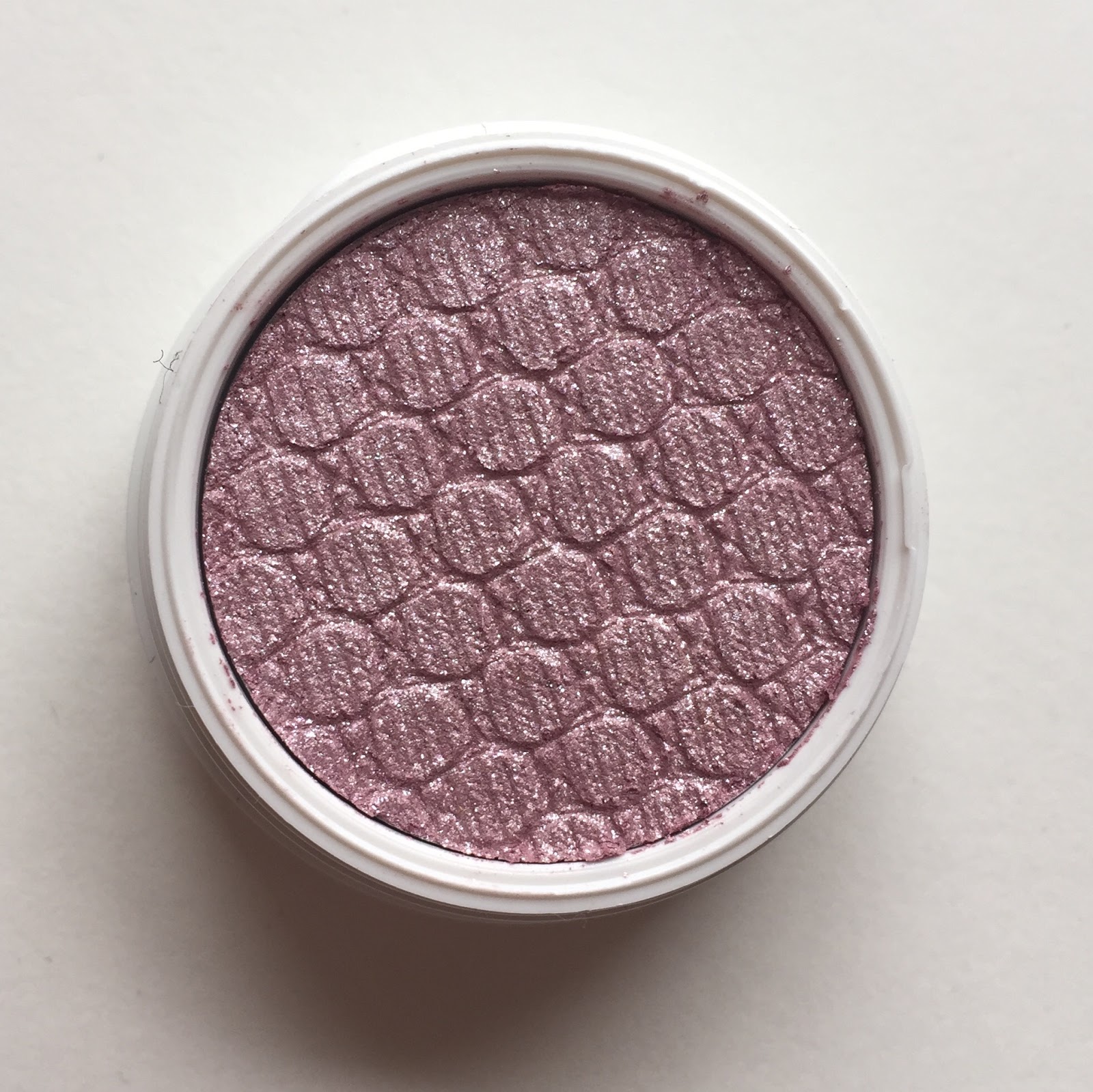
Problematic description aside, Shop is a great eyeshadow. It’s an unusual color for a shadow: an intense but muted orange-leaning coral. Because it’s not neon, as so many corals are, it pairs well with neutral shades. It’s the most pigmented of the three products I’m reviewing today, and the color applies smoothly and wears for hours without fading. It’s actually hard to wash the orange off my fingers after application! (Just as a reminder, ColourPop recommends applying its cream products with fingers instead of brushes. Once they’re on the lids, though, it’s pretty easy to brush-blend CP shadows into other brands’ powder shadows.)

Shop appears very matte in this photo, but direct artificial light tells another story. In fact, Shop is sprinkled with fine gold glitter! Instead of sparkling on the eyelids, it provides more of a vague sheen. I suppose if you want a subtle satin finish from ColourPop, you need to order a “matte” shadow.

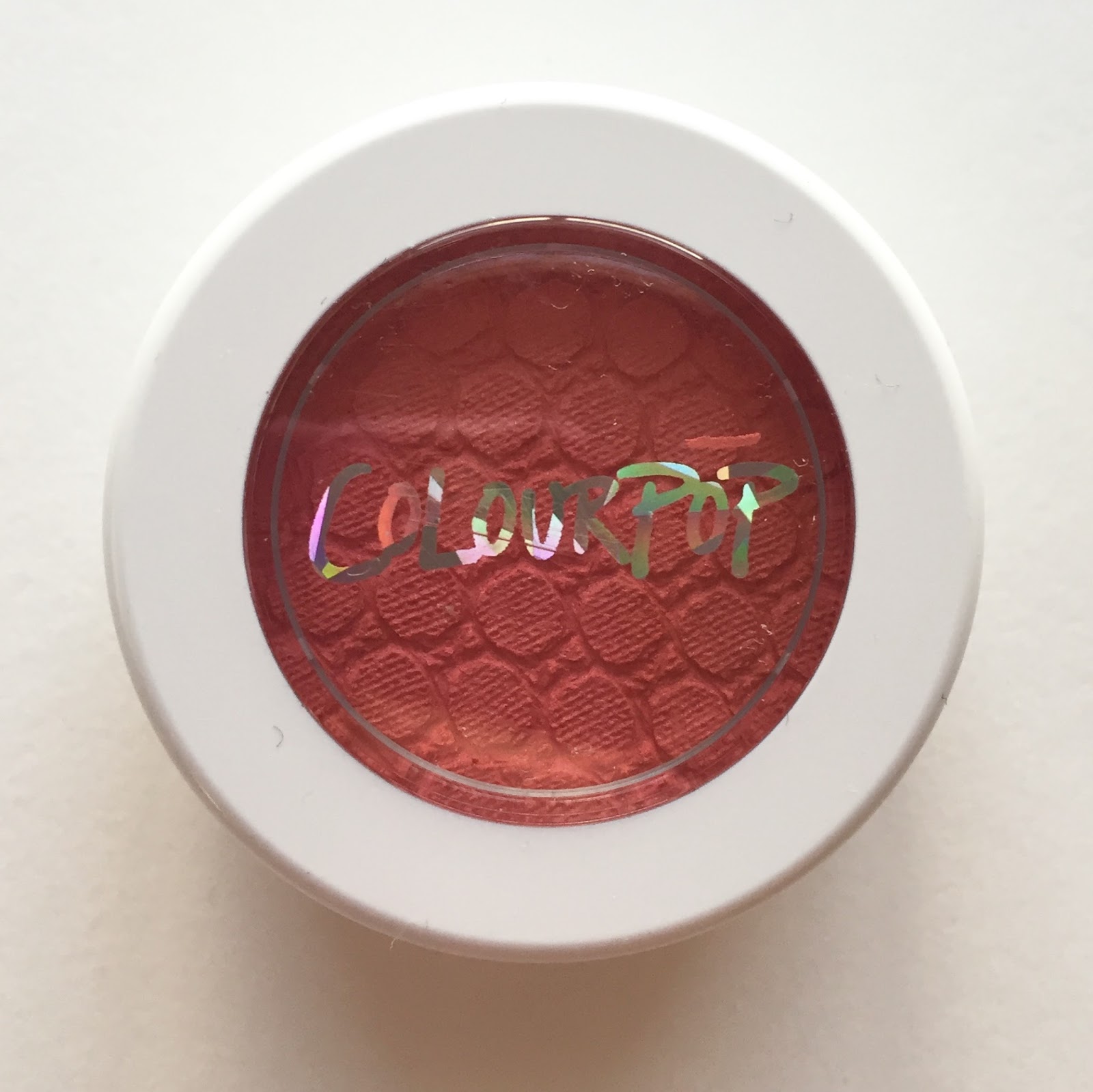
Finally, here’s Rain, my long-sought purple blush.

I’m a little skeptical of that 4.2g claim (NARS blushes, by contrast, are $30 for 4.5g). I’ve seen photos indicating that ColourPop’s blush pans are just as shallow as their eyeshadow pans, and I wonder if ColourPop sneakily included the weight of the packaging in the 4.2g figure. I wish I had a scale so I could find out for myself.

Rain is my first ColourPop blush, and I was surprised to find it drier than the shadows and highlighters I’d tried. It feels slightly more like a powder than a cream, yet I wouldn’t recommend applying it with a brush: when I tried that, the color stuck to the bristles without making the leap to my skin. My cheeks are quite dry in general, and even when I’m applying Rain with my fingers, I feel like I really need to work it into my skin so that it doesn’t just sit on top. I’m also a little disappointed in Rain’s pigmentation: I need two or three layers for the look I prefer, and I don’t even like wearing a lot of blush. However, the sheerness does make Rain more versatile, which I appreciate. It’s not a costumey blush at all, yet it can easily be built up to opacity. It’s not exactly a mindblowing product, but it’s very workable and I anticipate wearing it a lot this spring.
I didn’t bother making comparison swatches for the eyeshadows because I own nothing else like them, but Rain has a few distant cousins in my blush collection. L-R: Tony Moly Milky Violet, one layer of Rain, two layers of Rain, Urban Decay Rapture, NARS Mata Hari.

On my cheeks, Rain has exactly the pastel-candy effect I wanted from NARS Gaiety, which means that I can cross Gaiety off my wishlist for now! Here’s three layers of Rain concentrated on the apples of my cheeks; I’m also wearing Urban Decay Frisk (pale matte gray) and ColourPop Cowboy (matte lavender) on my eyes and MAC Pink Nouveau on my lips.

Here’s Shop as the focal point of an eye look: I smeared it all over my lids and blended it out, then lined my lashlines with a bit of theBalm Serious, a matte black. Blush is Sleek Life’s a Peach; lipstick is NARS Dolce Vita, which usually looks less peachy than this.

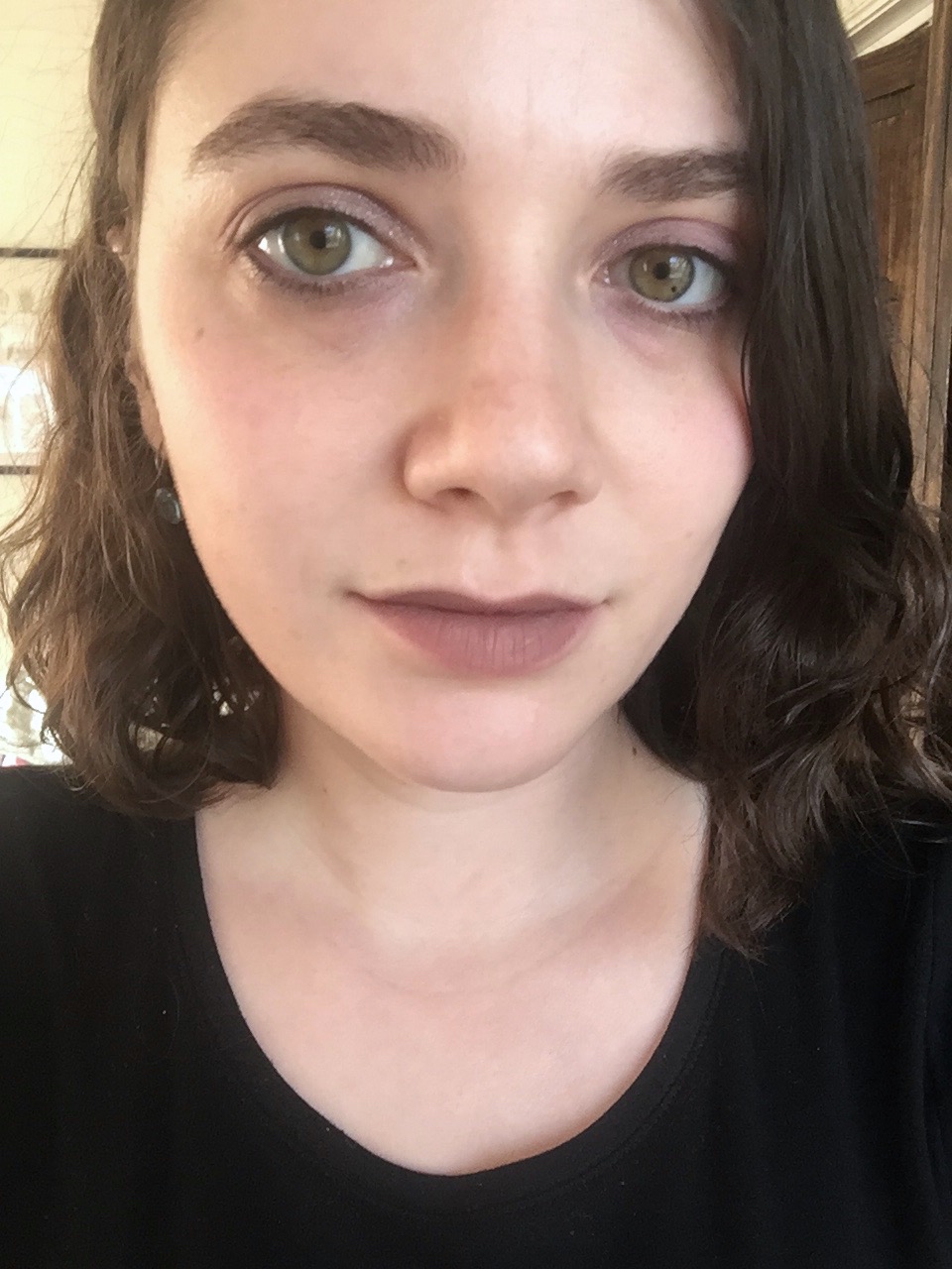
Lhasa (I think? why don’t I take better notes? or any notes?) and Eye Candy on my eyes, a lighter application of Rain on my cheeks, and ColourPop Trap on my lips:
March promises to be a busy month (applications, grading, a conference in Boston, and maybe my own work if I’m lucky), so I’m not sure how often I’ll be able to post here. At least we’re well on the way to spring, the season when hope returns to us all—that is, if we don’t pay too much attention to the presidential campaigns.

Ooh, Rain seems like the perfect candidate for a lavender blush – which has always intrigued me, but certainly isn't the type of thing I want to drop big bucks on. Which I guess is ColourPop's niche, in general. I think I'm just about ready to place an order out of curiosity…I love the last look – all of those colours pair so well together. Trap is shockingly wearable.
LikeLike
I think that colourpop products may perform better in warmer weather. I don't have the exact same colours as you do, but most cream-textured stuff are like that. Try and see if the texture changes in summer! All weights listed on cosmetics are supposed to be the net product weight, excluding all packaging weights, so I doubt they're doing anything shady. They're also a cream product, which will definitely be denser than powder, so they'll be able to pack more weight into a tiny looking pan. Anyway NARS blushes are not very large, Sleek's are HUGE.I also really like the look of Shop on you! You should wear it more.
LikeLike
I felt the same way about purple blush: I didn't know whether it would work on me, so I decided to drop $8 on Rain instead of $26 on Urban Decay Bittersweet, an almost identical color in a superior formula. I've promised myself that if I finish Rain, I can consider buying Bittersweet.Trap is basically my perfect nude. Who'd have thought? I see it as a darker and purpler (and, obviously, more matte) version of Bite's discontinued Cava lipstick.
LikeLike
That's a good point about the weather! We're about to get some summery weather in the next few days (75 F in early March–is this real life?), so I'll check to see how the products perform then. And I think you're right about the weight, too. I'm just inclined to be suspicious of ColourPop because…I don't know, reasons. I still think they're a tiny bit shady, but that's just personal prejudice at this point.And thanks! I was surprised at how much I liked it on me. I need to figure out more subtle ways of wearing it. I paired it with a matte brown shadow recently, and it was okay but not good enough to warrant a photo in this post.
LikeLike
Oh wow, I'm really loving Rain. Stop it, Colourpop. I don't want to order from you! I'm also really digging Shop – it seems like such a surprisingly wearable colour.
LikeLike
Before I tried Rain, I was worried that it would make me look bruised, because it was so dark in the pan. Seeing it turn almost pastel on my cheeks was a nice surprise!
LikeLike
I am not crazy about coral in any iteration (coral conjures a mirage of dancing clowns and salmon, all shrilly singing \”warm pink! warm pink!) but I'd be curious to see how Shop paired with an olive green. It looks like it has enough pink in it to avoid carrot tones, plus the gold shimmer might help the combination look less stark. Wait, I changed my mind, Shop with an antique gold color and maybe a dark brown. I am totally shocked by how Pastel Rain is! I love the look with Pink Nouveau.
LikeLike
Shop would look so lovely with your eyes, though! And coral + olive is one of my favorite color combinations–I'll have to try that. I have a nice Kiko olive that I almost never wear. AND an Inglot antique gold! I'm bad at thinking up interesting eyeshadow pairings, so your help is much appreciated. Definitely going to play around with Shop this weekend and see what I come up with.
LikeLike
Wow. Rain is really pretty. I think I might have to include it the next time I make an order, which will probably be soon. It is way too easy to succumb to temptation with their prices, even with the shipping costs. Shop looks amazing with your eye colour.
LikeLike
I think you'd like Rain a lot! It would go with so many of your favorite lip colors. I'm tempted to make a new order myself! I'm curious about their new satin liquid lipsticks, especially The Rabbit, which looks like a liquid version of Urban Decay Jilted. I just have to keep reminding myself that I don't wear liquid lipsticks as often as I do bullet ones…
LikeLike
[…] other two destashes are Glossier Balm Dotcom in Birthday and ColourPop Super Shock Shadow in Eye Candy. After almost a year of occasional use, I have to face facts: Birthday’s buttery vanilla […]
LikeLike
[…] 2. ColourPop Super Shock Cheek in Rain (review) […]
LikeLike