
Disclaimer: Lena of Kigo Color & Style is a longtime friend and generously did my color analysis for free (her standard price for a four-hour session is $400). I was under no obligation to write this post, though we did discuss it before I published it; all thoughts and opinions in it are mine except where noted.
If you care enough about beauty to be reading this blog, you’ve probably heard something about seasonal color analysis in the past few years. The system of sorting people into “seasons” based on their natural coloring developed in the early 1980s, when bestselling books such as Carole Jackson’s Color Me Beautiful prompted thousands of women to “get their colors done” by professional analysts. The idea was that identifying your correct season through draping—trying on a series of fabric swaths in an array of colors—would allow you to develop a makeup and fashion wardrobe that would set off your features to their best effect, which would in turn lead you to success in love and business. This approach to color suited the capitalistic ethos of the decade, and I’m absolutely certain that Kate Beaton’s ’80s Businesswoman had had her colors done.

Until recently, though, it seemed that seasonal color analysis had gone the way of double-breasted, shoulder-padded blazers. It popped up occasionally in beauty writing, but more as a historical curiosity or an artistic novelty than as a still-relevant method of thinking about personal style. I was introduced to the idea around 2013, when one of my favorite beauty bloggers, Kate of More Like Space, wrote a detailed series of posts (now private, alas) focused on the twelve-season Sci\ART system developed by Kathryn Kalisz in the 1990s. Each of Kate’s twelve posts featured a selection of lipsticks corresponding to one of the seasons, and my most flattering shades—plum, berry, cherry—seemed to belong to the cool-toned, high-contrast Winter category.

Kate’s post was an anomaly, though: I saw nothing more about seasonal color analysis online until almost another decade had passed. Then social media discovered the concept, and everything changed. Suddenly makeup and fashion devotees were debating hue and chroma in Facebook groups and on subreddits, and well-heeled women were flying across the country to get draped by the big names, and everyone on Instagram seemed to know whether they were a Soft Summer or a Dark Autumn.
Initially, I didn’t pay close attention to this new incarnation of the trend. After years of wearing and thinking critically about makeup, I felt that I had a pretty good sense of which colors flattered me, but flattery wasn’t the only reason I wore makeup. Sometimes I wanted to match my look to the current season. Sometimes I wanted to try out a technique or placement I’d seen on a k-pop idol or in a fashion editorial. Sometimes I just wanted to look weird. I gravitated toward flattering makeup more often as I got older, but I still felt suspicious of any method that threatened to limit my creativity by sorting me into a category.

Earlier this year, though, my friend Lena Glidden told me that she’d started her own color analysis business, Kigo Color & Style, after several months of Sci\ART training under an experienced teacher. I’d known Lena for about a decade through the online beauty community and for about five years as an IRL friend, and I’d always admired her analytical mind and trusted her bullshit-free opinions. (Her old beauty blog, Faceonomics, is still well worth a read.) So when she offered to give me a complimentary color analysis on my next visit to the Bay Area, I accepted with enthusiasm and curiosity.
Three days before we met up, Lena sent me an email detailing what I could expect from our four-hour session and how I should prepare for it. I was to arrive at the Rockridge BART station wearing no makeup and bearing a selection of cosmetics and accessories that I wanted to discuss after my analysis. Lena met me at the station and we drove to her studio, a private cabin in a residential neighborhood of Oakland. (The cabin is historic as well as beautiful: it was transported to Oakland from the 1939 Golden Gate International Exposition on Treasure Island.)

The glorious stained-glass window (in primary colors, perfectly suited to the cabin’s current purpose!) in the bedroom:

In the studio’s kitchen, Lena gave me micellar water to scrub off even the moisturizer I’d applied that morning, so that no external pigments or textures would influence the color analysis. (I’d worn sheer lipstick on my BART ride from San Francisco, which I shouldn’t have done; luckily, it didn’t stain my lips. If you book your own color analysis, keep in mind that “no makeup” really does mean NO MAKEUP.) After a preliminary discussion, during which Lena showed me the color charts she’d be using and answered my initial questions, I covered my clothes and hair with a robe and cap in a neutral shade of gray. Feeling a little like a Victorian invalid, I took my seat in the setup in the corner of the room: a chair, a bright white light, a gray background behind me, and a mirror in front of me.
Before starting the draping process, Lena scrutinized my face, describing everything she saw: skin color and texture, eye color, bone structure, and so on. She pointed out a few features that I’d previously noticed only subconsciously, such as the faint camel color of my eyelids, which had always interfered with my attempts to execute natural-looking eyeshadow. As she talked, it occurred to me how infrequently we get to see our faces from a completely new viewpoint. People who love us or are physically attracted to us may remark on our best features, but a dispassionate analysis is as hard to come by as it is valuable.
Lena then brought out dozens of drapes, each one belonging to one of the twelve subseasons, and arranged them around my shoulders one by one, comparing pairs of similar colors to narrow down the area of the chart into which I fell. In the Sci\ART system, each parent season (Spring, Summer, Autumn, Winter) contains three subseasons that differ by temperature (warm vs. cool), value (light vs. dark), and chroma (intense vs. muted). While I was wearing each drape, Lena commented extensively on how the color altered my appearance: whether it made my skin look clear or muddy, emphasized or de-emphasized my bone structure, etc. In the process of writing this post, I asked Lena in an email to refresh my memory about the draping method, and this was her reply:
“I first compared high vs low chroma seasons in order to narrow you into a quadrant or zone. In your case, I found the higher chroma versions of both warm and cool colors worked better, so I narrowed it down to the Bright seasons (True Winter, Bright Winter, Bright Spring, True Spring) and from there compared near seasons in order to dial in the exact brightness and temperature balance that was optimal. At all times I compared individual subseasons against one another. So while some systems sort you into a parent season first (like Winter) and then narrow down what kind you are, I focus on characteristics, which overlap among parent seasons to some extent. This helps avoid seasonal stereotyping, and encourages the analysis to focus on the specific individual in the chair, not on grouping characteristics that seem to belong to one parent season alone.”
My affinity for bright colors was a surprise, since I’d assumed I’d fall closer to Dark Winter than to anything else. Instead, Lena hesitated between Bright and True Winter before deciding that I needed the coolness and saturation of the latter (both Bright and Dark Winter contain some warmth). After two hours, it was official: I was a True Winter! A card-carrying True Winter, at that:

Here I am wearing the True Winter drapes (still barefaced):

Next came two hours of playing with makeup, both from Lena’s collection and from the makeup bag I’d brought with me. Lena advised that I looked best in a version of the look to which I’d always gravitated: a neutral eye (just a little sheer sparkle or a cool-toned liner) and a bold lip and cheek in a cherry or berry tone. Below are some of the products she recommended for True Winter; I scribbled the shade names beside them. I believe the unlabeled one is my beloved NARS Mysterious Red, which I brought with me as an example of a lipstick I’d always found flattering, and which turned out to be a perfect True Winter red! I felt so vindicated.

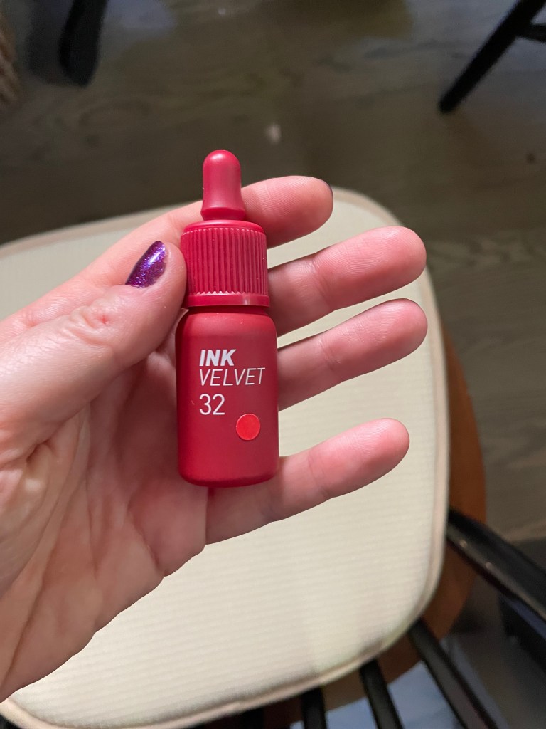
My favorite of the new products I tried on was Peripera Ink the Velvet Lip Tint in 32 Fuchsia Red, which you can see more clearly below:

I fully intend to purchase this soon!
I first tried on a “natural” face, which for True Winter means a sheer pinky red lip color and blush (here I’m wearing Nivea Tinted Lip Balm in Cherry and Milk Cream Blush Stick in Flip):

Next, a more done-up face featuring the Peripera tint:

And here I am waiting for my BART ride back to San Francisco. This final look comprises Aromaleigh Dewdrop powder foundation in 3YL, Glossier Monochrome in Jute, a mix of Milk blush sticks in Flip and Quickie, and a mishmash of about four lipsticks and stains, plus the black mascara I brought.

Three days later, Lena sent me a follow-up email containing a detailed summary of our session’s findings and a formidable array of recommendations for makeup, clothing, and accessories. She even analyzed my personal style, describing it as “grunge academia or graffiti academia. For the academia there’s a kind of rumpled formality that feels inherently you. Imagine you threw preppy in a washing machine with a denim jacket that had just been out to a concert….Then there’s an creative streak to your look that I hesitate to call ‘edgy’ because that feels moodier and more serious than I want. I am picturing ‘graffiti’ because it connotes color as well as irreverence.” I absolutely love the phrase “graffiti academia,” and I appreciate Lena’s willingness to take clients’ own style into consideration when making her recommendations. While I enjoy an ’80s Businesswoman blazer and a bold teal-and-magenta floral pattern, another True Winter woman might prefer softer lines and daintier patterns, and the seasonal color scheme has room for us both.
In my next post, I’ll feature some True Winter products from my own makeup collection and explore the Sci\ART recommendations for True Winters in more depth. For now, though, here are some of my reflections in the aftermath of my session with Lena:
First, I went into the session with a number of misconceptions. For one, I thought “contrast” referred to the contrast between one’s skin and hair; in fact, hair is far from the most important determinant of contrast. It can contribute to contrast, but a pale woman with blonde hair can be a True Winter just as easily as a pale brunette can, because contrast also comes from the outline of your jaw, the shape and prominence of your bone structure, and the difference between your iris color and the white of your eye. In an outfit, contrast can occur within a single item (e.g. white polka dots on a black background) as well as through colorblocking, and it’s especially important for a True Winter to incorporate contrast into her outfits—a black-and-white top will probably flatter her more than an all-black or all-white one.
I also assumed that everyone in a subseason would have similar coloring. Not so! People from different ethnic backgrounds can belong to the same subseason. Some True Winters are more pink-toned, like me; others are more yellow-toned. Value and chroma are just as important as temperature in deciding a client’s season (though in Lena’s view, my coolness is more pronounced than either my darkness or my saturation).
Finally, I was surprised to learn that the two other subseasons within an individual’s parent season aren’t necessarily their second- and third-best palettes. According to Lena’s email, my distant “runners-up” would be Bright Winter and True Summer, “and all nine other seasons would be completely left in the dust (equally).” True Summer and True Winter are the two completely cool subseasons, and because I benefit so much from cool-toned colors, the True Summer palette has more to offer me than the slightly warmer Dark Winter one does.
As I’m sure you can tell, I thoroughly enjoyed this experience. I’ve always been a huge color nerd, and it was fascinating to learn more about the relationship between my color choices and my overall appearance. I found our discussions of contrast particularly illuminating, and I’ve already started implementing those principles when shopping for clothes. I’m not planning to overhaul my entire wardrobe (I don’t have the extra money, and I own quite a few True Winter items already), but the guidelines make it easier to narrow down my options when I do buy something new.
Despite our shared love of beauty and color, Lena and I have different approaches to personal style. In her words, she prefers a “sandbox,” a set of principles that help govern her choices. My own approach is more eclectic and diffuse. During our session, we talked about the difference between “looking good” and “looking our best.” I always like to look good; it would be disingenuous to say otherwise. But if I always focused on looking my best—that is, emphasizing my most attractive features—I’d have to get rid of some beloved items and, more broadly, some beloved aesthetics. Seasonal color analysis aims to make everyone look their best. That’s its explicit purpose. I value having that knowledge, but I also value wearing my Elaine lipsticks when the weather first turns chilly.
I see significant parallels between Lena’s profession and that of my partner, who is a copyeditor for an academic journal. My partner’s job is to make writers sound “their best”—that is, to make their articles intelligible to the entire range of readers of the journal, from scholars of seventeenth-century French drama to scholars of contemporary Nigerian novels. Sometimes writers will reject an editor’s suggestions. Sometimes they intend to sound obscure, or to produce a specific effect with their sentence structure. And they have the right to assert their own preferences—to stet, in editorial lingo. But if they want to be understood in the context of that particular journal, which is not a specialist journal or a journal of creative writing, they would be wise to accept the editor’s advice.
Seasonal color analysis is like copyediting for personal appearance. It aims to make an individual’s appearance intelligible (harmonious, palatable, beautiful) to as many people as possible. There are numerous contexts in which this is my goal. If I ever venture out of novel-writing funemployment to a job interview, or find occasion to take author headshots, I’ll draw on what I’ve learned about my best colors. Will I throw out my chartreuse eyeshadow? Doubtful…but I might pair it with a True Winter lipstick.
A huge and heartfelt thank you to Lena for the session! If you’re in the Bay Area and want some guidance toward your ideal color palette—or just some insights on style from an extremely intelligent, knowledgeable, and entertaining person—you can do no better than her.

What an interesting post to read!! You’ve got me considering getting this done, and previously I’ve always dismissed colour analysis as something that seemed a bit boring and pretentious. The picture of you wearing the Peripera tint looks so good – bright and alive!
LikeLike
I think it’s certainly possible to take a boring or pretentious approach to color analysis, but then that’s true of most things! If you do get analyzed, make sure it’s in person–some color analysts claim to be able to do it on a webcam, but that’s not going to be accurate.
LikeLike
[…] terms of seasonal color analysis, I’d characterize Guessing Game as a Dark Winter or even Dark Autumn shade. It leans too […]
LikeLike
[…] disclaimer: This is the second of my seasonal color analysis posts. I’d recommend reading my first post, on my session with Kigo Color & Style back in August, for context. Lena is a personal friend […]
LikeLike
[…] I’ve written before, seasonal color analysis has one basic purpose: to make the face appear as balanced and harmonious […]
LikeLike
[…] in 2024 as I did in past years, partly because I was unemployed and partly, I think, because my seasonal color analysis in early August narrowed the field of color makeup for me. I haven’t sworn off every color […]
LikeLike
[…] fuchsia without the slightest hint of brown. (Lena assures me that it’s a perfect True Winter pink.) It reminds me of these roses I photographed earlier this […]
LikeLike
[…] for lipstick, getting my colors done has emboldened me to wear “loud” lip colors that I might previously have dismissed as […]
LikeLike
[…] blush for a subtle, somewhat natural-looking flush of pink. One of my main takeaways from my color analysis in 2024 was that a True Winter’s “natural” makeup look should eschew brown tones […]
LikeLike
[…] more comfortable wearing it than not, so it should be part of my interview look. According to my seasonal color analysis, I should wear a True Winter lipstick, but I can’t shake the feeling that even on me, those […]
LikeLike