
If you’ve viewed any other post on my blog, you’ve probably seen NARS Single Eyeshadow in Lhasa. Since buying it last November, I’ve worn it almost every day, which means that it’s found its way into the vast majority of my FOTDs. I use it so much, in fact, that I’ve almost stopped thinking about it; it’s become one of those under-the-radar beauty products that I don’t review because I take them so much for granted. But Lhasa deserves better treatment than that.

Released to great acclaim with the Spring 2012 collection, Lhasa is described on the NARS website as “lavender gray.” But a pure gray wouldn’t have sparked a frenzy in the beauty blogosphere; the frenzy arose because Lhasa is more taupe than gray, and taupe causes beauty bloggers to flip their collective shit. I can see why: the color flatters a variety of complexions and pairs well with just about every eye or lip shade. Lhasa is as cool-toned as a taupe can get without veering into gray, which explains why this beauty blogger, in particular, loves it so much. True gray eyeshadows look harsh on my pale, pinkish complexion, while most taupes are too brown, but Lhasa is a magical balance of cool and warm. NARS inexplicably categorizes Lhasa as a matte shadow, but it actually has a satin finish that sparkles under direct light.

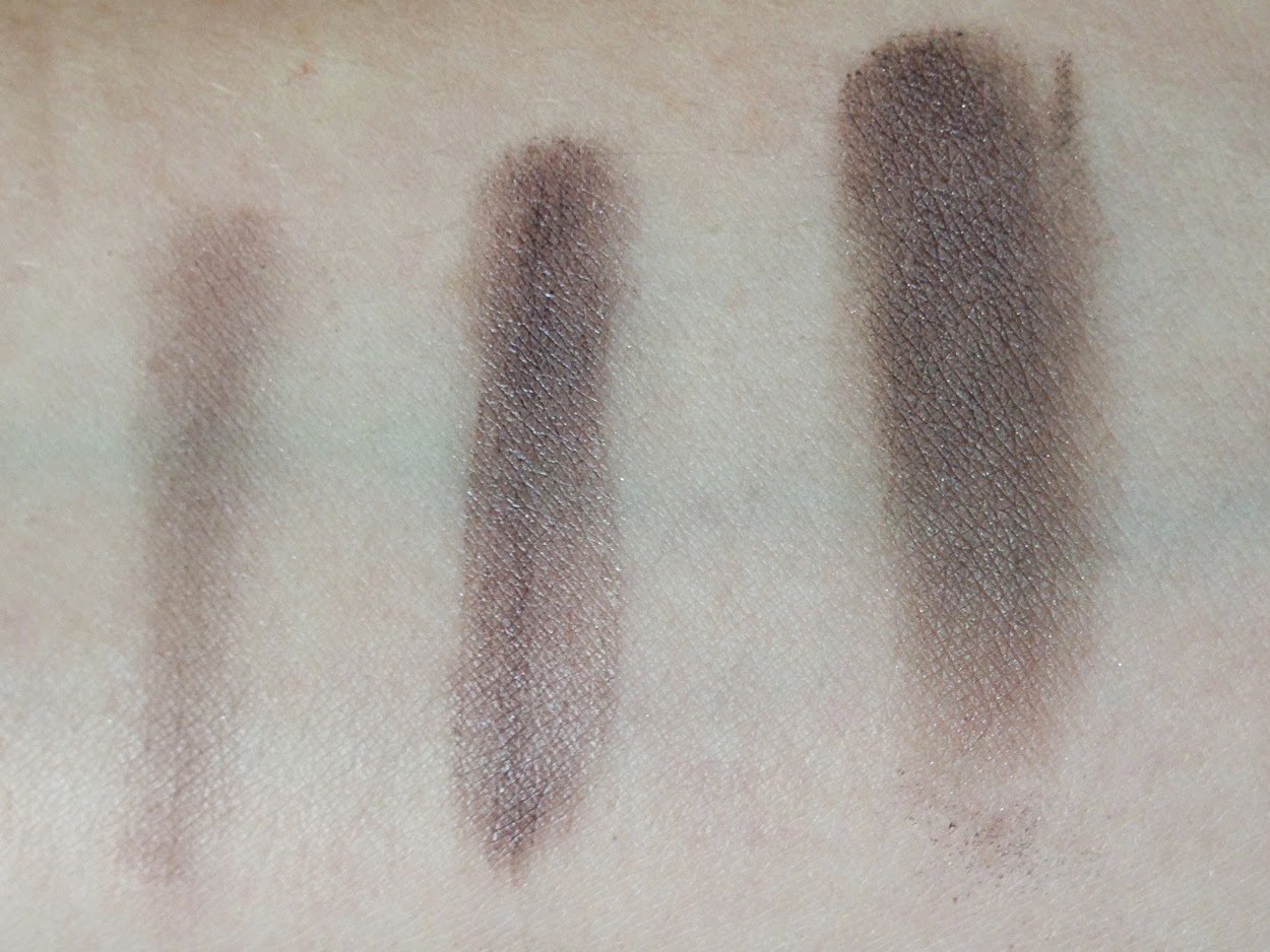
I own two eyeshadows that are similar to Lhasa: Selfish, from theBalm’s Nude ‘Tude palette, and Maybelline Color Tattoo in Tough as Taupe. Left to right: Tough as Taupe, Lhasa, Selfish.

Tough as Taupe is a cool-leaning matte taupe in a cream formula; Selfish is warmer and frostier than the others. As different as the three are from each other, they’re all connected in a chain of causality: I bought Lhasa to replace the near-extinct Selfish, and Tough as Taupe as an intensifying base for the semi-sheer Lhasa. (This is how you go bankrupt, kids.) Below, Lhasa swatched on its own, then layered (sloppily, sorry) over NYX HD Primer and Tough as Taupe:
Worn on its own, Lhasa is the perfect companion to a bold lipstick. To any bold lipstick, cool or warm: one of my favorite eye/lip pairings for spring is Lhasa and Milani Flamingo Pose, a pinky-red coral.

Inspired by this look from Dior S/S 2012 (taupey grays were everywhere two years ago, apparently):

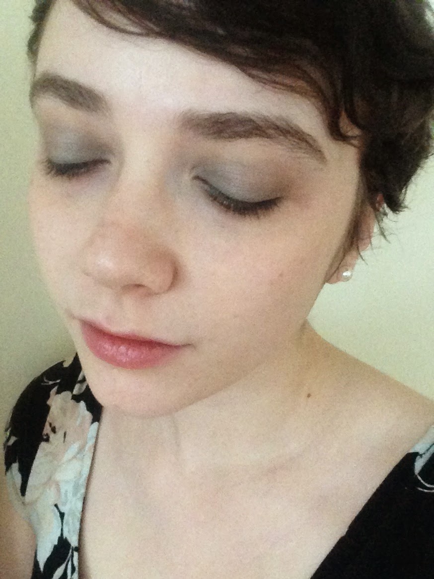
But Lhasa isn’t just a wingman for coral or fuchsia lipstick. It also pairs beautifully with bolder eyeshadows, lending depth and a violet sheen to any color it’s blended with. Below, I’ve swatched Lhasa over Maybelline Color Tattoos in Electric Blue and Pomegranate Punk, and under the left-hand shade in the NARS Habanera duo. Left to right: EB alone; EB under Lhasa; PP alone; PP under Lhasa; Habanera alone; Habanera over Lhasa (my favorite).

ETA, a day later: I liked the result of the Lhasa/Habanera experiment so much that I’m wearing the same combination today:
Maybe I like Lhasa so much because it reminds me of myself. Lhasa is a sociable introvert, unassuming but quietly eccentric, content on its own but also happy in small groups of friends. It’s the INFJ of the makeup world. That said, I often suspect that Lhasa is friendlier and more congenial than its owner. That’s right: I’ve been outclassed by an eyeshadow. It was bound to happen.

I love that you just Myers-Briggs-ed your eyeshadow. I'm supposedly an INFP; close enough that I think Lhasa would be a shadow after my own heart. A matte, slightly browner version may be Bobbi Brown's Taupe — I've been using it a lot in the year or so that I've had it, because it's so versatile. I've even used it as contour.
LikeLike
I knew of the colour taupe, and the colour coral, but never really appreciated either of them until I started reading beauty blogs and getting to grips with this whole makeup thing (I feel my grasp is now firmer, but frankly still slipping). This eyeshadow is on my list from NARS, along with Outremer (BE STILL, MY BEATING HEART) and the Kauai duo. Also, I am a sucker for travel/geographical themed things. There's such an air of exploration (by proxy) to it, somehow!
LikeLike
Oh, I Myers-Briggs absolutely everything. You have no idea. And I'm actually right on the cusp of J and P! Hmm, this makes me want to pair each Myers-Briggs type with an item from my makeup stash…
LikeLike
Taupe and coral are much fawned over in the blogging world, aren't they? I think it's because they're so tantalizingly undefinable! And they're such huge color categories that everyone will find something flattering within them–I didn't think I could wear coral until I bought Flamingo Pose.OUTREMER! So gorgeous. That shade of blue is my second favorite color (after fuchsia, of course).
LikeLike
That would make a fantastic series of posts!
LikeLike
[…] blush (limited edition for Holiday 2013, tragically), NYX Butter Gloss in Peach Cobbler, NARS Lhasa (in future I’ll try to limit the Lhasa overexposure on this blog), NARS Habanera eyeshadow […]
LikeLike
[…] my review of NARS Lhasa, I mentioned that I have several under-the-radar beauty staples, products I use so often I’ve […]
LikeLike