
(Yes, I’ve been rewatching Arrested Development.)
I bought theBalm’s Nude ‘Tude eyeshadow palette, a mostly cool-toned mix of neutrals, back in August 2012. It was my first eyeshadow palette, and still the only one I own. I’d spent all summer vacillating between Nude ‘Tude and Urban Decay’s recently released Naked 2, and I might never have bought either one (the usual upshot of my makeup dilemmas) if theBalm hadn’t gone on HauteLook for a considerable discount. So I pounced, and nearly two years later, you can see how well the twelve-shadow palette format worked out for me.
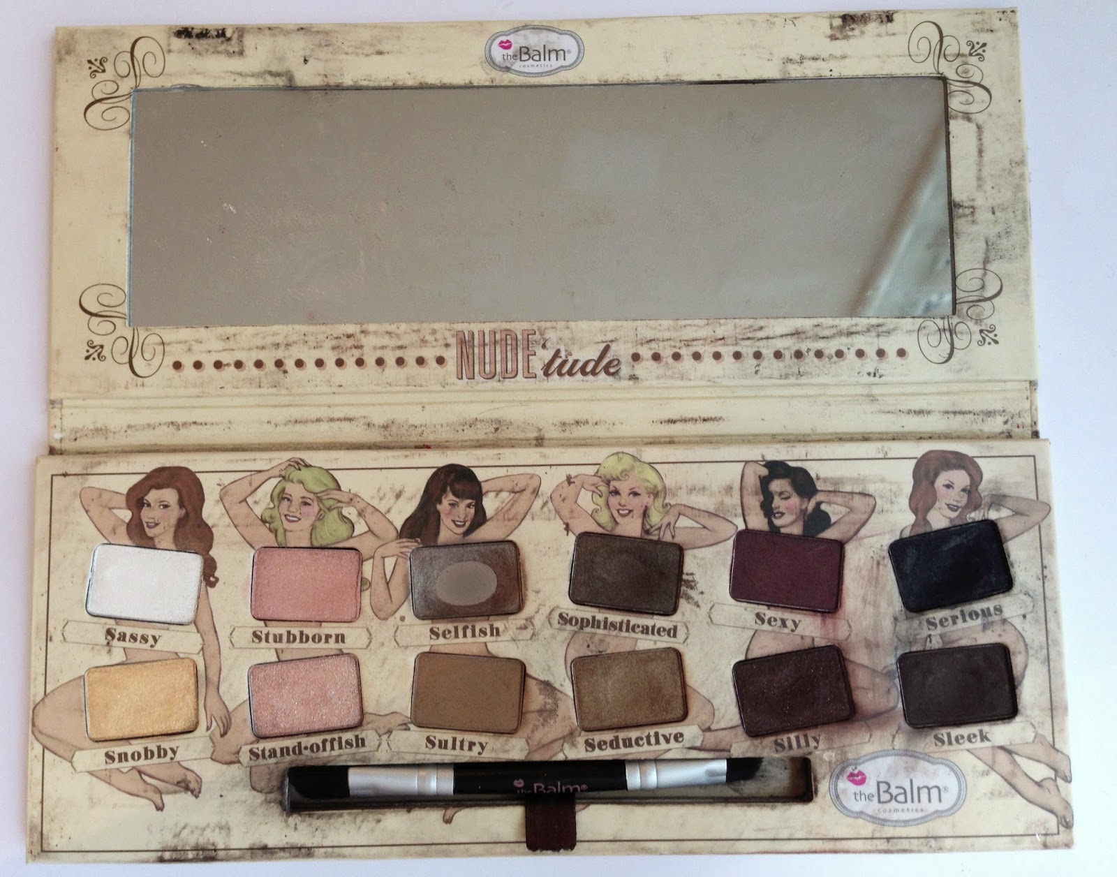
That’s right: I hit pan on Selfish, the taupe shade, before I even knew that “hitting pan” was a thing, but I’ve barely made a dip in the others. I don’t think I’ve worn any of the four leftmost shades in public even once. So in the interest of using my stash to its full potential (especially as I’m traveling with a limited supply of makeup and on a continent where the odds exchange rates aren’t in my favor), I’ve decided to spend a couple of posts testing the range of Nude ‘Tude. Apologies for the filthy condition of the palette, by the way; the cardboard surface is impossible to clean. It looks better with the lid closed.
Nude ‘Tude was theBalm’s response to the nude-palette frenzy created by Urban Decay’s original Naked palette in 2010. It would be easy to dismiss this palette as an imitator, except that it’s actually Naked 3 avant la lettre: an assortment of pinky neutrals, with quite a few darker shades for smokier looks. It’s packaged in a lightweight cardboard, perfect for traveling, and it comes with a small double-sided brush that’s useless for applying eyeshadow as shadow but perfect for applying it as thick and thin liner.
The left side of the palette contains the lighter colors.
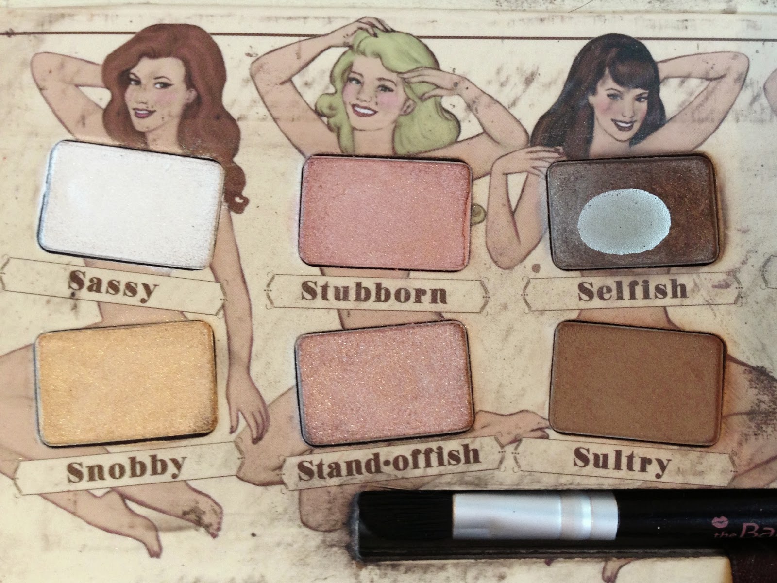
Sassy is a rich, pigmented frosty white that’s meant to be a highlight shade, but it’s so opaque that I’ve never been sure how to use it without looking like a time traveler from 1999. Snobby is a pale shimmery yellow-gold. Stubborn is a neutral satin pink. Stand-offish (which should actually be one un-hyphenated word, but whatever) is lighter, peachier, and more frosty than Stubborn, but I really don’t think this palette needed both pinks. Selfish is a cool-toned satin gray-taupe, and the first eyeshadow I fell in love with and felt the need to wear everysingledayomg. Sultry is a warm matte brown that I cannot wear, ever, on any part of my eye. It makes pale, cool-toned me look like I’ve been punched in the face.
Swatched in the same order (Sassy, Snobby, Stubborn, Stand-offish, Selfish, Sultry):

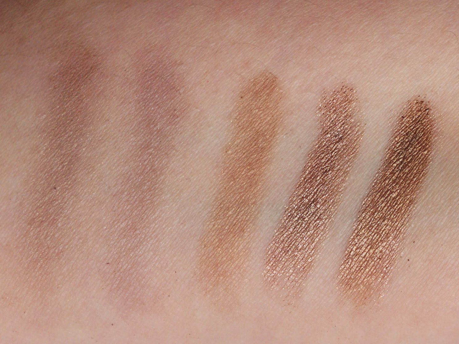
The right-hand half contains the darker shades, which have gotten more use (and have made the poor pin-up girls behind them look like inadequately clothed Victorian chimney sweeps):
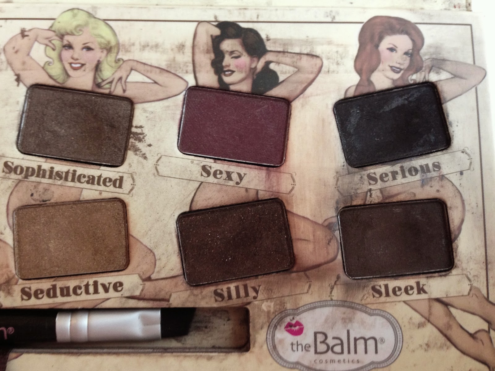
Sophisticated is my second favorite shade in the palette, a cool-toned shimmery brown that swatches lighter and more taupey than you’d expect. It pairs perfectly with Selfish. Seductive is a shimmery warm bronze; I usually ignore it in favor of Maybelline Bad to the Bronze, a cooler bronze in a long-wearing cream formula, but I also like layering Seductive over Bad to the Bronze for more opacity. Sexy is a matte burgundy, perhaps the most unusual color in the palette. It’s beautiful to look at, but I tend to avoid dark matte eyeshadows, which accentuate my pallor and undereye circles. Silly is a dark matte reddish brown with bronze glitter; I wish the glitter showed up as well on the lid as in the pan. Serious is a matte black, Sleek a matte black-brown, and both work best as liners.
Left to right: Sophisticated, Seductive, Sexy, Silly, Serious, Sleek.

And here’s the entire palette swatched on white paper; I’ve included this photo less for color-accuracy (which it lacks) than for sheer aesthetic harmony. Look how well-ordered they are! Top row, from left: Sassy, Snobby, Stubborn, Stand-offish. Second row: Selfish, Sultry, Sophisticated, Seductive. Third row: Sexy, Silly, Serious, Sleek.

Finally, a couple of comparison swatches. From left: theBalm Selfish, NARS Lhasa, theBalm Seductive, Maybelline Bad to the Bronze, and Seductive layered over Bad to the Bronze.
Though I’ve neglected most of the colors in this palette, I don’t at all regret buying it. Almost everything I know about eyeshadow, I learned from Nude ‘Tude:
1. I shouldn’t buy large palettes! I never use more than two or three eyeshadows in any look, and I’m extremely loyal to my favorite shadows, so I’d rather buy a carefully chosen duo or a few singles and finish them than get a dozen shades at once and ignore most of them.
2. Taupe = good.
3. Matte = bad (for me, as a rule).
4. Unless used as eyeliner, because matte eyeshadows often make the best liners.
5. Nude/naked/neutral palettes are, paradoxically, more hostile to easy minimalism than smaller, quirkier palettes are. Unlike the Suqqu and THREE quads reviewed by some of my favorite bloggers in recent months, Nude ‘Tude doesn’t contain a statement shade; you have to layer a few shades to get a striking effect, and that effect is usually “smoky.” Not my style, and not conducive to many variations (though, as ever, my inexperience might be coloring my opinion).
6. Comprehensive palettes like Nude ‘Tude are most useful for two kinds of makeup users: beginners who don’t know where to start and experts who know how to get the most out of each shade. In 2012, I was a beginner. These days, I know more about placement and mixing and color harmonies, but I’m hardly an expert. I hope that through my experiments with Nude ‘Tude, I’ll come closer to expert level–or, at least, amuse my readers with my incompetence.
7. But seriously, I should have bought Naked 2 instead.

Lol @ 7. I love neutral palettes but disdained the Nakeds for some reason and went for this palette instead. It's a nice solid option but kind of boring as you pointed out. I had other stuff that filled the void, so I didn't miss this at all after I got rid of it via a blog sale. theBalm Shady Lady Vol. 2 has some more \”fun\” shades, if you like the quality of theBalm shadows. 🙂
LikeLike
If my palette were in decent condition and not two years old, I might consider selling it. But since I probably couldn't pay anyone to take it in its current state, I'm trying to make it work for me. It's hard, though! I've been doing a few looks for an upcoming post, and I've found that several of the colors are either so warm that they don't mesh with my undertones at all (e.g. Seductive), or so close to my skintone that they blend in and look a little odd (e.g. Stubborn). Meh.I remember checking out the Shady Lady palettes around the same time that I bought Nude 'tude and thinking they looked promising! I should take another look.
LikeLike
Hehe, as a fan of the Naked 2 palette, yes, you should! No, but more seriously: I bought that Naked 2 because I had discovered I liked UD's formula and wanted to get some all-purpose neutrals. To this date, I haven't really been tempted by another neutral palette, because really, how many do you need? The only thing that bothers me is that the palette really isn't as 'cool' as its often made out to be. Either that or I'm just so exceptionally cool that I make the shades seem warm.*Puts on sunglasses*
LikeLike
That was actually the reason I decided against Naked 2: it was being touted as the cool-toned answer to Naked, but it looked too warm for me! I remember asking Christine of Temptalia for a recommendation for a cooler neutral palette, and she suggested Nude 'tude, and so here we are. *adjusts sunglasses*
LikeLike
I was going to reply coherently to your comment, but I realised that I made a typo of 'its/it's' in mine, and shame overtook me…*sunglasses fall off horrified face*;-P
LikeLike
If it makes you feel better, I didn't even notice! But I'm as hard on myself about typos as you are, and I hate that we can't edit our own comments in blogspot. Disqus is so much nicer that way. *smashes sunglasses into smithereens*
LikeLike
[…] Pan That Palette project for 2016! My victim: theBalm’s Nude ‘Tude palette, reviewed here and […]
LikeLike
[…] previous post on theBalm’s Nude ‘Tude palette was devoted to swatches and mini-reviews of the colors. […]
LikeLike