
In the last couple of weeks, I’ve been a bad early modernist: I’ve watched the BBC miniseries of Hilary Mantel’s Wolf Hall without first reading the books. I did start reading Wolf Hall two years ago, but I just couldn’t get into it, despite my childhood obsession with Tudor history. There’s something about grad school that makes one averse to novels set in the time period one studies. (My own research interests lie in Stuart, not Tudor, England, but the early 16th century is close enough.) However, I didn’t have any trouble getting absorbed in the BBC version, not least because of its aesthetic richness. The indoor scenes are filmed in deep shadow to evoke an era before electricity. The costumes and hairstyles make me feel like I’m watching Holbein portraits come to life (indeed, Holbein makes a cameo in the fourth episode). And while the makeup is historically accurate, i.e. barely there, I can still find beauty inspiration in the colors that the characters wear. The standout shade for me is Anne Boleyn’s signature greenish yellow, a cross between mustard, chartreuse, and bronze. Ignore the reflection of my melon head below.

You can find this color and its relatives in a number of Renaissance paintings, including Holbein’s 1540 portrait of Henry VIII:

My love for old gold, or whatever you want to call it, is nothing new. NARS Paramaribo has been on my eyeshadow wishlist for well over a year, and Rouge Bunny Rouge Abyssinian Catbird recently joined it, thanks to Belly’s RBR roundup post. Most shades of yellow do my complexion no favors, but yellow with hints of brown and green can be surprisingly flattering. Look how well the shade suits another pale, cool-toned, brunette AB:

So it’s no wonder that on my trip to Toronto’s Inglot store with Liz last week, I gravitated toward the antiqued-looking olive-gold #433, though not after a good deal of heart-eyed browsing. Despite its small size, the store was overwhelming. So many eyeshadow and blush and lip palettes to be created!

I almost emulated our beloved Sylirael, who went for a blue-purple lipstick duo on her visit to Dubai’s Inglot store, but I’ve been trying very hard to limit my lipstick purchases this year. In fact, I haven’t bought a lipstick since Milani Matte Naked in late February–and if I’ve received another as a gift since then, well, that wasn’t my fault, even if I did request it. And lip liners and glosses don’t count as lipsticks, right? Right. Time for a paragraph break!
Anyway, I opted for an eyeshadow duo instead. (Liz displayed more restraint and bought a single taupe shadow.) Inglot’s “Freedom System” requires you to buy a palette separately from the makeup you want to put in it. I paid $9 CDN for the empty duo palette and $10 for each shadow, which came to $24 USD: not cheap, but $11 less than a NARS duo. (In the US, each shadow is $7 and the palette is $8: you Canadians are right that Americans have it easy.) If you want the makeup itself, you get a lidless metal pan, which can be inserted into a Z Palette or whatever. This is ideal for serial depanners, but I found it a bit annoying, since I don’t own a magnetic palette and had no choice but to buy the Inglot palette to hold my shadows. Oh well, the experience of choosing the colors was worth the extra $9. After much dithering, I settled on #433 and, as a highlight shade, pale gold #08. (I own almost no highlight shades and dislike the ones I do own, like the frosty white and bright yellow-gold in theBalm’s Nude ‘tude palette.)
Here are all the components in their boxes:

Unboxed:
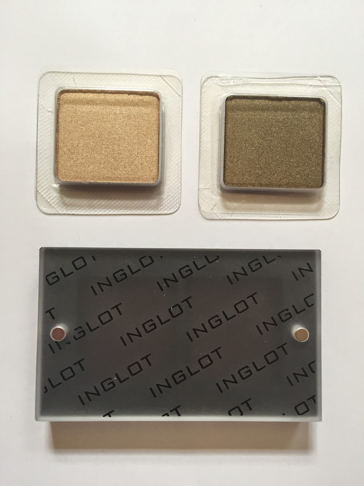
And nestled in the palette:

The lid is held to the pan with those two tiny magnets. This arrangement looks nice but doesn’t feel terribly secure. I wouldn’t travel with this duo unless I held the lid in place with a rubber band or hair tie, and even then I’d be wary. To access the shadows, you must either remove the lid entirely or use one of the magnets as a hinge, like so:

I am a spastic, clumsy individual in general, and I always experience a twinge of fear when I start to push the lid to the side. I am 90% sure that at some point in the near future, my hands will shake while I’m reaching for the palette and send the eyeshadows, pan, and lid flying every which way. For now, though, let’s leave the realm of paranoia and enter the realm of product photos.
Here’s the duo in sunlight, which makes 433’s olive tones come through:

08 and 433 swatched in shade:

Each of these swatches has been built up somewhat, as the eyeshadows are on the light, powdery side. As I’ve said before, I don’t actually like hyper-pigmented, hyper-opaque shadows, but I do wish these had a little more opacity.
Here’s 08 (right) next to theBalm Snobby, the aforementioned yellow-gold. As you can see, 08 is cooler and paler, which means that it pairs more harmoniously with my favorite eyeshadow colors. Granted, theBalm’s formula is better than Inglot’s (that’s one pass of Snobby vs. two or three of 08), but I’m not sure I’ve ever worn Snobby out of the house, so.

And here’s 433 with a few bronzey shades, plus one olive. Left to right: Maybelline Bad to the Bronze, theBalm Seductive, Inglot 433, NYX Iced Mocha, and Kiko 270.

433 is by far the goldest (is that a word?) of the three. Unlike Snobby, though, it has an antiqued, almost decayed quality to it. I love this color, guys, and I don’t even know what to call it.
It’s a testament to my love that I wore this duo for three days in a row this past week, each time in the same placement and with the same accompanying makeup: Illamasqua Zygomatic blush and Milani Matte Naked lipstick. I realized the other day that I haven’t posted a makeup look on this blog since April 13, a full six posts ago, so allow me to rectify that lack with a surfeit of my face. In all the photos, I’m wearing 08 on the inner 2/3 of my mobile lid and 433 on the outer 2/3 and along my lower lashline.

The Inglot sales associate assured me that the combination would set off my eyes, and I think she was right:
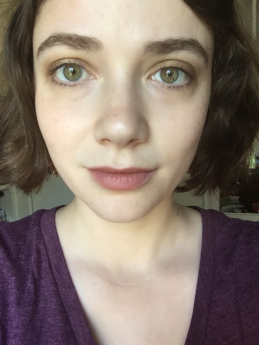
Ooh, shiny:

Now, what to call this duo? I’d like to give it a place name, along the lines of most of the NARS duos–this is the poor man’s Paramaribo, after all. Something that evokes Renaissance England, I think. Whitehall? Hatfield? Help me out here.

The duo is so pretty on you! They work so harmoniously well with your eyes, lips, and the top. :)I'm not particularly drawn to warmer shades but I do have a soft spot for antique golds. It is good to know that Inglot eyeshadows are not super pigmented since I do not like the kind, either.
LikeLike
I have a thing for antique-y golds — MAC Gilt by Association is a favourite. The sales rep was right — I think this makes your eyes greener!As for the duo name, I am far from a history buff, so all I can offer is Hampton Court.
LikeLike
Those colours are beautiful separately and together – you did a great job of putting the duo together. I don't know if I'd have that kind of foresight; I'd probably just pick colours I liked regardless of how well they went together!I've never been tempted by Inglot before since I didn't know there was a store here, but I might have to go check it out. Not that I need more eyeshadow, but the freedom system is tempting.
LikeLike
Thank you! 🙂 And yes, I usually go for cooler-toned eyeshadows as well, but I do love my taupey bronzes and antique golds. I can't do warm-toned brights, though. (Or I don't want to, which comes to the same thing.)I've said it before: I think a lot of bloggers are too harsh on shadows that aren't super-pigmented at first swipe. That's one of the reasons why ColourPop has gotten so much praise–their shadows swatch perfectly. But it's one thing to swatch a shadow, and another thing to actually blend it out on the eye!
LikeLike
I love Hampton Court! I think it sounds the most NARS-ish of all the current candidates, actually.
LikeLike
Those are really pretty. I love that antique gold shade.
LikeLike
Thank you! I tried to go for colors that I could pair with eyeshadows I already owned–I have a lot of plums and purples, for instance. Now I just need to get over my insane phobia of wearing non-neutral eyeshadow (and yes, this duo counts as \”non-neutral\” for me) with non-neutral lipstick.Apparently there are a few Inglot stores in NYC as well, which is a dangerous thing for me to know.
LikeLike
Thanks! I almost wish I'd gone for another shade as striking as the antique gold–a teal, maybe. I suppose I did the practical thing, since I didn't own a lighter shade that would work well with 433, but still. Next time!
LikeLike
Oooh, that gold looks especially awesome with the purple shirt. Glad that our visit turned out to be fruitful. I haven't opened my lonely solo shadow yet. Either I'll get it a partner with a snug palette home or return it. It was just so hard to leave the store without some sort of a souvenir. ;O
LikeLike
Aww, your poor untouched shadow! It was a taupe, wasn't it? I agree, there was no way I was leaving without buying something…
LikeLike
So pretty! I have Paramaribo and I don't use it often. I think the shades are too close to each other on my skin tone. Abyssinian Catbird is gorgeous, though, but I don't htink it's as sheeny as the one you got. 🙂
LikeLike
The shades in Paramaribo are pretty close to each other even before they're applied, though, right? I'm surprised that NARS didn't choose a much lighter bronze or a different color entirely, as they usually do.
LikeLike
Yeah, it's weird. They look too much alike to be in the same palette, as pretty as both shades are.
LikeLike
[…] how it looks in context. I’m wearing my Inglot eyeshadow duo here, plus Sleek Life’s a Peach blush to warm up my […]
LikeLike
[…] Eugenie with my Inglot gold duo and Illamasqua Zygomatic blush. I’ll probably return later and replace this photo with a […]
LikeLike