
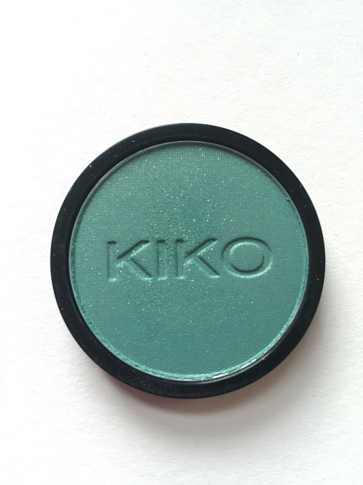
In my review of Sephora Formula X Enigma, the nail polish that sparked my love for teal, I mentioned that I wanted to try a teal eyeshadow. It didn’t take me long to find a suitable one, so here we are with my second London beauty buy: Kiko Infinity Eyeshadow #264, a green-toned teal with subtle gold glitter. Kiko describes it as “Sparkling Green.”
Last year, I made the mistake of buying two bulky compacts in which to house my Infinity shadows; this time, I bought only the pan.
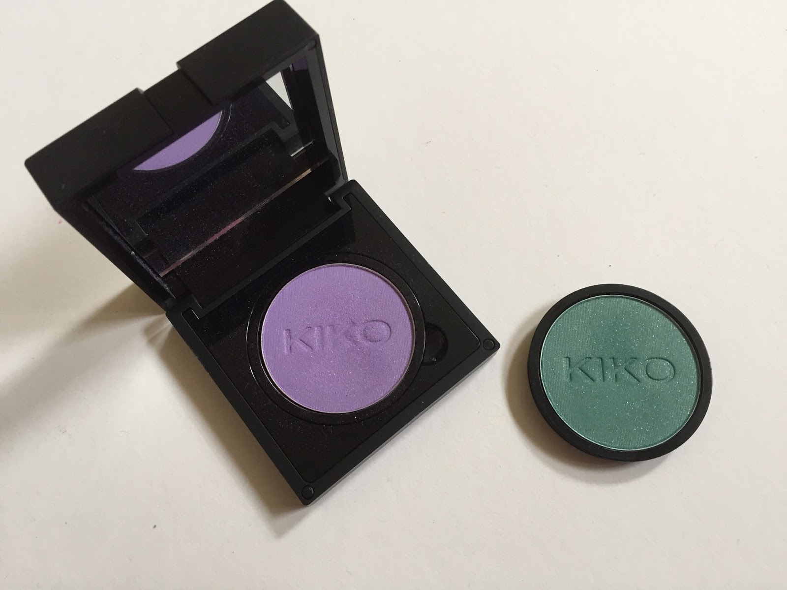
The pan has a snap-on plastic lid that makes it ideal for traveling. I really appreciate beauty brands that make the effort to produce minimalist packaging, though Kiko sort of ruins that effort by pressuring customers to buy the unnecessary compacts. I wish I had held on to the plastic lids from my other two Kiko shadows, because it’s so hard to transport them in their compacts! Live and learn, I suppose.
Since all the Infinity eyeshadows were over 50% off at the Regent Street store, I began to worry that Kiko might be discontinuing the line entirely. The shadows are still available on the UK site, but once again, they’re £2.80 instead of £5.90 each. This sale is marked as a “special offer”; I don’t know whether this means that the Infinity line will be discontinued in the future, but if you’re looking to score some high-quality eyeshadows for very low prices, now is your chance. There’s a formidable range of colors, from the softest neutrals to the screamingest brights, and all of the shadows I swatched in the store seemed to have good formulas. I gravitated toward the bolder, sparklier shades, but if you’re curious how the matte neutrals perform, Belly reviewed four grays and browns last year.
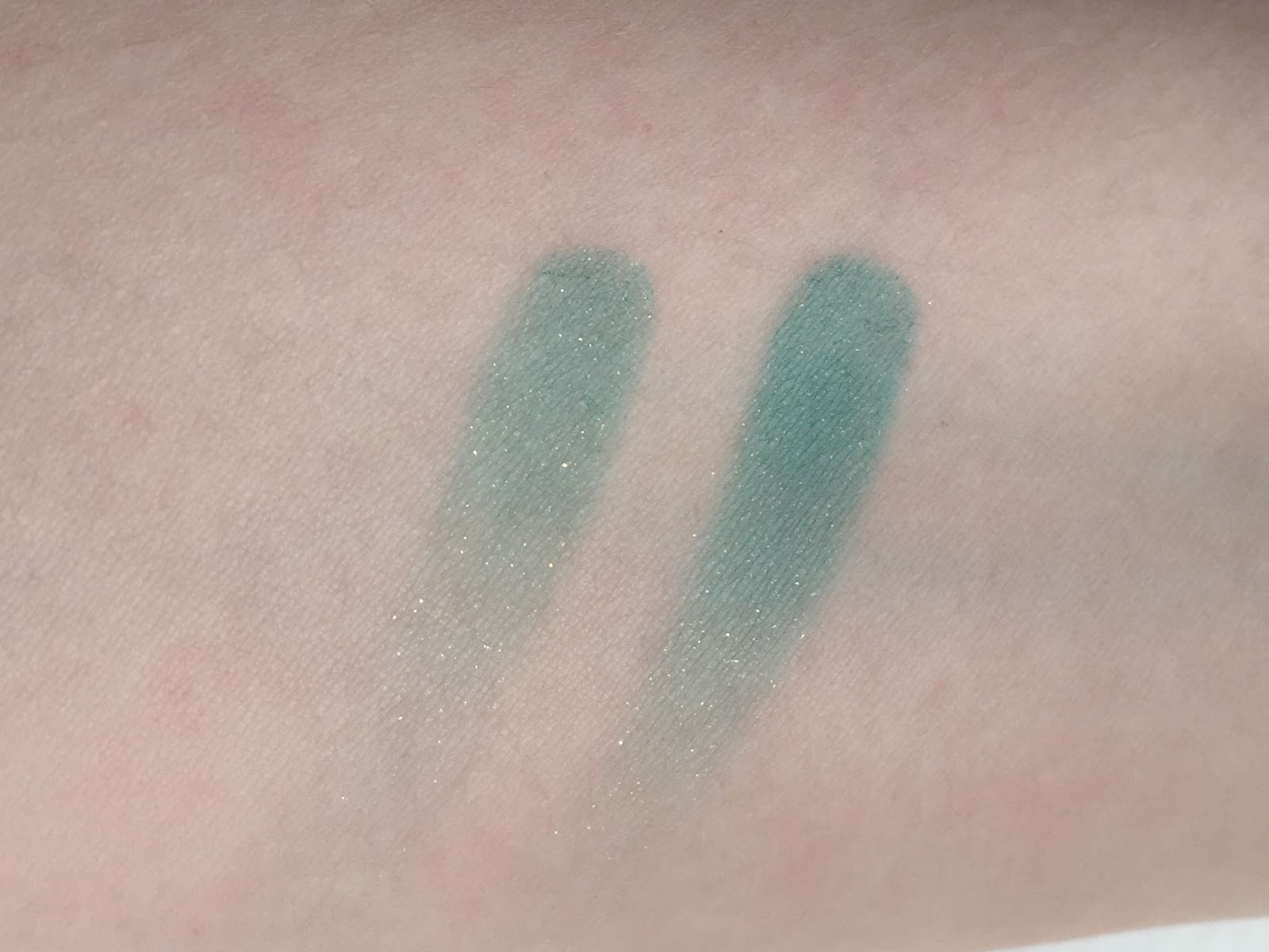
I was very happy with the two Kiko eyeshadows I bought last year, and 264 is equally impressive. It has the same smooth, non-powdery formula as 270, the shimmery olive green, though it’s slightly less pigmented. This is fine with me, as I like being able to build up pigment gradually on my lids, especially with a bright color like teal. I’ve swatched 264 below: one pass on the left, and two on the right. As you can see, the glitter becomes less evident as you build up the color.
So, teal eyeshadow. I’ll be honest, I’m not smitten with how the color looks on my face. It’s not unflattering, but it really takes over. I’ve always been more comfortable with bold lips than with bold eyes, and part of the reason is that my eyes are big, deep-set, and darkish already; they don’t need much enhancement to make them stand out. So if I slap a bright color on my lids, my face becomes all EYES!, and if I add a bold lip color to balance out the eyes, I look like the ’80s have thrown up on me. I really need to stop acquiring non-neutral eyeshadows, guys. At least this one was cheap. If I try to buy one of the new Urban Decay duochromes, please throw virtual tomatoes at me.
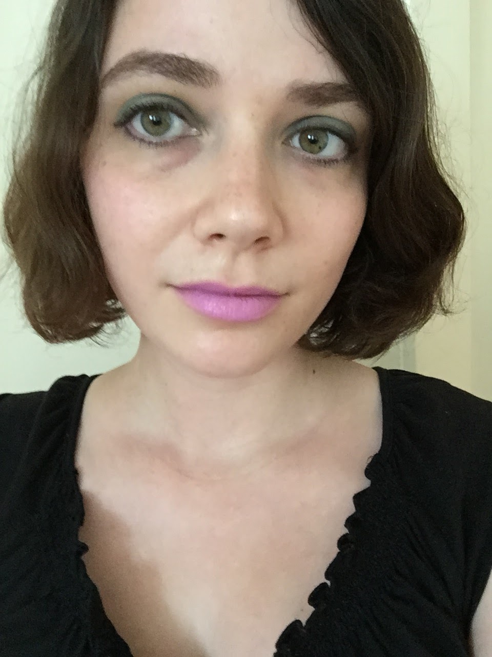
The first look I tried with 264 was pretty unremarkable. I wanted to see how the shadow behaved without primer and didn’t want to mix it with too many other colors, so here we have an almost solid block of 264, with Inglot 08 at the inner corners. Damn it, I CANNOT remember these numbered names offhand. I hate having to look up my earlier posts to jog my memory.
Aaaanyway:
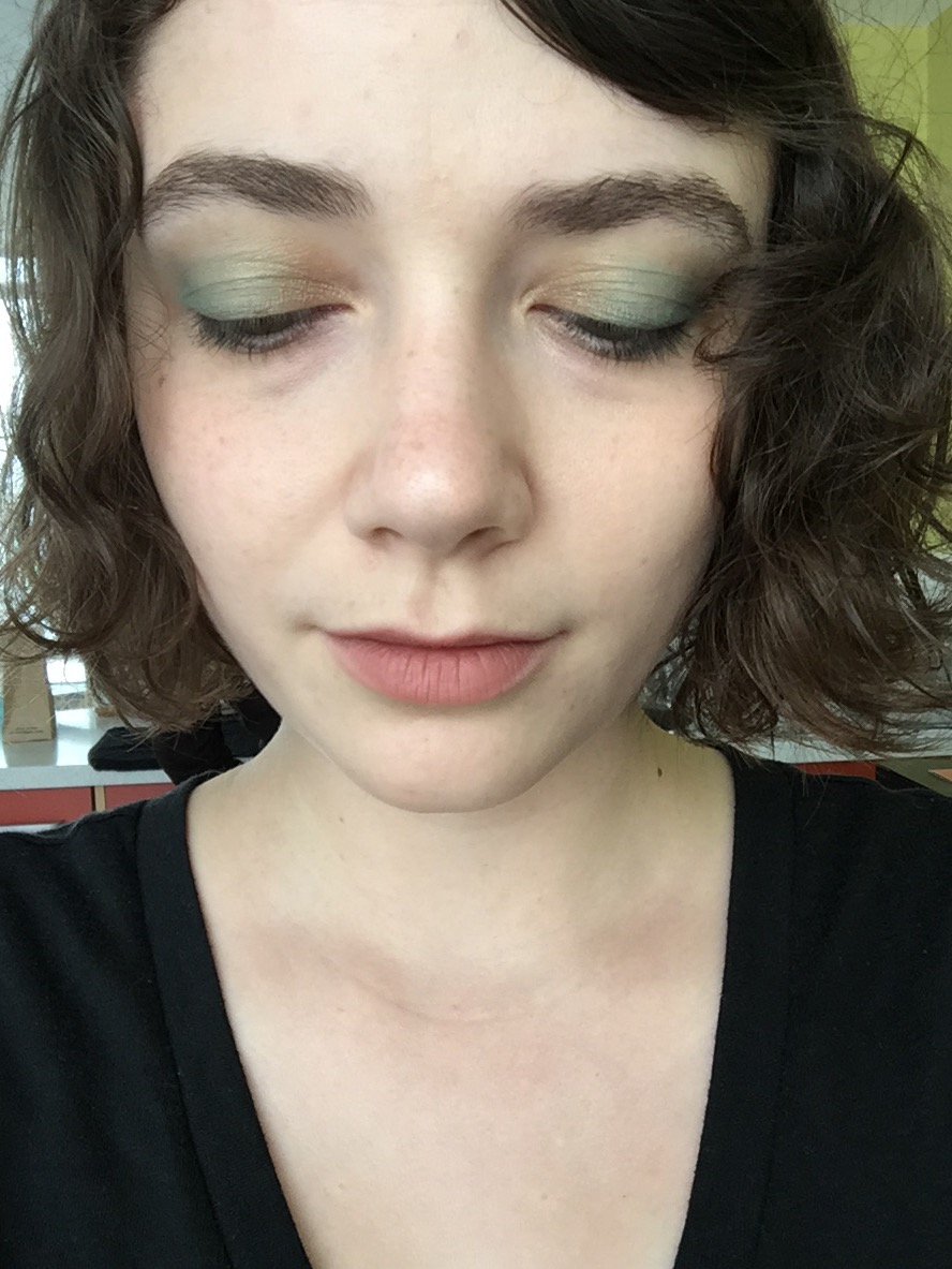
My blush here is Illamasqua Zygomatic (not that it matters, since it’s barely visible), and my lipstick is Milani Matte Naked, my favorite lip color to pair with bold eye makeup.
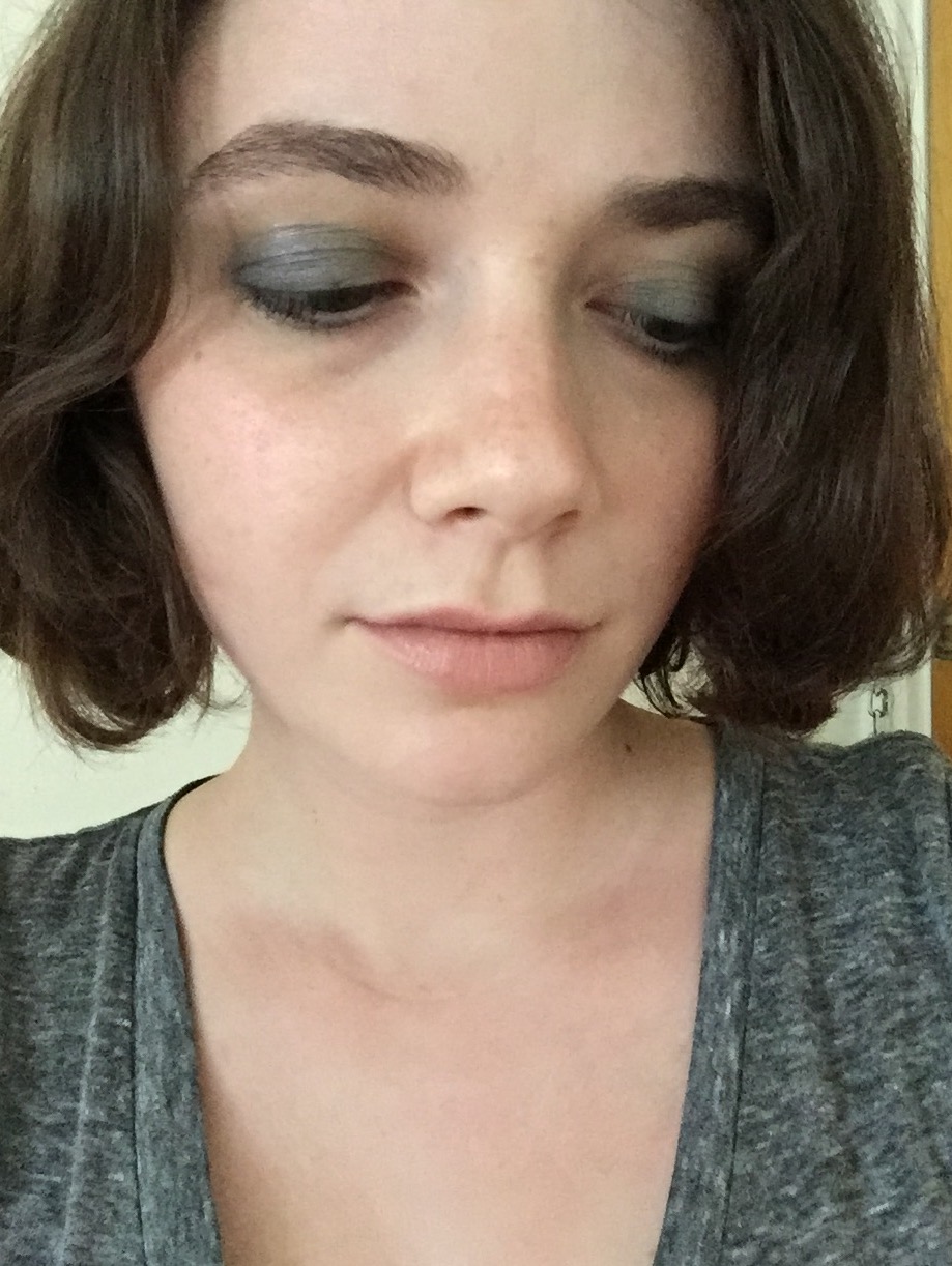
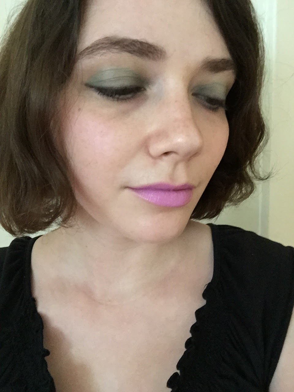
For my second 264-centric look, I decided to tone down the teal with a bit of navy and apply the shadows over primer, since 264 had faded pretty quickly without it. From the inner to the outer corners of my mobile lids, I have NARS Lhasa, 264, and Milani Bella Navy, with a bit more Bella Navy on my lower lashlines. Blush is Milani Coral Cove; lipstick is Maybelline Nude Lust, which I hadn’t worn in over a year before I happened upon it in my lipstick box. I should wear it more often: nudes with a hint of gray look better on me than warm peachy ones. Nude Lust also looks a bit like Bite Cava, a longtime lemming. Maybe I don’t need Cava after all?
And here’s the same eye/blush combination with NARS Dolce Vita lipstick. See how the blue-toned green of 264 sort of competes with the yellower green in my eyes? I’m not enamored of the contrast.

A solid swath of teal also looks a tad ’70s, as evidenced by this Maybelline ad from 1978 (source):
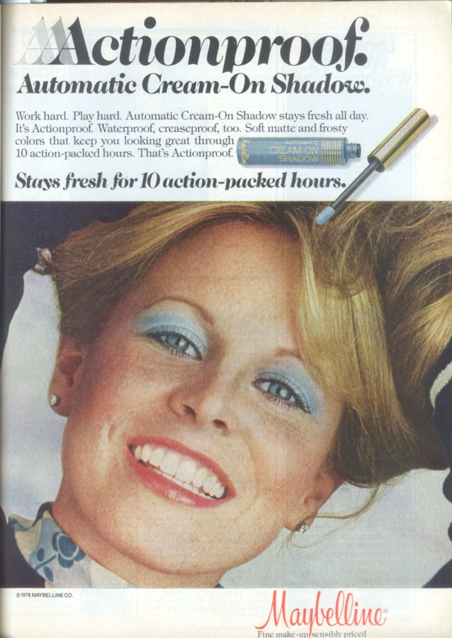
Yeah, that doesn’t exactly appeal to the tastes of 2015 (though I love the Marimekko-esque pattern on that top, as well as Maybelline’s willingness to use a visibly non-teenage model). But what if I added some black eyeliner as a buffer between the shadow and my eyes, along these lines?
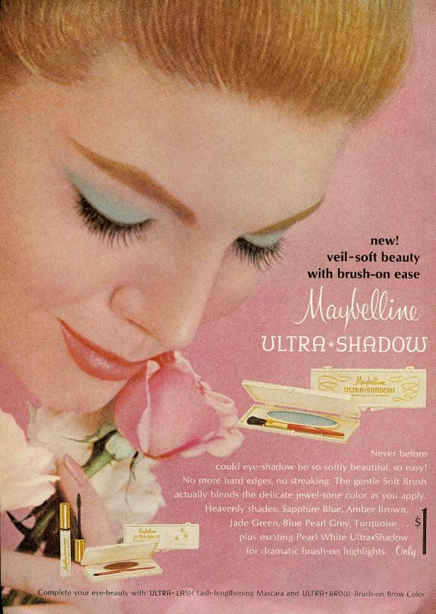
21st-century interpretations of mod eye makeup tend to involve thick, graphic strokes of black liquid liner, as seen in the vintage Max Factor ad above (source). But it doesn’t have to be this way! A Maybelline ad from 1965 (source) shows a softer, subtler look that I prefer, not least because my extra eyelid crease makes sharp cat-eye flicks pretty much impossible.
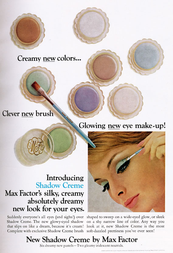
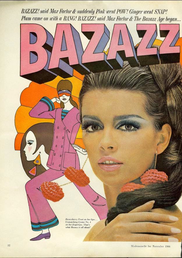
This Max Factor ad from 1966 (source) features a cross between a teal smoky eye and a graphic pastel eye; note the lack of black flicks at the outer corners, though the pale blue is winged out past the eyebrows. I don’t know what’s going on in the background, but I’m into it. BAZAZZ!
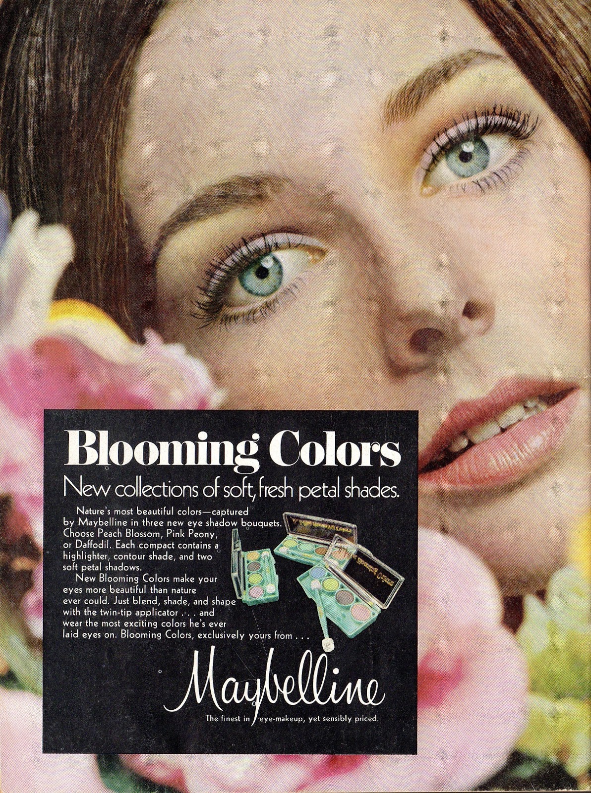
By 1969, the black liner had vanished from the lower lashline, but pastel still reigned on the mobile lids:
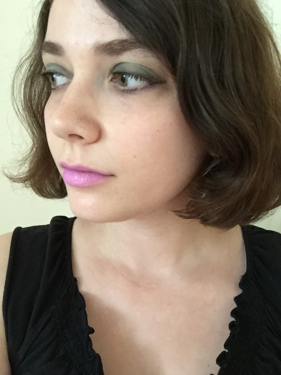
This morning I tried for a mashup of the ’60s ads, ending up with this:
With an eyeliner brush, I applied theBalm Serious (matte black) to my lashlines. My blush is Tony Moly Milky Violet blush; my lipstick is Maybelline Lilac Flush. Once again, I used eyeshadow primer, a necessity in this insane humidity.
I’m really pleased with how this turned out! I like getting weirder with my makeup looks in the summer, when most students and professors have cleared out of town and I’m not absolutely guaranteed to run into someone I know at the coffee shop across from campus.
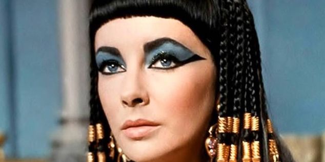
I can’t end a post on ’60s-inspired teal makeup without mentioning Elizabeth Taylor in Cleopatra (1963), a film that I’m given to understand was a life-changing experience for a generation of heterosexual preteen males. These days we’d identify Taylor’s makeup as a decidedly man-repellent look, but I guess people in the ’60s were inured to bold eyeliner:
I don’t think I’ll be giving up my bold lips and neutral eyes anytime soon, but it’s nice to escape old habits every so often. How do you like to wear teal?

I love your Kiko #264 looks with Dolce Vita & Lilac Flush! Wearing pale lavender shades on cheeks and lips is my favorite way to work with green/teal although I still don't think it is the most flattering look for me. (Speaking of lavender cheeks, I think I need to get the Clinique Pansy Pop after all).
LikeLike
Ah, so I'm not the only one who likes the combination of teal and lavender! I think teal also looks nice with coral lips and cheeks, but that's a little too showy for me to feel comfortable wearing.I'm still looking for a lavender blush that's more pigmented than the Tony Moly! Pansy Pop is beautiful, though it seems like it leans more pink than purple once applied.
LikeLike
Since I have blue-green eyes, I try to avoid wearing much blue/teal/turquoise/green at all. I do make an exception for it when it comes to eyeliner – I feel like that's the best way, and most comfortable for me, to wear bright colours. I do love that lavender lip on you!
LikeLike
Green eyeshadow will never be my favorite, either, but sometimes I do enjoy wearing something that's not traditionally flattering. I do want to try applying this eyeshadow with an eyeliner brush for a subtler look.And thanks! I'm delighted that purple and lavender lip colors have become more mainstream in the last few years. There are so many more choices than there used to be!
LikeLike
I love kiko!! I bought their 4 pan compact, even if you leave 1 pan empty I think it's good for traveling. Mine is composed entirely of taupes, lolz.I think the simple look with dolce vita is pretty wearable for everyday! Not too much of a Look 🙂 Also re. Lavender blush, sleek candy collection blush by three actually has a lavender shade in the middle. Temptalia reviewed it, and although it's somewhat powdery and not fantastic quality is very, very lavender, plus dirt cheap. It was LE though, but it's something you might wanna consider!
LikeLike
Now that you say that, I remember that I was planning to get one of Kiko's stick eyeshadows in a shimmery taupe. Oh well, if I forgot about it at the Kiko store AND while writing this post, I probably didn't need it.The teal/navy combo was more of a Look in person, but it was very cloudy when I took those photos, which toned down the colors slightly. And thanks for the lavender blush tip! Having looked at some photos, I think the Sleek is a little pinker and softer than I'm looking for. I want something like the blush version of MAC Lavender Jade or ColourPop Brills, but that seems not to exist. Alas!
LikeLike
Re the taupe, is it the one that is a supposed dupe for By Terry Misty Rock? I think I have that one and its a great one wash lid colour. Get it the next time!! :p
LikeLike
[…] version of us insists we’ll use it all the time. Well, the alternate-reality Zoe may wear sparkly teal eyeshadow, but the real-life Zoe invariably reaches for matte or barely shimmery eyeshadow in taupe, gray, […]
LikeLike