
Three weeks into my no-buy, I’m not feeling any great temptation to get something new, but I do find myself adding a worrisome number of items to my “buy in 2016” wishlist. In the interest of self-distraction, I think I’d better get back to reviewing the stuff I picked up during my stress-shopping phase in September and October. Introducing my newest blush (and, to my credit, one of only two blushes that I bought this year): Urban Decay Rapture.

Despite my longtime devotion to all things plum, I didn’t own a plum blush until Rapture. NARS Mata Hari is a medium cool pink with a slight plum tone, and Sleek Flushed is a warm berry red, but neither blush is quite purple enough to qualify for inclusion in my favorite makeup color category. So when Urban Decay had a sitewide 20%-off sale in October, I bought not only the Revolution Lipstick in 69, but also the blush version of Rapture, the lipstick I’ve been wearing constantly this fall. Rapture the lipstick has become such a necessity for me (dark enough to make an impression, neutral enough to look professional) that I couldn’t imagine being disappointed in Rapture the blush.
Rapture is part of Urban Decay’s long-awaited Afterglow 8-Hour Powder Blush line, which came out this past summer. The Afterglow (eyeroll) blush that appealed to me first was Bittersweet, a bright true purple. But I couldn’t justify spending $26 on a novelty color, so I ignored the Urban Decay blushes until this fall, when I started looking for a shade deeper than Mata Hari and more purple than Flushed. I was deciding between Rapture and NARS Sin, and then UD had a sale and NARS didn’t, so here we are.
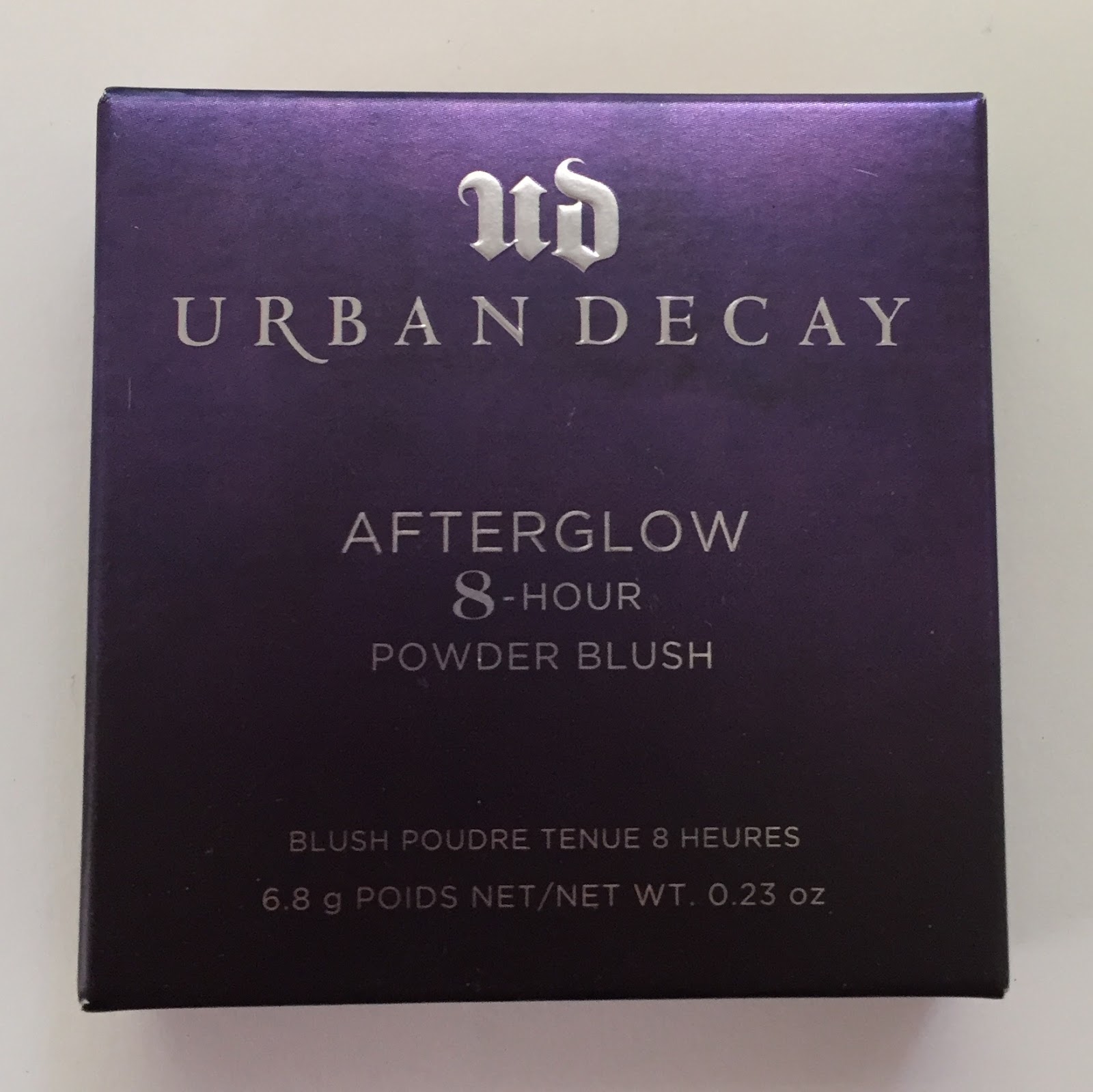
Urban Decay certainly has more exciting packaging than NARS does—I love the metallic ombré box:

The blush compact itself walks the fine line between dystopian-kitschy-cool and (apologies to Ebony Dark’ness Dementia Raven Way) GOFFIK:
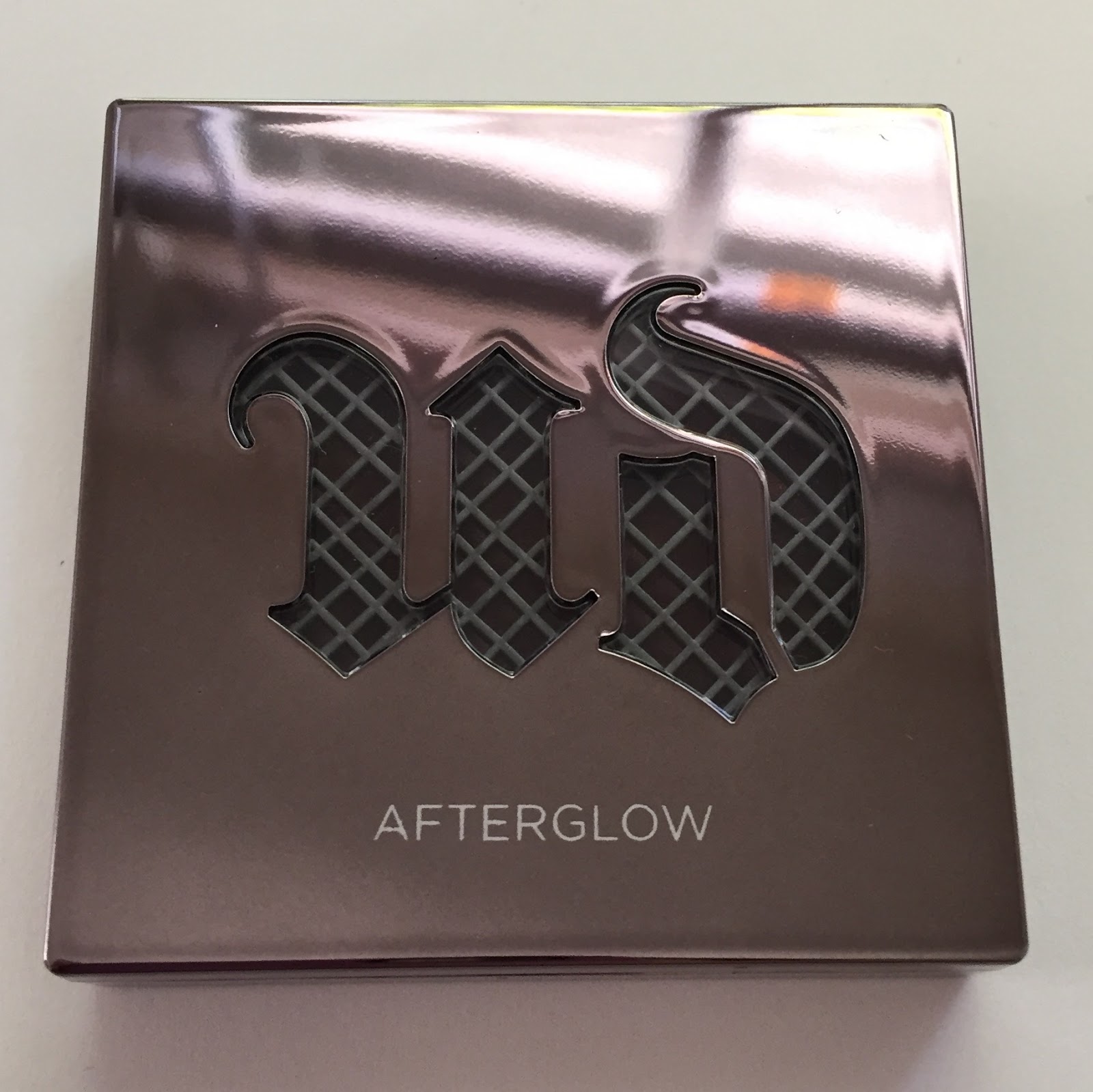
We’re a long way from NARS, folks.

Honestly, though, I don’t mind. So what if this blush looks like it comes straight from the set of the Divergent movies? I’m not of the faction that believes all adult makeup should be minimalist and tasteful. I love the look of Anna Sui’s bird’s-nest-topped nail polishes, Paul & Joe’s cat-printed compacts, and YSL’s gaudy ’80s-tastic gold lipstick tubes. Too Faced’s new heart-shaped blushes are really toeing the line between “foppish objet” and “toy makeup”—they look identical to some of the Polly Pocket sets I had in the ’90s—but I’ll give even them a pass. Sometimes I want to be sleek and fancy, but I also appreciate whimsical beauty products that capture a sense of play. We’re literally drawing on our faces, people. We might as well admit it.
(What I don’t love about Rapture’s packaging is that the compact closes with a magnet instead of a clasp. This makes me uneasy: the magnet doesn’t seem terribly strong, and I’ll probably feel the need to secure the compact with a rubber band when I travel.)
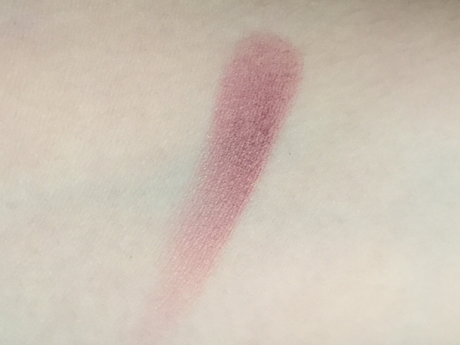
When I ordered Rapture, I was hoping for a purple-leaning plum with visible gold shimmer. Instead, I got a brownish mauvey plum with extremely subtle shimmer. I was a little disappointed, but in Urban Decay’s defense, the website does describe Rapture as “a deep mauve with a hint of shimmer.” I should have held out for a blush closer to my ideal, but I find that stress makes me buy beauty products not for what they actually are but for what I want them to be, even if I know better. One more reason to continue my no-buy until the end of the year! Luckily, Rapture is still a beautiful blush:
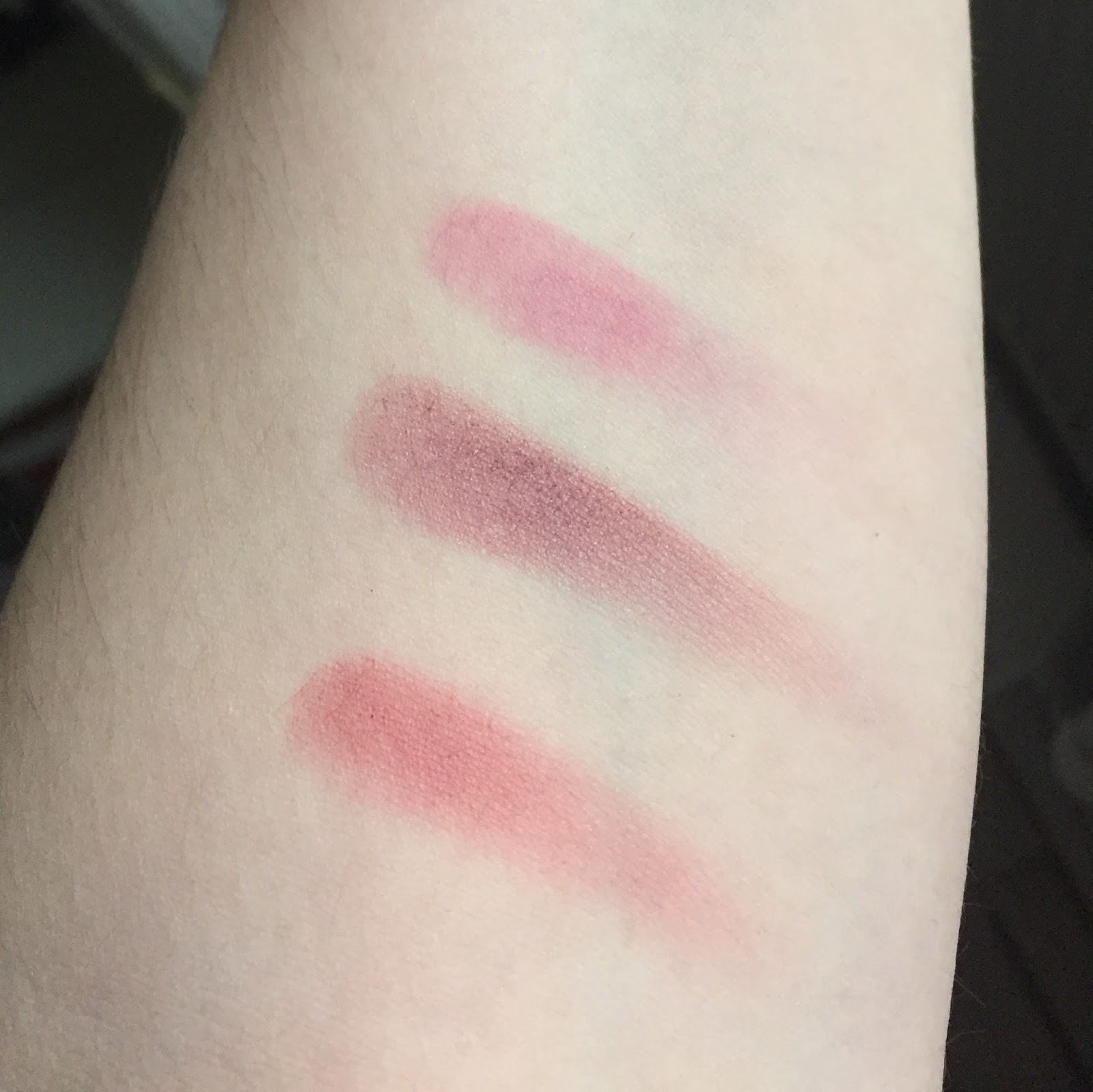
It’s also very different from Mata Hari and Flushed, at least in built-up arm swatches (L-R: Flushed, Rapture, Mata Hari):
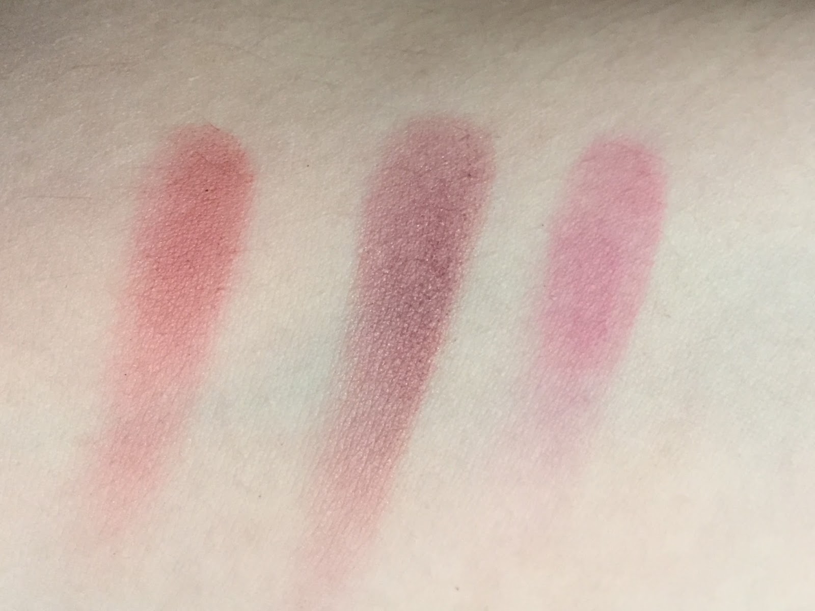
Compared to Rapture, Flushed looks almost like a burnt coral!
Unfortunately, these differences aren’t quite so apparent when I’m wearing the blush as it’s meant to be worn. Blended out, Rapture looks more or less like a cool pink, and the shimmer diffuses into a soft sheen. I have a poor track record of applying blush so that it’s actually visible in blog photos, but with Rapture you’re in luck: yesterday I had a practice Skype interview (I have a real one in a week and a half, eep!), and I wore more blush than normal so that the webcam wouldn’t wash me out. Here’s a photo I took before putting on lipstick:
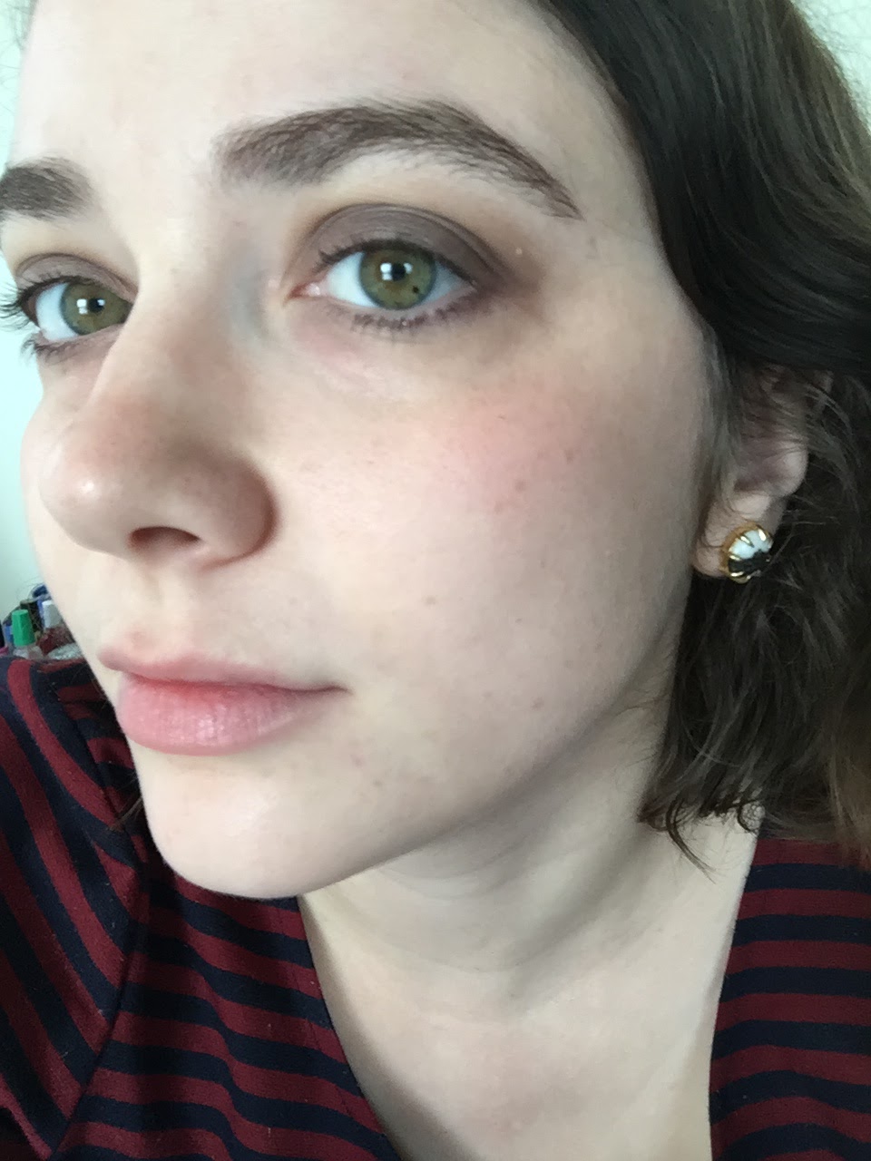
Rapture is a little darker than Mata Hari, but it’s not dramatically different, and after trying it on for the first time I resolved to send it back. Except that I reached for it a few days later, and again the next day, and now a month has passed and I’ve worn Rapture almost every day of that month. I think it’s fair to say that I’m keeping it.
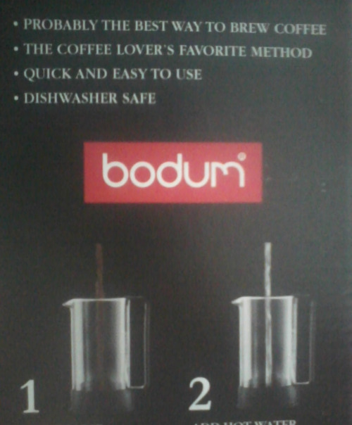
Formula-wise, Rapture is pretty much perfect: finely milled, easy to blend, and long-wearing. Of course, the “8-Hour” moniker sets a hilariously low bar: most of us do in fact wear our makeup for at least eight hours at a time and would like our blush to last that long. For sheer self-effacing modesty, this blush falls right behind my coffee maker, which touts itself as “probably the best way to brew coffee.”
 |
| (Taken with my old flip phone back in 2012.) |
I do appreciate Urban Decay’s frankness: it’s better than the wacky “24-hour” claim that some beauty brands make. And for what it’s worth, Rapture might be my longest-lasting blush. In fact, I’d venture to say it hangs on longer than 8 hours.
In case you were wondering, it also pairs perfectly with Rapture lipstick:

I still want a purple blush, though, and Bittersweet is still tempting me, but I might cheap out and order ColourPop Rain when my no-buy ends. For now, Rapture is a self-evident choice as the days get shorter and colder.

Have you tried any Urban Decay blushes? I’m very impressed with the formula and the shade range, though $26 still seems a bit steep to me.

Wow, I've always considered Flushed to be the most plummy blush in my collection, but swatched next to Rapture it really doesn't look plum at all! I've been in the market for one that's more of a purply plum, and this one will go on my \”to be considered\” list. The picture of it in the pan is gorgeous – that colour is fall in a nutshell.I've been very intrigued by the UD blushes since they came out, but they're so pricey – especially with the Canadian markup. $31, sigh. (Says the person who's planning on buying a $41 Hourglass blush in the next month…)Good luck with your interview!
LikeLike
Does it kick up a lot of powder? And good luck! This FOTD is perfect for an interview!
LikeLike
I officially need this blush color. It looks magical on you. However, $26? Yikes. I suppose I get to go dupe hunting?By the way, I want you to know that you're the one who inspired me to start my own blog. Thank you so much for what you do!
LikeLike
The look is great! Professional but not boring.I wanted bittersweet too but i think for the weird colours i may as well head for indie or colourpop. I love blushes and never go without it but I've not bought a new blush for a long time because frankly they look very similar once blended out. I have one from almost every major colour family, that's it. Have you ever tried making blush the key look? Would love to see you try packing it on! (I pack mine on like the end of the world daily)
LikeLike
I hereby recognize you as undisputed Queen of Plums. Your eyes are GLOWING green. I realize most of us are guilty of wearing blush at indistinguishable levels, but you look sooo good with a little extra. I recall thinking when you did your Baroque beautification post a thousand years ago that you can really rock the flush. Best of luck with the interview!
LikeLike
I don't know why I balk at spending $26 on an Urban Decay blush when I didn't object to paying $30 a pop for my two NARS blushes. I think part of it must be the aesthetic of each brand: NARS isn't a truly high-end brand like Guerlain or Dior, but it *feels* more luxe than Urban Decay, which has a more accessible, Instagram-friendly vibe. Successful branding at work! I've never bought anything from Hourglass because the price point is just a bit more than I feel comfortable with, but their blushes really do look \”worth\” the money (whatever \”worth\” means in an industry based entirely on subjective perceptions…).And thanks! I'll be glad when it's over.
LikeLike
I haven't found that it does, but then I tend to apply my blush a tiny bit at a time, instead of swirling the brush around vigorously. With pigmented blushes like Rapture, I literally just press the brush into the pan.
LikeLike
Aww, thank you for telling me! I'm very flattered. Off to check out your blog now!
LikeLike
I now have nine blushes, and while there's a noticeable difference on my cheeks between, say, a fuchsia and a coral, there's much less difference between a fuchsia and a plum. I think you really have to build up the color for the subtleties to come through.That's a really good idea! I think I'll write a blush-centric FOTD post soon.
LikeLike
I humbly accept the title of Queen of Plums! That might be an even more flattering title than \”high priestess of satire,\” given to me by one of my professors. And thanks for the vote of confidence re: blush. Overblushing has been one of my principal makeup fears since I first started wearing blush (it looks so bad when it's sloppy and not obviously deliberate), but I'm going to experiment with playing up my cheeks instead of my eyes or lips!
LikeLike
[…] Urban Decay Afterglow Blush in Rapture* […]
LikeLike
[…] 13. Urban Decay Afterglow Blush in Rapture (review) […]
LikeLike
[…] I’ll be honest, I’m not a fan of the rest of her makeup (or of her mullety hairdo, for that matter). She’s wearing the harsh black eyeliner that many women of her generation, my mother included, adopted at the age of sixteen and never gave up. If you look closely, you can see that the eyeliner on her lower lashline doesn’t connect—isn’t even close to connecting—with the eyeliner on her upper lashline. I think a brown eyeliner and/or some brown shadow would have looked more flattering and less dated. The peachy blush isn’t working for me either: it’s not bad with her complexion, but it doesn’t harmonize with the berry lipstick. And is that some Trumpesque bronzer I spy? Hillary, hire me as your makeup adviser and I’ll hook you up with a pan of Urban Decay Rapture. […]
LikeLike
[…] I like to do a neutral taupey color on the eyes and either Sleek Flushed (red berry) or Urban Decay Rapture (mauve-plum) on the cheeks. Here’s 413 with NARS Lhasa eyeshadow, some dark purple theBalm […]
LikeLike
[…] thing, ColourPop characterizes the shade as a “dusty mauve.” Which…no. Urban Decay Rapture is a “dusty mauve.” Flirt Alert has the tiniest hint of purple in the same way that a […]
LikeLike
[…] Captive Audience, and a more purple-toned one with MAC Smoky Mauve, Urban Decay Afterglow Blush in Rapture, and Urban Decay Vice Lipstick in Rapture. Three new or newish products and three extremely old […]
LikeLike