
As I’m sure you’ve heard by now, Bite Beauty has almost finished releasing a series of twelve Amuse Bouche lipsticks inspired by the signs of the zodiac. Bite started with Aquarius in January, and they’re now two signs from the end, having just revealed Scorpio on Thursday. (If you’re curious about Sagittarius and Capricorn, Trendmood has leaked all twelve shades here.)
Like any other enamel-pin-collecting queer millennial, I enjoy astrology. I don’t believe in it, per se, but I’m a Scorpio with Pisces rising and Aries moon, and that combination of signs is unnervingly accurate for my personality. (I didn’t identify with Aries until I caught myself saying to my boyfriend, “I don’t have anger issues; I’m just angry all the time.”) So I’ve been following Bite’s releases all year, first with eager anticipation, then with increasing bafflement, and now with outright annoyance. The Astrology by Bite series was a great idea that could have been executed in a million appealing ways, but Bite simply blew it. The lipsticks themselves seem up to Bite’s usual high standards, but almost every shade is an absolutely bizarre choice for its zodiac sign. I didn’t feel the need to complain on my blog, though, until I saw the Scorpio shade.
Now, look: everyone knows that Scorpios are the goths of the zodiac. Halloween and the Day of the Dead (i.e. my birthday) fall during Scorpio season. Scorpios are INTENSE and MYSTERIOUS and VENGEFUL and occasionally PETTY. In fact, we’re vengeful and petty enough to write an entire snarky blog post if Bite releases a Scorpio lipstick that isn’t even close to the vampy splendor we deserve:
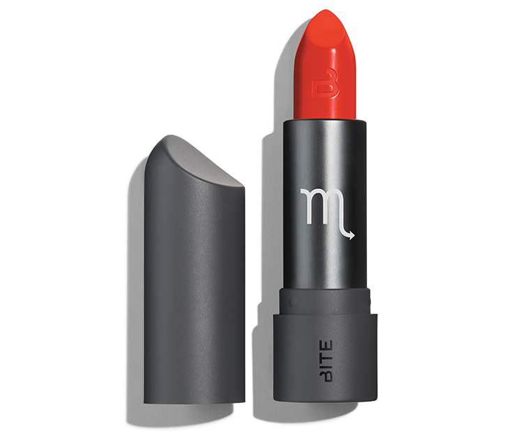
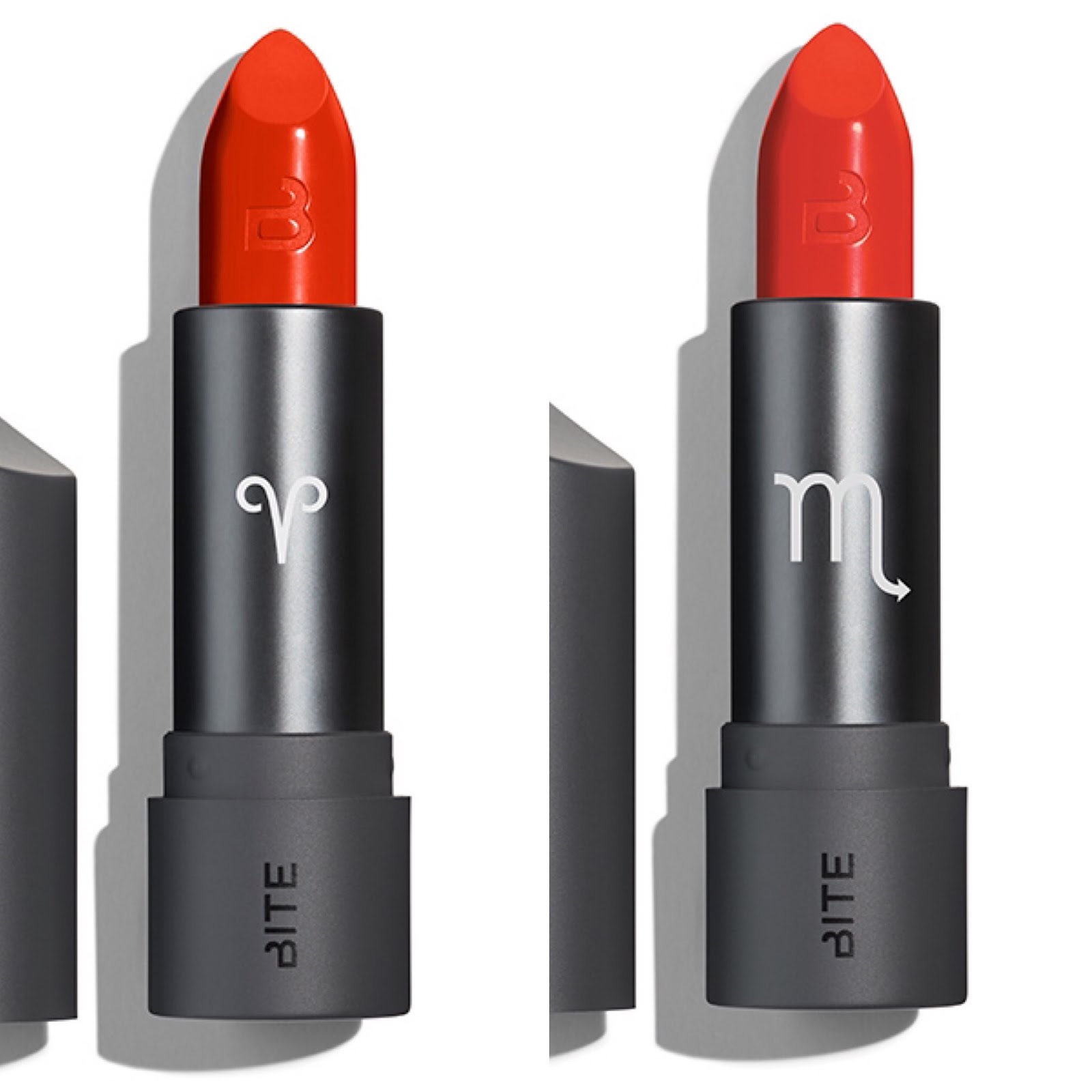
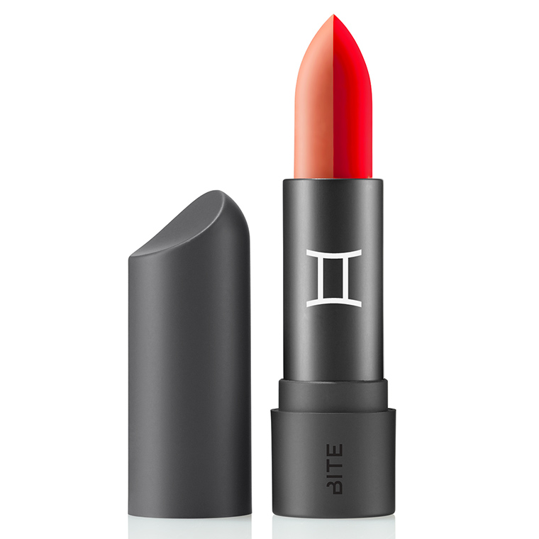
EXCUSE ME? A bright orange-red? A bright orange-red that looks identical not only to a bunch of other orange-reds Bite has released previously, but also to the Aries shade from March? Would you even be able to tell these two apart without the astrological signs on the tubes?
They look only slightly more different in these swatches from Bite’s Instagram story:

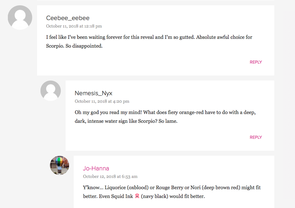
Bite’s explanation for this choice is that Scorpio is the most ~*~sExUaL~*~ sign of the zodiac: “For sexy Scorpio, Bite mixes up a bombshell shade. This searing, spicy red is perfect for hot dates.” Hot fire-sign dates, maybe, but Scorpio is a water sign, and its particular brand of sexuality isn’t the retro pinup look-at-me brand. Like, come ON. Everyone was expecting a dark purple or plum, or a burgundy, or even a metallic black reminiscent of the studded leather outfits we Scorpios wear while tying up our lovers in sex dungeons. A bright orange makes no sense for Scorpio. And I’m not the only one who thinks so:
 |
| Source: Temptalia |
But Scorpio isn’t the only sign to have gotten totally shafted this year, so let’s go through the Astrology by Bite series sign by sign and analyze where the problems lie. (I wasn’t able to find Bite’s blurb for every shade, but I’ve copied and pasted the ones I could find. All photos are Bite promo images from Temptalia.)
Aquarius (“berry plum”):

Bite started the year strong with this bright purple, a good match for eccentric Aquarius. I don’t have any complaints about the shade itself, but I am annoyed that Bite kicked off its series with the first zodiac sign in the Gregorian calendar year. The zodiac actually corresponds to the Julian calendar, in which Aries is the first sign.
Pisces (“pitch-perfect peach”):
“Ruled by the planet Neptune, Pisces is the water sign of artists and dreamy creative types; it’s considered the most spiritual and compassionate sign of the zodiac. Pisces are soulful, and like water they ‘go with the flow,’ blending in and out of different environments.”
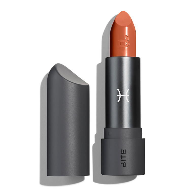
Just two lipsticks in, things start to get weird. Pisces is a water sign. Its symbol is literally two fish. For this most aquatic of signs, Bite chose…a brownish peach. I think a soft shade of blue would have been perfect for sensitive Pisces, but Bite clearly decided to stick with traditional lipstick colors for this collection, despite having created blue lipsticks in the past. Bummer.
Aries (“fiery orange-red”):

Back to the expected with this bright warm red, which is exactly the color I would have chosen for impetuous, hot-tempered Aries, though I might have made it metallic for even more punch.
Taurus (“muted white-chocolate rose”):
“Taurus is an earth sign, ruled by the planet of love, Venus. Sleepy, sensual Taurus is enamored with everyday luxuries: Flowers, chocolate, and all the finer things in life are essential to beauty-loving bulls.”

When I think of Taurus, I think of rich food and dark wine. This is a beautiful MLBB, but it’s more subdued and professional than I’d expect a Taurus lipstick to be. For this sign, I would have liked to see a rich chocolate brown (similar to Smoked Za’atar) or a merlot red, though I understand that Bite was trying to make a spring-appropriate shade.
Also, it’s “enamored of,” not “enamored with.” Just sayin’. My mistake: both are correct!
Gemini (“warm nude” and “fun-loving red”):
“For Gemini, the sign of the twins, Bite offers a double-sided bullet. A warm nude and a fun-loving red let Geminis mix up their style as they please.”
Here is where the Astrology by Bite series jumps the shark. How would a human being wear this lipstick? I appreciate the spirit of the thing, but if you’re going to make a two-toned lipstick, maybe pick two colors that actually go together. (Kate of More Like Space mixed the two shades to create a soft salmon pink, but I can’t imagine many people going to that trouble.) Or if you want the red/nude split, make a dual-sided lipstick like the ones Bite itself has released in the past. Or just give us a freaking duochrome along the lines of the Prismatic Pearl Multisticks. Bite could have conveyed the Gemini ethos in so many interesting ways, but they went with the least wearable one. If you want nightmares, check out the two-toned lip that Bite itself created. [Edit, 6/19/22: Or don’t, because the link is dead now. Trust me, it was bad.)
Cancer (“muted mauve with gray undertone”):
“For nurturing, caring Cancer, Bite mixes up a safe-but-sexy neutral. Cancers will love this muted mauve with gray undertone that looks just as good at home as it does at work.”

Gosh, that looks familiar:
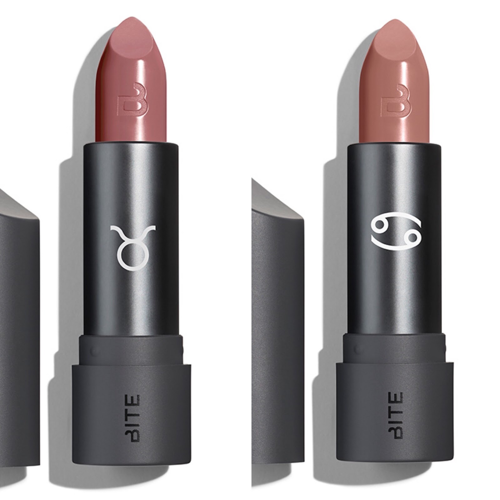
Cancer and Taurus aren’t quite as similar as Aries and Scorpio, but they sure are close. Also, Bite missed the perfect chance to set an oceanic mood by describing the lipstick as a “sandy beige” (though as swatches reveal, Cancer is much pinker than the promo photo indicates).
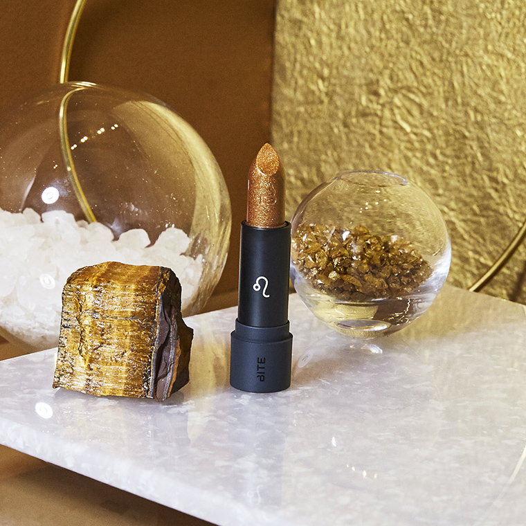
Leo (“glittering gold”):
“Leo offers incredible vibrancy and bold dimension. Leo is a fire sign, ruled by the sun. Like the sun, bold Leo lions like to be the center of attention: They’re dramatic and charismatic, always the star of the show.“
 |
| The person in charge of these promo images is totally a Leo. |
Here’s where my inner conspiracy theorist emerges. Leo looks very similar to the sheer gold lipstick that Bite released for the holidays a couple of years ago. Is it possible that some of the zodiac lipsticks are repackaged older shades with astrological signs slapped on? I won’t deny that this lipstick is appropriate for Leo, but surely the stereotypical Leo would want an opaque gold, not a sheer one.
Virgo (“grapey-red”):
“Virgo is an earth sign, ruled by the planet of communication, Mercury. Disciplined Virgos demand perfection and order all around them; they’re known to be humble and practical, and love a good value…For earthy Virgo, Bite mixes up a shade inspired by the fruit of the vine. This grapey-red is a smart hue that goes with everything.”
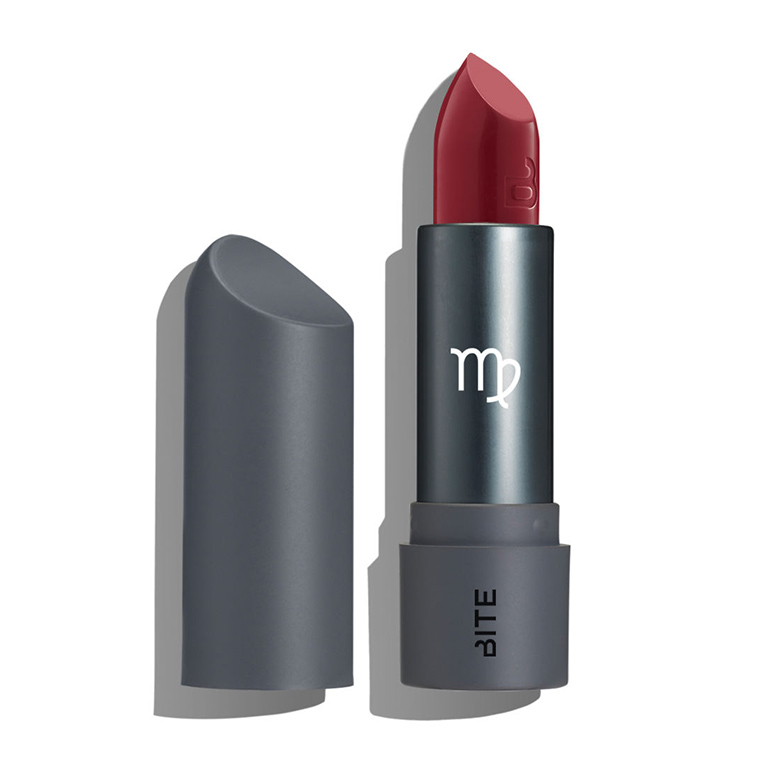
This is by far my favorite shade in the series (surprise), and it’s not a terrible choice for Virgo, though I would have expected something a little less dramatic.
Libra (“balanced medium brown”):
“For stylish Libras, Bite mixes up a shade made for hitting the social circuit. This balanced medium brown gets along with just about anybody.”
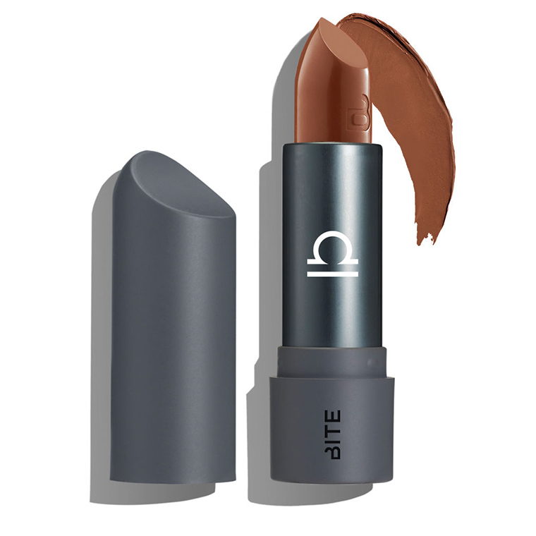
In my opinion, it’s impossible to make a brown lipstick that “gets along with just about anybody.” There is nothing less flattering than a brown lipstick that clashes with your undertones, as I discovered when I tried on Bite’s own yellow-toned Edgy Neutrals collection last year. And Libra is a warm brown that most certainly won’t get along with cool-toned folks. That said, I’m not sure what color I would have assigned to Libra. It’s an artistic, creative sign, so maybe a neutral with a twist, like a grayish lavender?
Sagittarius and Capricorn are a bright pink and dark plum, respectively. Many of the Sagittarians I’ve known well have been narcissists with no sense of personal or professional responsibility, and neon pink is indeed a color that shouts “look at me, but don’t expect anything of me.” (No offense to any Sagittarians reading this, of course. I’m sure you’re lovely people.) Bite’s choice for Capricorn is more mystifying. Capricorn is a businesslike earth sign, so I would have assigned it an office-appropriate color, a soft neutral like Taurus or Cancer. Why not give the vampy shade to Scorpio? (Look, we hold grudges. We’re not going to get over this.)
Taken as a whole, the Astrology by Bite lineup seems unbalanced and incomplete: lots of warm oranges and browns, two pairs of near-dupes, only one dark shade, and no truly offbeat colors (unless you count Leo’s gold). This series had so much potential, but it’s started to feel like a cynical cash grab: “Well, the kids like astrology, so let’s re-release some old colors and put astrological symbols on the tubes; they’ll eat that shit up.” The first four lipsticks sold out almost immediately, but all five shades from Gemini to Libra are still available on Bite’s website, suggesting that I’m not the only one to have soured on Astrology by Bite. I think Bite is at its best when pursuing its foodie roots (e.g. Edgy Neutrals, Spice It Up) instead of hopping on the latest trend, and I hope Astrology by Bite isn’t an indicator of things to come for the brand.

I'm not a big astrology person, so I wasn't super into this collection – but I did think it had potential for interesting colours. I'm bored. And I already have warm reds! Bite did release some LE two-toned lipsticks like Gemini so repromotes of former failed LEs doesn't seem out of the realm of reality…
LikeLike
Yeah, ideally a collection should stand on the strength of the actual products, not on the trendiness of the theme, but this doesn't have much appeal even if you ignore the astrology stuff. That said, I would have liked to see them lean in even more to the astrological theme. A tiny symbol on a boring gray tube is not very exciting.
LikeLike
I don't really care about astrology, so I've not really been following this collection. All I wanted was an interesting colour for cancer. As a cancer who is not very cancerian, I was hoping for like an orange for crabs or blue for water…but it's another nude colour. It's a fine nude. But not one that would work with my hardcore warm yellow undertones.I also just wanted to say I have never heard someone say \”enamoured of\”. Maybe it's an American thing? (I'm British). But I have only heard \”enamoured with\”. If it is a British English thing, then it would make sense for Bite to use it as they're Canadian.
LikeLike
I'm a a Gemini who thinks astrology is half fun half real and I HATE that stoopid lipstick. I would have really liked a duochrome or heck, even one of those lame ph-adapting lipsticks from the 70s
LikeLike
Aquarius, Aries, and Leo are the closest to matching their actual signs, and Aquarius and Virgo are the shades that appeal to me the most. I still totally think the entire collection peaked with the first release, though there are a few good colours sprinkled in. I cannot possibly articulated how OFFENDED I was about Gemini. The colours are both way too boring for a Gemini's bold personality, and the entire concept is just stale. Anything that reduces Geminis to \”two-faced\” is BORING. There is more to us than that, and as a frequently-maligned sign I demand justice in the form of lipstick.The nudes and the brown shade are bizarre choices, too – obviously no lipstick is going to look good on everyone, but those shades leave a lot more room for disaster than a red or plum. I think a soft, daytime plum would be nice for Libra – still \”balanced\”, but a bit more special than your normal MLBB/nude and flattering on a wider variety of skintones.
LikeLike
Yes. Exactly. I was so excited to see the Gemini one. I love playing with astrology, and despite being a terrible Gemini I am very loyal to my sign so I'll pick up the most ridiculous stuff if it's associated. But that lipstick is so crap. And lazy. Oh hahaha the twins get two lipsticks. Groundbreaking
LikeLike
You're absolutely right: I looked up \”enamo(u)red\” and both \”of\” and \”with\” are apparently correct, with \”of\” being more common in the US. (It's \”enamored by\” that's wrong.) Mea culpa!
LikeLike
I love how many pissed-off Geminis there are in the comments! And I agree, you guys definitely got the worst one. At least the Scorpio lipstick is usable. (Bite divided Gemini into two mini lipsticks for the holiday vault, but they're really uninteresting colors on their own, too.)
LikeLike
I love Geminis! I've had quite a few Gemini friends over the years, and I agree, you've gotten an undeservedly bad rap. I also agree about the Libra shade: a muted plum would have been nice, or even a well-balanced neutral red (like the red half of Gemini, maybe).
LikeLike
Loooove this post because I am still outraged — OUTRAGED, M'AM! — at the poop brown that was chosen for my sign, Libra. Libras are known for balance and, yes, pleasing everyone so I figured an on-the-nose color would be a neutral pink or rose that appeals to many. But no. I also figured since Libras are also known for their appreciation of beauty and sophistication, perhaps a wearable wine or deep red or complex rich berry? The common thread here being a color that would appeal to many, since that's what this sign is known to strive for… and yet! Here we are, with lipstick the color of meconium! Outrage! Of course, I'm fair and quite cool-toned and a bright winter, so a poop brown does me no favors.And thus, your post really, really speaks to me. I have been so disappointed with the color selection this year, which you so accurately described. Virgo's is the only one I got and it's so beautiful that I had high hopes things were turning around.
LikeLike
It looks like Bite sort of got the memo about the Gemini lipstick, because in their astrology vault they have split it into two minis rather than one double-sided mini.
LikeLike
i didn't pay much attention to this collection and i'm not even that drawn to astrology — and if i were, with upbeat superficial product descriptions like that the collection would have felt like too much of a commercial ploy to appeal to me — but i really enjoyed this detailed critique. maybe i even savored it.it's disappointing that bite would've bothered with a collection like this if they weren't going to be a little more committed with the colors. the product descriptions seem like a huge missed opportunity, too, and it wouldn’t have cost them much to write something truly horoscope-y, which is half the fun. and maybe this is too obvious, and i know that the amuse bouche line is known for creamy satin-matte textures, but for a collection referencing the stars, shouldn't there have been more opalescence? more prismatic, shimmery shine? if not in the lipstick shades then at least in the packaging. if bite had just been willing to go a little more out there the collection could have been really, you know, stellar. (runs away)
LikeLike
You know, I was so worried while writing this post that people were going to be like \”ugh it's just lipstick, get over it, bitch.\” I'm relieved to see that I wasn't alone in my disgust!One of Bite's strengths is their offbeat nudes for multiple skin tones: gray/lavender-toned beiges, yellow-toned browns, etc. Libra falls into that category, which is awesome, except that they're claiming it works for everyone and it just…doesn't, by a long shot. It looks terrible on the pale lady they chose to model it on their Instagram account. I agree that a plum or wine color would have had the best chance of suiting a wide variety of skin tones.
LikeLike
Yeah, at least there's that! Though I assume it would have been really difficult, if not impossible, to make a double-sided mini.
LikeLike
Snarky critiques are the most fun to write, for sure! And I completely agree: astrology is all about stars and mysticism and outer-space vibes, yet there's not one metallic or even shimmer in the bunch? The packaging feels really lazy, too (but I find Bite's packaging very boring in general).
LikeLike
So I am an extremely virgo Virgo and while that colour is nice, it's NOT for Virgos. We need something much more sensible and less dramatic.On the plus side, I can't get Bite in the UK so it's probably better that I'm disappointed.
LikeLike
My thoughts exactly! The Virgo shade would have been perfect for Scorpio JUST SAYIN(happy Scorpio season btw)
LikeLike
EWWWWW I'm not sure the nail has been hit on any of these heads
LikeLike
The Aquarius lipstick is the only one that I think is truly a win, both in itself and as a match for its sign.
LikeLike
I'm an astrophysicist who has little time for pseudo-science but all the time in the world for makeup-related snark!
LikeLike
Thank you so much for the link 🙂 I completely agree with you about Scorpio. I felt like Scorpio was basically a \”freebie\”: like Aries, the type of colour that was appropriate was super-obvious. But unlike Aries, they chose to go in another direction. I was sort of hoping that they'd do something like a near-black charred red with a bit of a copper sheen, but I guess that was out of the question. As a Libra, I was left scratching my head over the choice for my sign as well. I spent the year dreading a pastel shade, since that's what's often associated with the sign, but then I saw the brown and while it's a lovely shade, it's completely inappropriate.
LikeLike
I share many of your gripes (most especially with Scorpio), but Pisces is a salmon pink, so maybe not totally inappropriate for a fish sign.
LikeLike
Ohhh, that makes so much sense! WHY DIDN'T I THINK OF THAT
LikeLike
I'm late to this party but I adore Bite and was looking forward to my very own Sagittarius lipstick all year.Bite drop kicked the ball on this collection. I would have loved some sparkly sliver or green or going with the theory that they are repackaging old product, their Opal iridescent lipstick would have been perfect. I did buy the mini vault at a discount but can't bring myself to try on \”my\” shade. I know it's going to wash me out and clash with my red hair. I might have to comfort myself with the shades of my fellow fire signs, Leo and Aries. Fun Fact: I was supposed to be born a Scorpio but perhaps the due date calculation was incorrect or I was just content to remain in utero until the signs changed.
LikeLike
[…] products that I bought in 2018 but have put off reviewing because it felt more pressing to, say, snark at length on Bite’s zodiac lipsticks. I probably won’t do a no-buy for the entirety of 2019, but […]
LikeLike