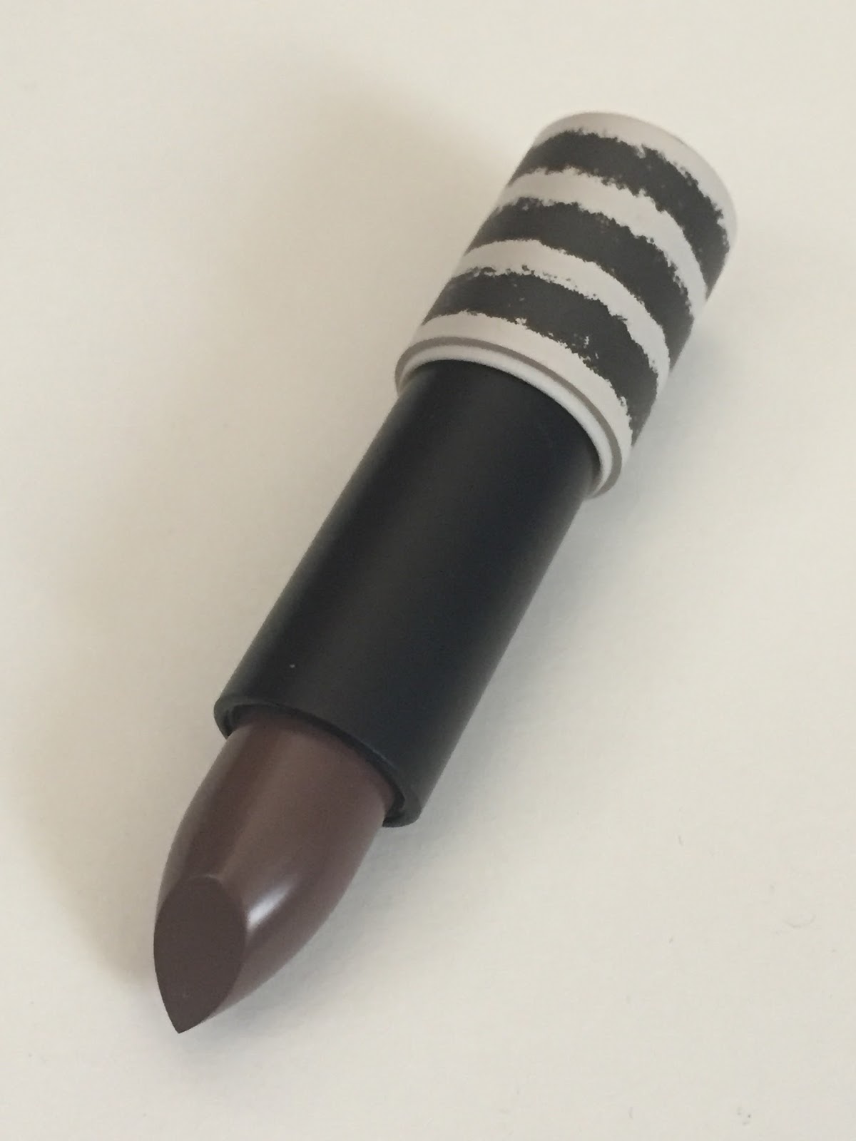
2015 will certainly go down in makeup history as the year of the brown lipstick. Dark gothy brown, ’90s-style midtone warm brown, muddy red, and the strangest brown of all: a cool-toned gray-brown, often with a hint of purple. I don’t know why undead lips have become so wildly popular this year, but they’ve been everywhere in the last few months. MAC Stone is the best-known example, but there are many others, mostly from Insta-friendly trendy brands. ColourPop alone has three gray-toned browns in its equally trendy liquid-matte formula: Trap, Kapow, and Beeper. But my distaste for liquid mattes is no secret, and the zombie lipstick that caught my eye last month was a conventional bullet: Topshop Boardroom, which I mentioned in my recent wishlist post.
The elephant in the boardroom, so to speak, is that this shade of brown doesn’t flatter many people. So why does it appeal so strongly to me, and why did it catch on in the first place? I swear the current craze for post-apocalyptic fiction has something to do with this desire for a vaguely unhealthy lip look. There’s also the element of challenge: a mushroom-brown lipstick, like a vivid purple blush or a lime-green eyeshadow, is just daring you to make it work. These shades seem to hold particular attraction for makeup junkies who have already collected their most flattering colors—the berries, the peaches, the nudes—and have nowhere to go but zombietown.
So perhaps it’s fitting that I ordered Boardroom late at night under the influence of a fairly high fever after finishing a postdoc application. (I’ve been getting sick repeatedly in the last few weeks, due to stress, sleep deprivation, and a campus swarming with undergrads who somehow got into an Ivy League university without learning how to wash their hands.) It was my first time ordering from Topshop’s American website, and I appreciated the free shipping, which I wasn’t expecting for a $12 lipstick. Less pleasing was the condition in which the lipstick arrived:
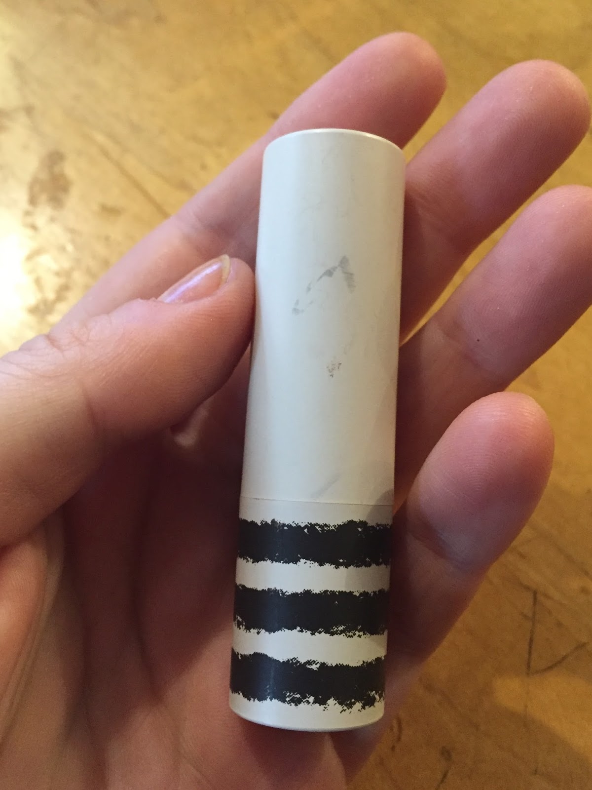
The tube was bound to get scuffed eventually (there’s a reason that most lipsticks aren’t housed in white tubes, Topshop), but I would have liked to see it in pristine condition at least once. At least the tube wasn’t broken and the lipstick itself wasn’t damaged at all. I assume the scuffing happened before shipping, since the box was fine:
Boardroom is described as a matte lipstick, but all this means is that it’s not super-glossy; I’d call it a semi-matte. It has a strong fruity-flowery scent, like a synthetic strawberry crossed with a YSL-esque boozy rose. I find the scent quite pleasant, though, and it doesn’t linger after application.
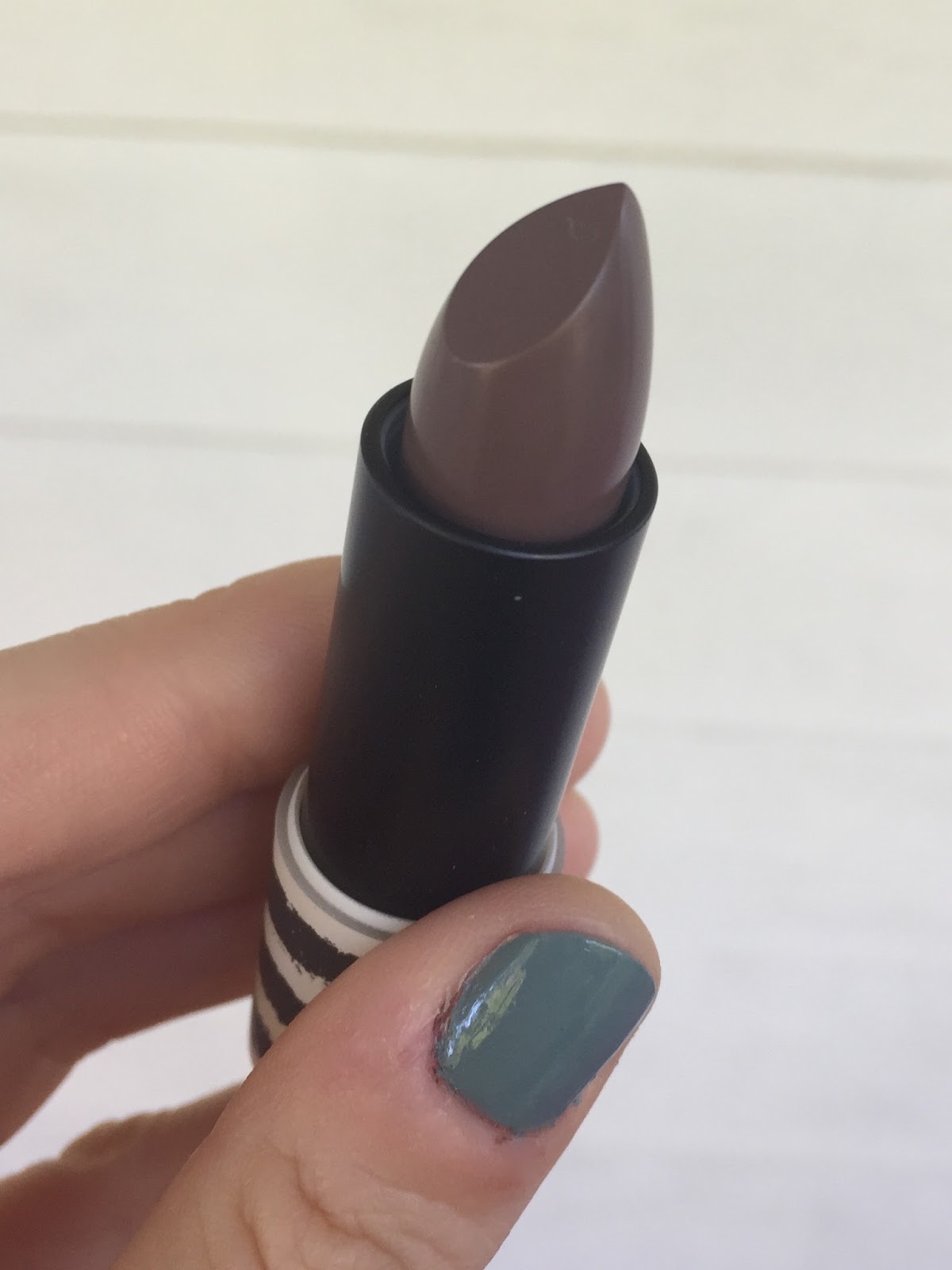
Like Rio Rio, Boardroom has a soft, slippery, slightly translucent formula; I was surprised at how much lighter it looked on my lips than it did in the tube. Here’s one pass on my arm:
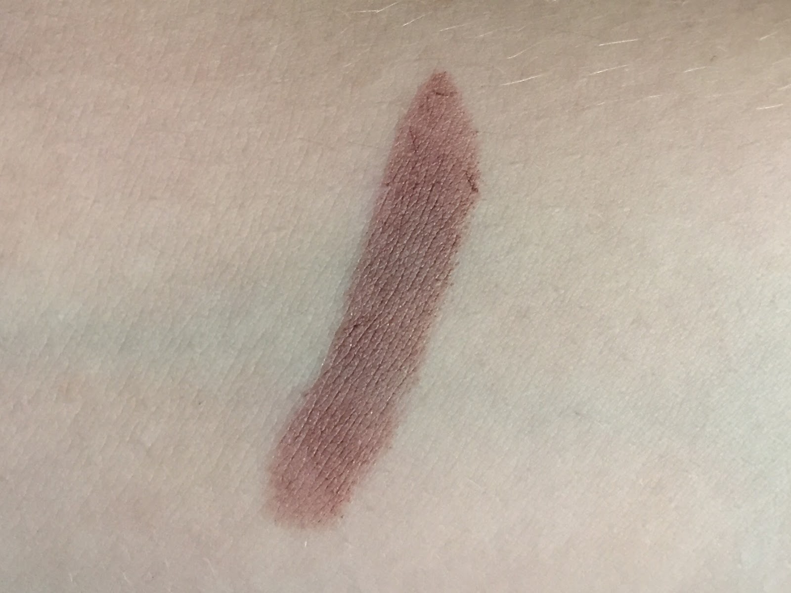
Left to right: NYX Enamored, Boardroom, Maybelline Crazy for Coffee, NARS Last Tango.
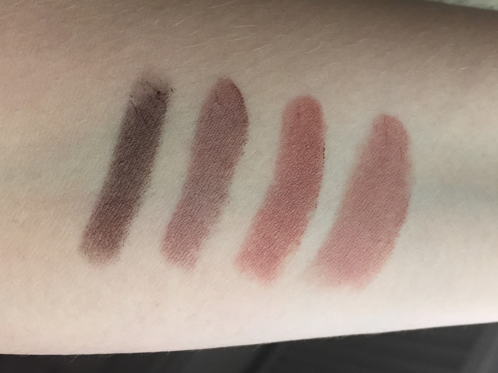
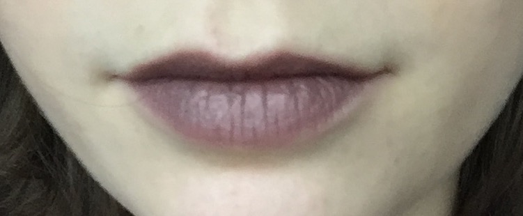
And two coats on my lips. As you can see, the gray and plum tones come forward much more strongly here. This particular lighting also makes my skin look quite gray; I swear I’m not actually a zombie though I mean if you ever feel inclined to send some brains my way just let me know and I’ll give you my address
Boardroom and Rio Rio share a light, comfortable, non-drying formula, but also a tendency to sink into lip lines after a couple of hours. Boardroom also doesn’t have much lasting power, and will come off on cups if you’re drinking. But it’s a lighter color, so I forgive it. Seriously, when did we all start expecting lipstick to wear like iron? Did that start with the liquid-matte trend, or did the liquid-matte trend originate in the desire for magical 24-hour wear? Is this yet another product of the modern apocalyptic imagination—a demand for disaster-proof lip color, just in case?
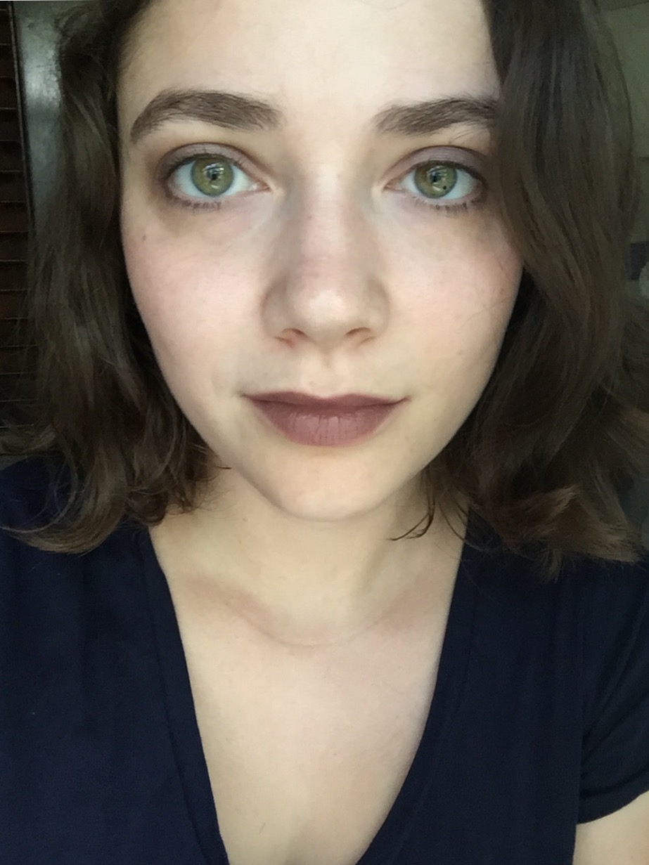
Now for the fun part: figuring out how to wear this tricky color. My first attempt was very simple: matte plum eyeshadow from theBalm smudged along my upper lashlines, plus a light dusting of NARS Mata Hari blush (all but invisible here, sorry):
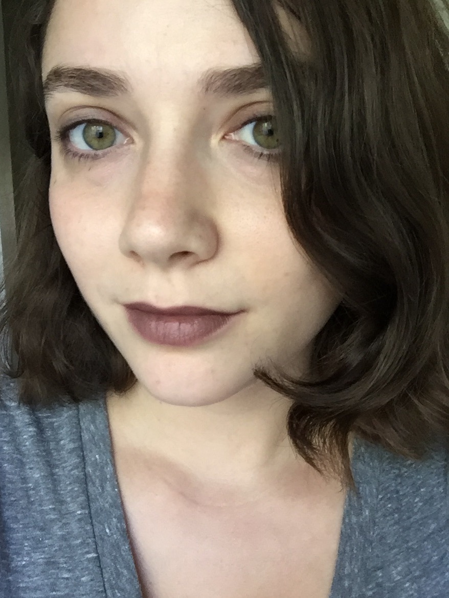
After posting this photo on Instagram and sending it to my boyfriend and roommate, I was surprised at the number of people who told me it didn’t look all that weird. I don’t think I’d wear it to an interview (or in a boardroom, for that matter), but it seems to be just shy of a statement lipstick. It’s a neutral teetering on the brink of the uncanny valley. I dig it.
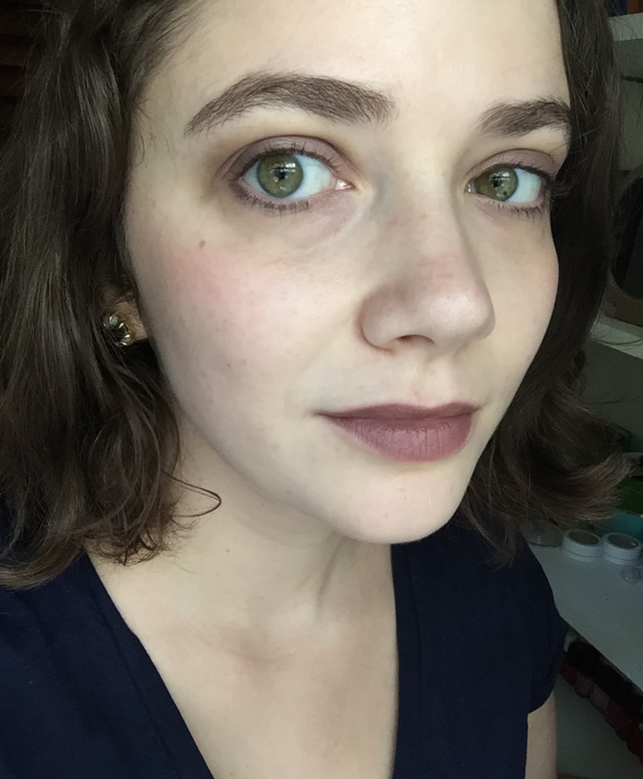
Here it is with slightly heavier eye and cheek makeup: ColourPop Bill and the plum from NARS Habanera on my eyes and Sleek Flushed on my cheeks.
I succumbed to Urban Decay’s Rapture blush, a plum with soft gold shimmer, during their Columbus Day sale yesterday, and I can’t wait to see how it looks with Boardroom. I think Flushed is a bit too warm for this look.
What think you of the zombie-lips trend?

As one of those people who look naturally dead, I can appreciate the zombie-lips trend, though I'm always trying NOT to look washed out. Maybe I should break my resistance to this and find a zombie lip. My only reservation is that Nova Scotia is supposed to be a zombie-free haven (according to World War Z, anyway. I'll take it), and I don't want to alarm my fellow Bluenosers.I think Boardroom is a really good neutral-with-a-twist on you. Interesting enough to be unusual, but commonplace enough to wear just about anywhere (minus the boardroom and job interviews). It's really flattering on you.
LikeLike
I am really enjoying the zombie lips trend, and the post-apocalyptic inspired makeup in general; it has happily delivered on a few things I have been craving for years, such as strong purple blush. I think Boardroom looks great on you, btw. Also, I think you're spot on with makeup junkies moving beyond the flattering colours into zombie territory. Heh, I know that's what I'm doing, at least!
LikeLike
I think it really makes the green in your eyes pop (green: more evidence that you are a zombie!).
LikeLike
I think it would be fun to throw all the barely abnormal make up on together, think this lipstick with monster on the cheeks, a metallic eye liner and maybe colored mascara. Or perhaps these vaguely eerie products are best spaced out to keep them just hinting at strange without packing any real punch. My favorite nearly dead lipstick in my collection is Hello Sailor from Lipstick Queen which keeps a lot of the blue on my pale lips. It gives a hint of that highly coveted hypothermia-sufferer look.
LikeLike
I succumbed with LASplash's famous Ghoulish, although because I'm super yellow it looks odd on me. My husband immediately told me I looked like a corpse and a friend asked me why I wanted to look like I was a heavy smoker. But I thought it looked better the more I looked at it, so whatever. I think boardroom looks GREAT on you. I think you must have some greyish tones in your skin because the grey hardly shows up, just enough to blend in well. Is there some yellow-based zombie lips alternative?
LikeLike
Love it! I think its just perfect. The lippie is not too dark nor too light.
LikeLike
I appreciate looking naturally dead because it means that bright lipsticks rarely look crazy-bright on me, while zombie lips look weirdly natural. But I don't think I could ever go for the straight-up gray lip (e.g. NYX Stone Fox) that seems to be catching on, at least on the Internet.And thanks, that's good to hear! I always worry that my sense of what looks normal has been skewed by all the time I've spent reading beauty blogs and looking at Instagram FOTDs that take over an hour to put together.
LikeLike
Purple blush seems to be everywhere this year! I was so excited when Urban Decay Bittersweet came out, since I'd been wanting a true purple blush for what felt like ages. Oddly, though, its availability makes me want it less. I'm not sure I can justify spending over $20 on a bright purple blush that might make me look bruised…I think it's interesting that the trend for neutral makeup has produced such unnatural-looking neutrals. '90s browns always had some red for warmth, but modern cool browns don't look natural on many people.
LikeLike
I prefer to take it as evidence that I'm the true Heir of Slytherin.
LikeLike
Yessss, I would love to do that! I wish I had colored mascara and an even more unnatural highlighter than Monster: green, perhaps? I was reading Sultry Suburbia's blog last night and discovered that she's releasing a makeup line soon, and two of the products are a green and a blue highlighter. Those would be perfect with Boardroom, I think.I didn't realize that any of the blue from Hello Sailor actually came through on the lips, but that's very intriguing. I've been interested in Lipstick Queen's Butterfly Ball colors, too, because of the faint blue sparkle.
LikeLike
Haha, there's nothing wrong with wearing an unflattering lipstick sometimes! I just looked up Ghoulish and, wow, that name is accurate. As for yellow-based zombie lips, MAC Whirl perhaps? It looks like it would be too warm for me, but it has some gray in it.
LikeLike
Thanks! I expected it to be a lot vampier than it turned out to be.
LikeLike
I love that second look! I think the heavier eye makeup balances it out nicely. But I agree with others – it doesn't look particularly weird! That grey undertone is surprisingly wearable, at least with your colouring. Now I kind of want it, but I don't think the Canadian Topshop website offers free shipping.
LikeLike
Great Post – after much research and falling into the trap of stress buying myself I marched with conviction down to a Topshop and got the lipstick in person after the website I ordered it from (with free shipping) emailed me that it was actually out of stock – mission accomplished! I agree with many others – the shade actually doesn't look particularly death-like and is actually a pretty shade on you.Oh and about Zombie lips I love the trend (griege lips) I have a few but, I feel like Boardroom is probably the most suitable/comfortable everyday shade for my dark skin – so thanks for your review :)!+ lol at the long lasting lipstick trend to wear like iron haha – I think that came with the liquid lipstick trend, that spilled over to matte/general lipsticks which has now spilled over into all the things – 'budge proof' seems to be the current makeup mantra – maybe it’s a phase?
LikeLike
[…] of the Liquid Suede, though, and I’ve also tried it under two problematic lipsticks: Topshop Boardroom, a greige, and NYX Up the Bass, a grayish purple. Here’s Boardroom alone (top) and over […]
LikeLike
[…] The color is positively luxurious: a very dark, almost black, cool-toned brown. You see a lot of gray-toned taupey browns these days, but rarely do you come across a brown with so much purple in its base. It’s not […]
LikeLike
[…] Despite my ambivalence toward the Audacious formula (and for that price, one really shouldn’t feel ambivalent), I’ve been attracted to this color ever since the Audacious line came out. Dominique is one of the ten shades exclusive to NARS freestanding stores, the NARS website, and Barneys, so I didn’t get to see it in person until this month, when I visited the NARS boutique in New York. I’d always assumed that Dominique was similar to MAC Up the Amp, since they’re both midtone purples with a hint of gray. But it turns out that Up the Amp is brighter and pinker (that is, more wearable for most people), while Dominique has that zombie undertone I find oddly flattering: […]
LikeLike