
Before I start my review, let me welcome you to the new home of Auxiliary Beauty! After years of swearing to migrate my post archive from Blogger to WordPress and purchase my own domain, I’ve finally followed through, and I’ll be making my old blog private in a week or two. Please bear with me as I tweak the new site!

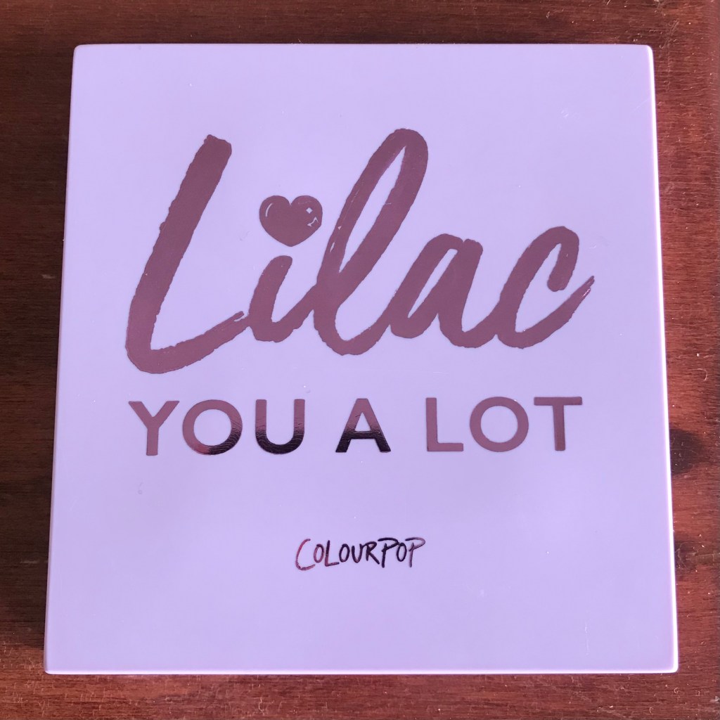
I bought my third ColourPop palette, the purple-focused Lilac You a Lot, when ColourPop had a sale on palettes in early April. I’d intended to order the grayscale Blowin’ Smoke instead, but that palette is perpetually out of stock, and a palette full of lavenders and pinks seemed more appropriate for spring, anyway. And, despite the fact that purple is one of my favorite colors, I owned only two true purple eyeshadows: ColourPop Howlin’ and Glossier Lidstar in Lily.
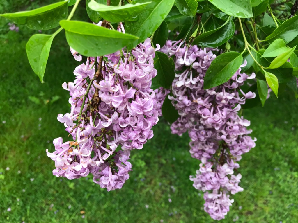
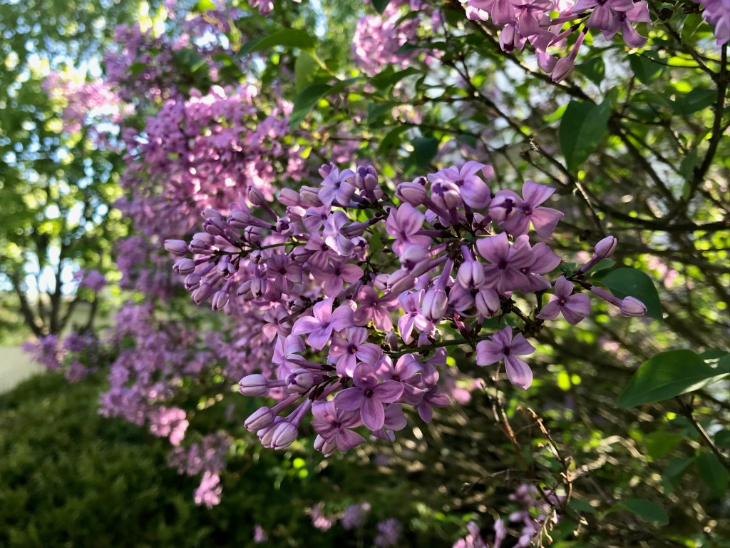
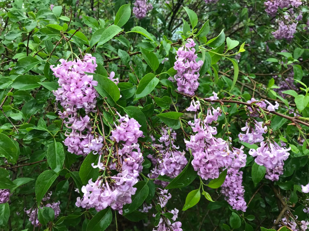
Lilacs rank high on my list of favorite flowers, too, and I may or may not have delayed this post until the start of lilac season so that I could include some gratuitous lilac porn from around town.
I ordered a few other things from ColourPop, of course: Pressed Powder Shadows in Turntables and Let Me Explain, No Filter Concealer in Fair 06, Super Shock Cheek in POV (swatched here), and an empty 12-pan magnetic palette. Rehoming most of my ColourPop single shadows in the magnetic palette has given me new motivation to compile that big ColourPop swatch post I’ve been putting off for ages.

Except in color, the packaging of Lilac You a Lot is identical to that of Uh-Huh Honey: shiny plastic with a mirror (which I’ve left covered for now). I prefer the cardboard packaging of That’s Taupe, which is lighter and more environmentally friendly and travel-appropriate, but I have no real complaints about the plastic palettes.
Lilac You a Lot contains four shimmer/glitter shades and five mattes. There are five true purples and lavenders (Fluff, Trainwreck, Zoned Out, Iffy, and Filtered), three pinks (Cloud, Ghostin’, and Wake Me), and one dusty mauve (Imagine That). ColourPop says that Ghostin’, Zoned Out, Iffy, and Filtered are “not intended for use in the immediate eye area.” This is because they contain non-FDA-approved pigments that can stain the skin, though I haven’t experienced staining with any of the shades in this palette.

My chief complaints about Uh-Huh Honey were that it contained a non-eye-safe plastic pressed glitter and that the shades were too similar in color value, with no truly light or dark colors. Lilac You A Lot has neither of those problems, thank goodness (I refuse to buy any more ColourPop palettes that include pressed glitter). My one color-related quibble is with the inclusion of Imagine That, which seems better suited to a neutral palette, and which resembles many pinkish neutral shades I already own. The palette’s nomenclature is strange, too: Uh-Huh Honey’s shade names all evoke bees, honey, and sunshine, but Lilac You a Lot’s shade names have nothing to do with flowers or the color purple, and a few of them even seem like sexist epithets (Trainwreck, really?). I’d wager that any of us could come up with more appropriate names in about five minutes. Taro? Amethyst, hello? I’m not even trying here.

As in That’s Taupe, the mattes in Lilac You a Lot are of excellent quality, while the shimmer and metallic shades are on the dry side. Most of my ColourPop shimmer and metallic singles have a soft, smooth formula, so I’m curious why similar shades in the palettes are inevitably dustier and chunkier. The good news is that there are no dud shades in this palette as there were in That’s Taupe (Constrictor) and in Uh-Huh Honey (Palooza, the glitter, by default). Overall, Lilac You a Lot is the highest in quality of the three palettes and the one I’d recommend most enthusiastically.
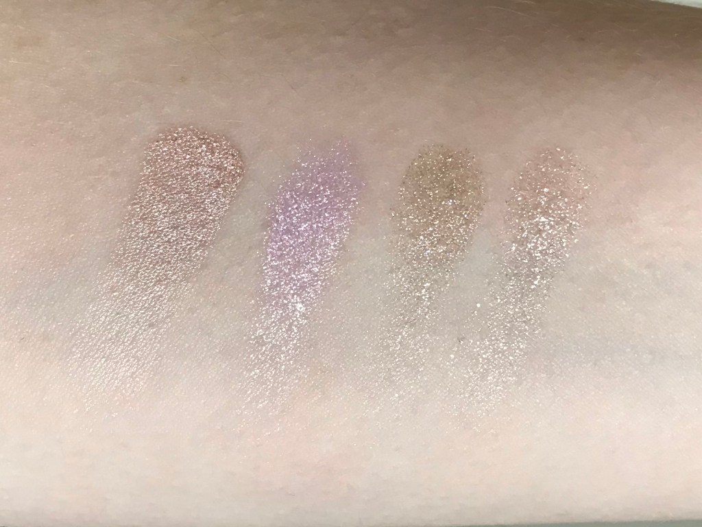
Cloud is a sheer pinkish lilac with big gold sparkles. If I owned a glitter primer, I’d wear it with this shade, since my usual primer doesn’t prevent fallout. That said, I don’t really mind glitter fallout: if I’m wearing a straight-up glitter eyeshadow, I’m not in a situation formal enough that stray glitter on my cheeks would be a problem. Frankly, many of my friends and acquaintances probably expect me to show up to social events covered in stray glitter (or crumbs, or the hair of someone else’s dog).
Imagine That is a matte mauve. Bloggers and brands alike love to describe the most unlikely pinkish brown colors as “mauve,” but this really is the closest shade to true mauve in my eyeshadow collection. It looks more purple on my skin than it does in the pan.
Ghostin’ is a matte bright cotton-candy pink with a hint of lavender.
Wake Me is a sheer metallic magenta with a subtle blue shift. Very ’80s, very Lisa Frank–and, not coincidentally, my favorite shade in the palette.
Fluff is a metallic deep lavender with chunky sparkles. Watch out for fallout with this shade, too (you can actually see some of the fallout in the photo above).
Trainwreck is a metallic light periwinkle with soft gray undertones and a subtle pink shift.
Zoned Out is a matte lavender that works shockingly well as a blush (more on that later).
Iffy is a matte royal purple. I was bracing myself for patchiness with this shade, but it has great pigmentation and blends nicely. A miracle!
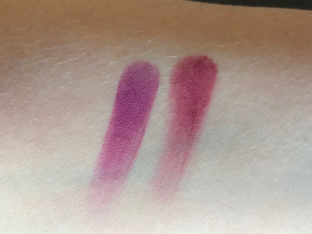
Filtered is a matte purple berry that looks brighter and pinker (closer to magenta) when blended out. It’s very pigmented, so apply just a little at a time.
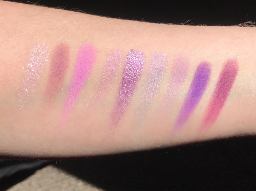
Swatches:
L-R: Cloud, Imagine That, Ghostin’, Wake Me, Fluff, Trainwreck, Zoned Out, Iffy, Filtered. Top photo in shade, bottom in direct sun. Unfortunately, neither of these shots does justice to the duochrome prettiness of Wake Me and Trainwreck.
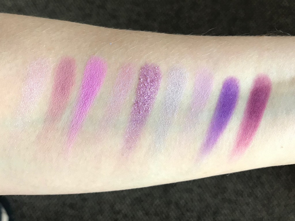
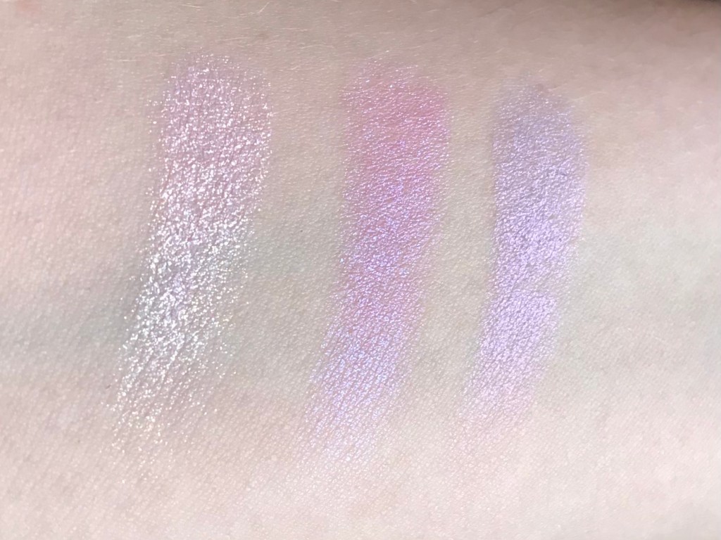
A better shot of the glitter shifts in Cloud, Wake Me, and Trainwreck:
Shade comparisons (Lilac You a Lot shades in purple):
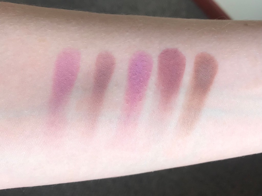
Dose of Colors Spaced Out (Marvelous Mauves palette), ABH Buon Fresco (Modern Renaissance), Imagine That, Dose of Colors Wishy Washy (Marvelous Mauves), ColourPop Python (That’s Taupe):
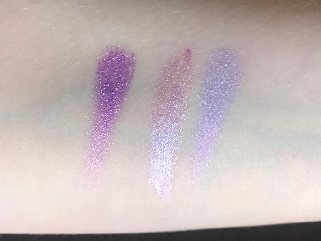
Fluff, Glossier Lily, Trainwreck:
ColourPop Howlin’, Zoned Out:
ABH Vermeer (Modern Renaissance), Cloud, ColourPop Super Shock Shadow in Birthday Wish, ColourPop SSS in Ladybird:
Filtered, ABH Love Letter (Modern Renaissance):
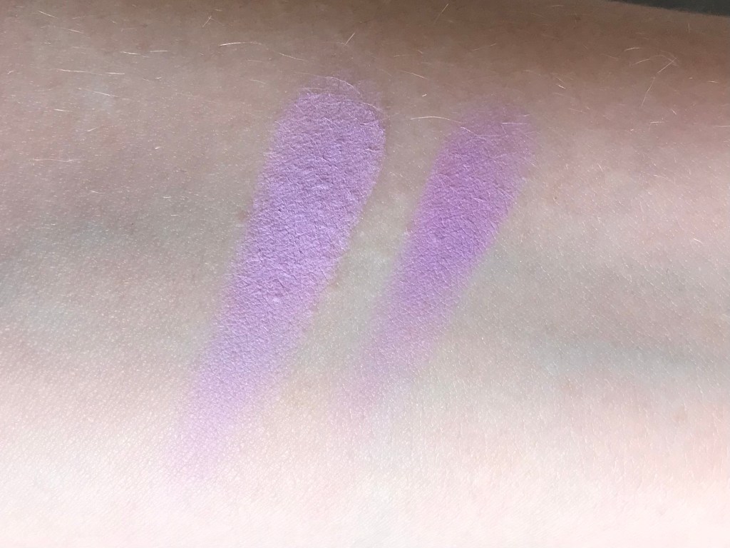
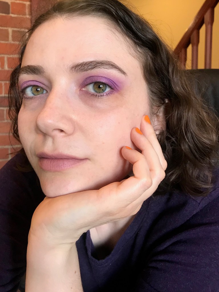
Now for some looks! I find that there are a few natural pairings and groupings in this palette, which is the sign of a well-designed color story. First, a mod-inspired look with Zoned Out in the crease and on the browbone (not much difference between the two areas on my face) and Trainwreck on the lid:
Zoned Out in the crease/browbone (creasebone?), Fluff on the lid, Iffy in the outer corner:
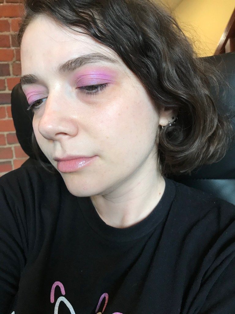
Ghostin’ in the crease/browbone, Wake Me on the lid:
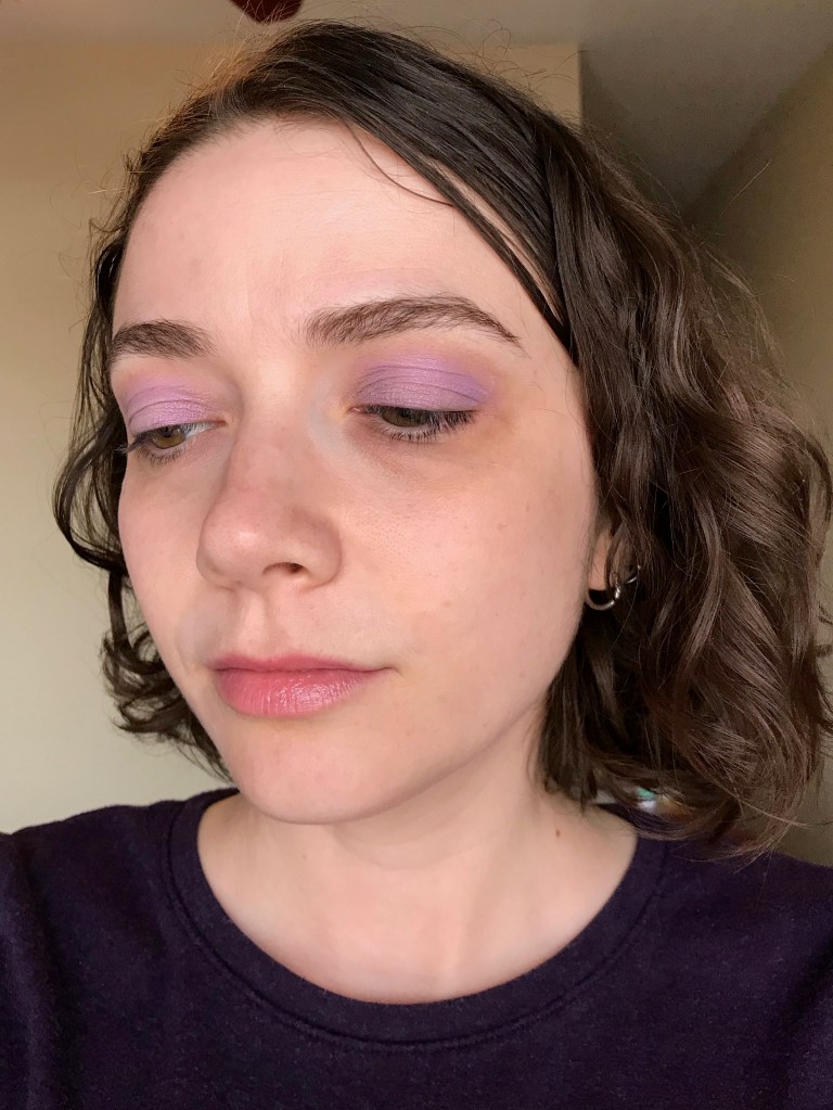
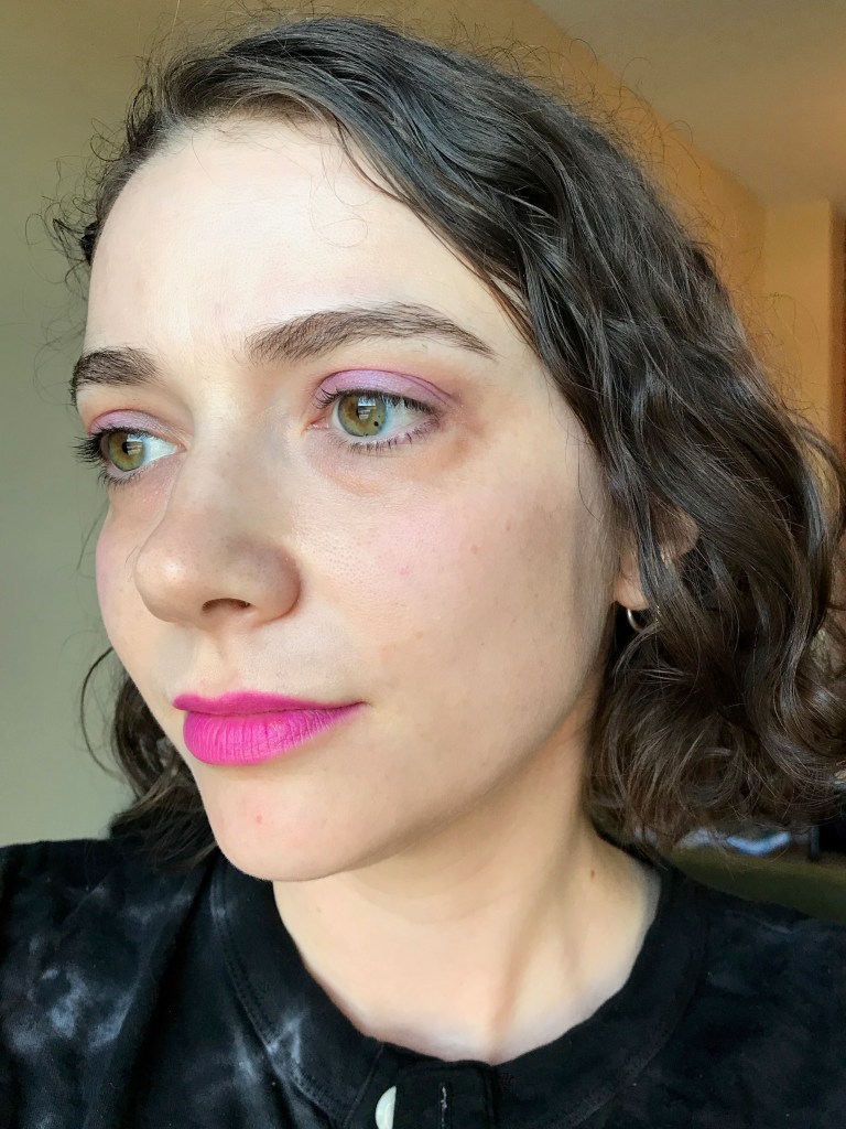
Loosely inspired by a Cutex ad from 1983: Wake Me on the lid, Filtered everywhere else, and a very thin line of NYX Gunmetal eye pencil on the upper lashline. I’m also wearing Glossier Cloud Paint in Haze and Maybelline Shine Compulsion lipstick in Berry Blackmail.

Finally, Zoned Out as blush! I’m very excited about this discovery. Longtime readers will know that my blog is partly an ongoing chronicle of my failure to find a lavender blush that actually shows up as lavender on my skin. “Lavender” blushes from Western brands (e.g. ColourPop Whirl) tend to be pink instead of true lavender, while lavender blushes from Korean brands (e.g. Tony Moly Milky Violet) tend to be very sheer. In all my years of futile searching, it never occurred to me to try using a lavender eyeshadow as a blush until I bought Lilac You a Lot. On a whim yesterday, I popped Zoned Out onto my cheeks, and surprise: it was exactly what I wanted. You can see it in the photo below; my eyeshadow is Wake Me and my lipstick is Revlon Super Lustrous in Dramatic, which I picked up for $5 at Walmart after receiving my second dose of the Pfizer vaccine earlier this week!
And some more lilacs, just because.


Congrats on the new domain! Also it’s nice to see you blogging again, which I’ve been meaning to say since you restarted, but I keep reading your posts on devices where I’m not logged in to comment.
My own pandemic cosmetic adventures have been in the perfume direction lately. This morning I tried on a perfume themed after a T. Rex; it smelled like leather and blood, which was probably geraniums really, but it had that visceral oh-no-something’s-bleeding tang. I would never wear this around anybody, but when we’re all staying distanced and covering our noses it’s a good time to experiment with socially marginal smells.
LikeLike
I’ve been wearing perfume more often during the pandemic, too. I feel self-conscious wearing fragrance around people I don’t know well because I never know if they’ll be sensitive to it, but it’s nice to wear just for myself.
That T-Rex perfume sounds amazing! I’ve been thinking recently about how words are an integral part of our experience of perfume because there’s no real visual component; we rely on the brand’s narrative to pull us into the story. I’m currently writing an essay about the (bad) smell of my current town, and telling the story of a smell is a real challenge!
LikeLike
Storytelling is SUCH a huge part of smells! Especially unfamiliar ones. The set of samples I’ve been testing are from the brand Zoologist, and each scent sets a scene inspired by a particular animal. There’s no way I would have been attracted to these without the theme and the endearing black-and-white illustrations of each animal in human clothing, but honestly, that’s fine! It’s genuine value added! It’s a charmingly embodied way to think about different places and experiences, especially since I’ve been feeling some pretty serious wanderlust for a while now. Also different smells help differentiate the days from one another.
That said, not all of these stories are ones I need to experience repeatedly–one time around with the T. Rex one was enough, and there are a couple that are very pretty but my skin brings out one base note that overwhelms the rest–and I’d be happy to pass them on to somebody else to experience. Do you have any interest?
LikeLike
Purple really brings out the green in your eyes – I’m jealous, I’ve always wanted green eyes! Congrats on your new domain, I’ve been following for years so I was so pleased when you took up blogging again 🙂
LikeLike
Thank you! I feel very lucky to have readers who have been following me for so long. ❤
LikeLike
I love all the looks you did, the purple is so flattering with your eye color. Congrats on the new blog and domain! Sorry about the jerks using the non-hyphenated one, that’s awful…sadly I’m not surprised. Anyway, looking forward to more posts here at your new online home!
LikeLike
Thank you! Hey, at least my URL now matches my Instagram handle, so I guess that’s something…
LikeLike
[…] monochrome ’80s look. In the photos below, I’m wearing Wake Me from the ColourPop Lilac You a Lot palette on my eyes and Glossier Cloud Paint in Haze on my […]
LikeLike
[…] this time) with some other shades in the mauve-rose family. L-R: ColourPop Imagine That (from the Lilac You a Lot palette), ABH Buon Fresco (Modern Renaissance), Heather, Dose of Colors Spaced Out and Rosy (both […]
LikeLike
[…] ethos. Here I am wearing Eve in a purple-toned look also featuring ColourPop’s Lilac You a Lot palette, Pat McGrath Madame Greige, and an ’80s […]
LikeLike
[…] shade name is perplexing, because the color isn’t even close to lilac; instead, it reminds me of the bougainvillea that grows on houses all over San Francisco. I guess […]
LikeLike
[…] For a dinner out last night, I wore Red Bean Red with ColourPop eyeshadow in Wake Me (from the Lilac You a Lot palette), About-Face Cheek Freak Blush Balm in Score, a vintage top that I bought for $3 on South […]
LikeLike
[…] the ’90s makeup ad I just saw on Pinterest, and so on. I’m not going to give up colored eyeshadow or peach lipstick because they don’t fit the True Winter palette; however, I’m more […]
LikeLike
[…] and emphasized cheeks and lips over eyes. But I certainly don’t plan to get rid of, say, my ColourPop Lilac You a Lot palette. I think there’s a real danger in subordinating your personal preferences to any […]
LikeLike