
I was eight for most of 1996, but I remember that year quite well. In fact, I remember it as an especially good year in my young life. My parents and I had moved to San Francisco the year before, back when an assistant teacher and a busker at Ghirardelli Square could afford a nice two-bedroom in Cole Valley. The Summer Olympics took place in Atlanta, and my best friend Dana and I played with her new gymnast Barbie (complete with parallel bars). I owned a fuchsia velour T-shirt embossed with daisies. My parents drove a 1983 Toyota Corolla. My mom and I laughed at the mysterious “www.” and “.com” appearing on billboards and bus ads all over the city. On the evening of the presidential election, my dad picked me up from ballet and I said “Clinton won, didn’t he?” and my dad, very pleased, said yes. And the upstart beauty brand Urban Decay launched its first collection: nine lipsticks and a dozen nail polishes in bizarre metallic colors with names like Smog, Plague, and Asphyxia.
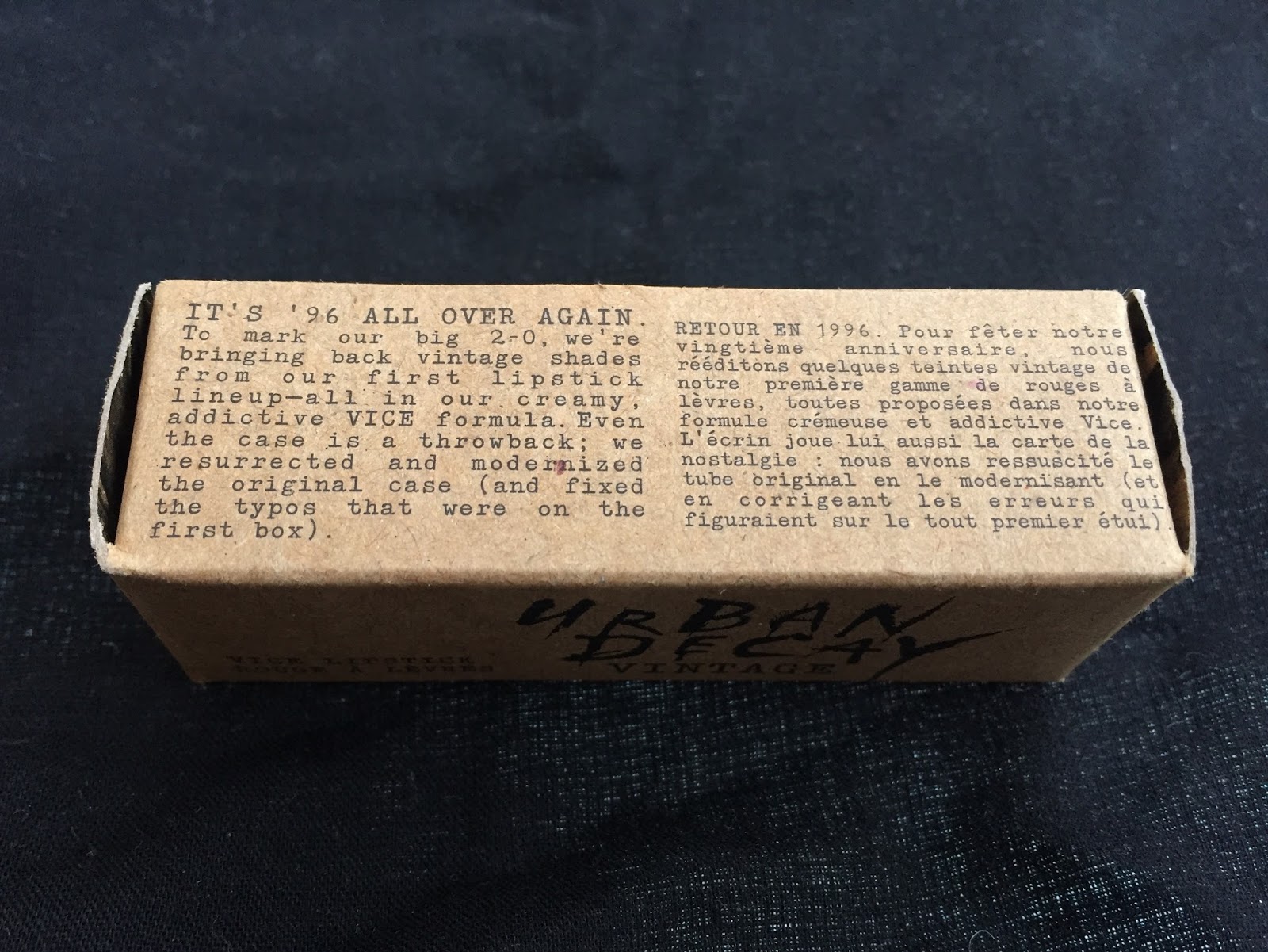
All right, so I don’t remember that last detail. But I was still excited when I learned last summer that Urban Decay was bringing back its original product lineup for its 20th anniversary. And the lipsticks’ brown cardboard boxes looked familiar enough that I know I must have seen them, or something very like them, back then. To paraphrase another cultural touchstone of the late 20th century, Nigel Tufnel: “It’s like, how much more ’90s can you get? And the answer is none. None more ’90s.” Honestly, I prefer the brown boxes to the current gaudy ones. (Nouveau Cheap has a great post, itself now seven years old, on the evolution of Urban Decay. Did you know they used to sell temporary tattoos?)
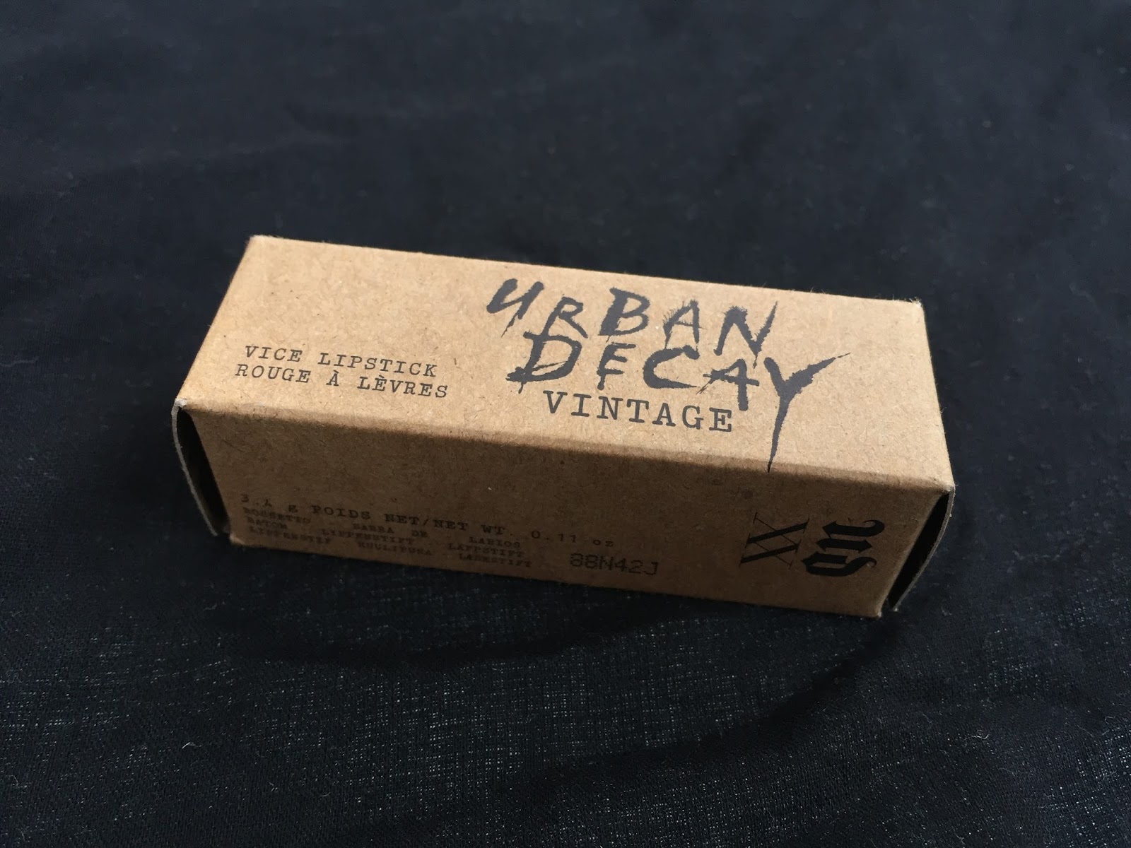
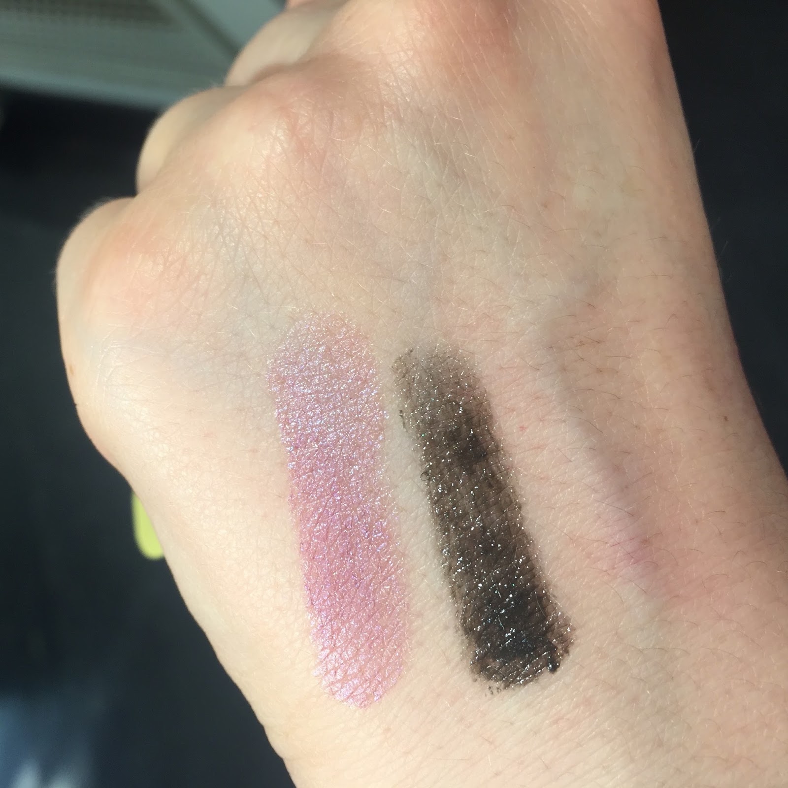
The XX lipsticks must not have sold very well, because they were marked down to $11, from the original $18, by December. I was a little surprised, given the current popularity of metallic and frosted lipsticks in offbeat colors, but the problem may have been opacity: the repromoted UD shades ranged from slightly translucent to quite sheer. Below are Asphyxia (which, appropriately, made me look dead when I tried it on) and Oil Slick:
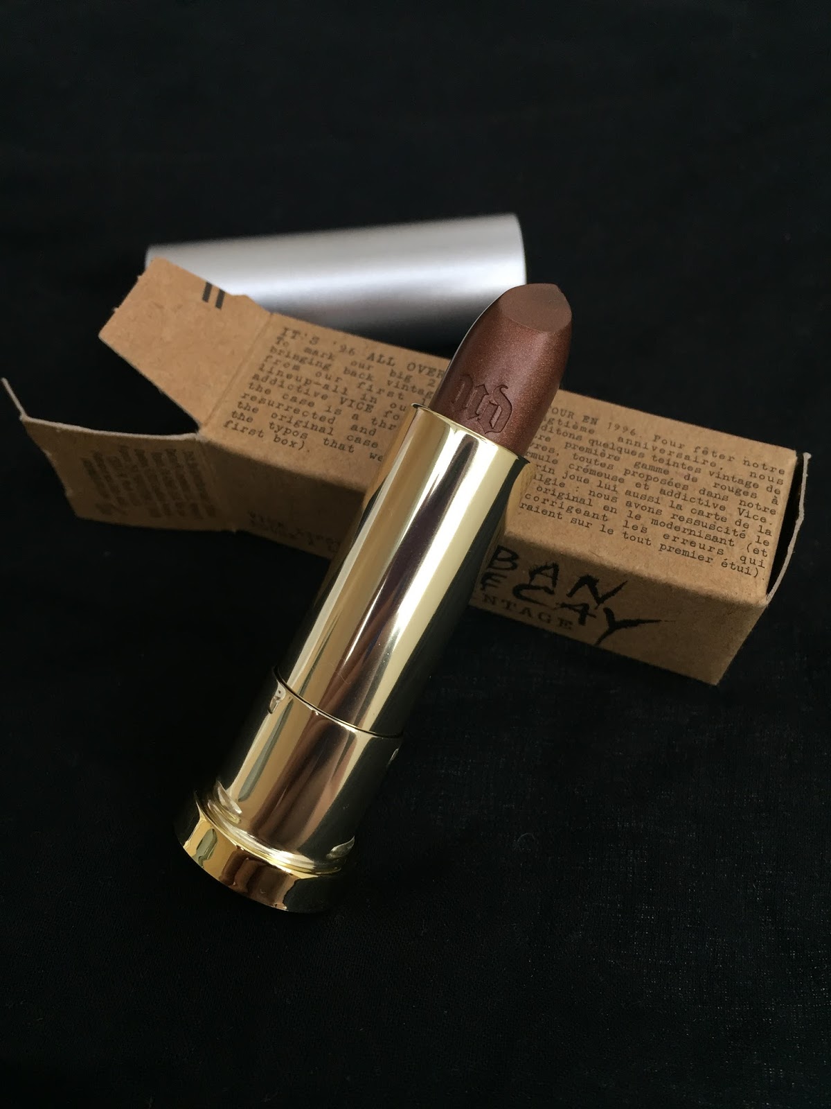
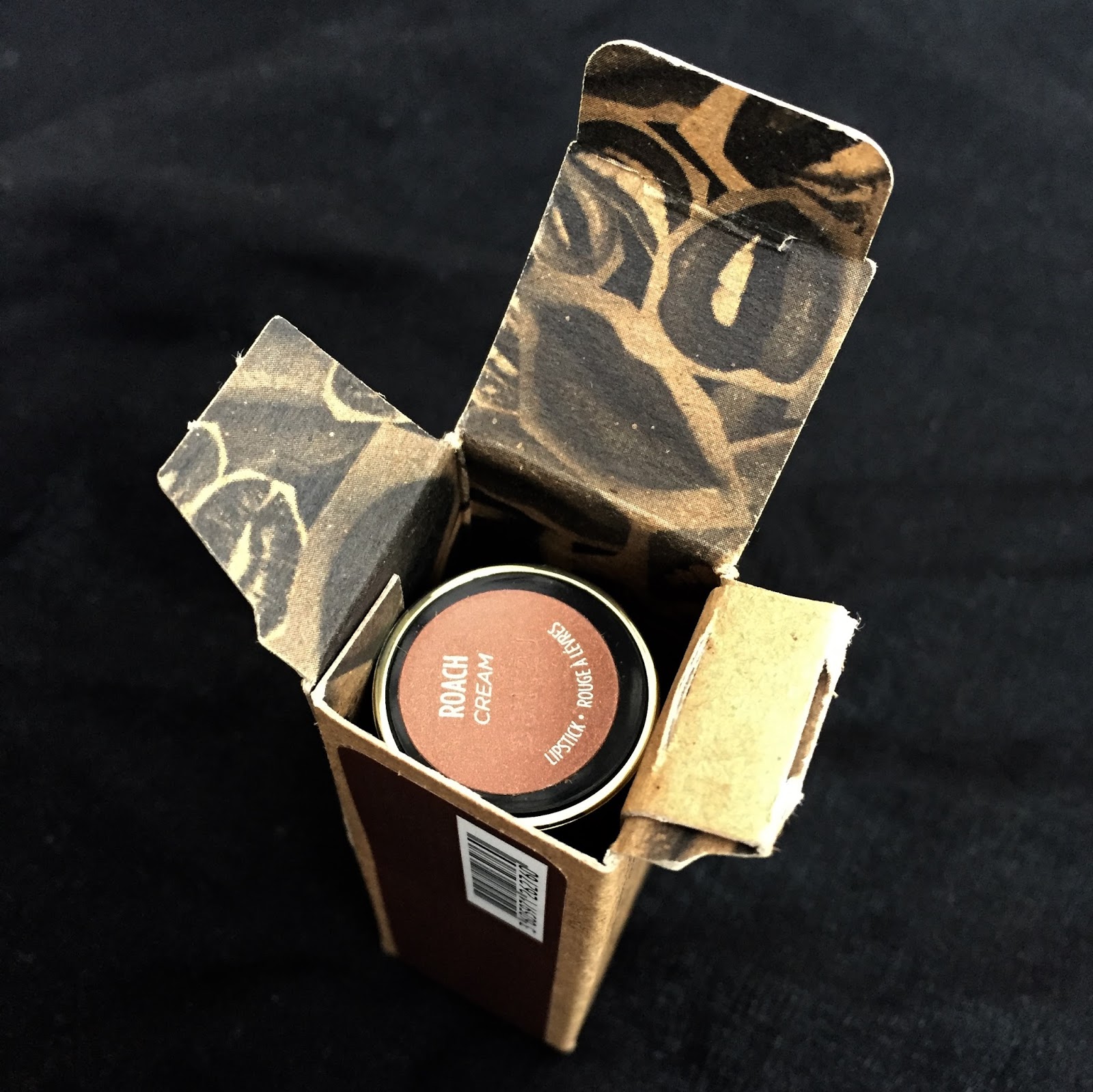
I assumed that if I ended up with any of the shades, it would be one of the three purples. But while returning NYX Up the Bass at Ulta in December, I found myself drawn to Roach, a rich bronze. Longtime readers might remember that after NYX released its metallic Wicked Lippies in 2014, I coveted the orange-bronze Wrath for at least a year before deciding I wouldn’t wear it enough to justify the purchase. Now here was a slightly cooler-toned bronze in a higher-quality formula, for a mere $11. I couldn’t resist.
Urban Decay does a good box lining:
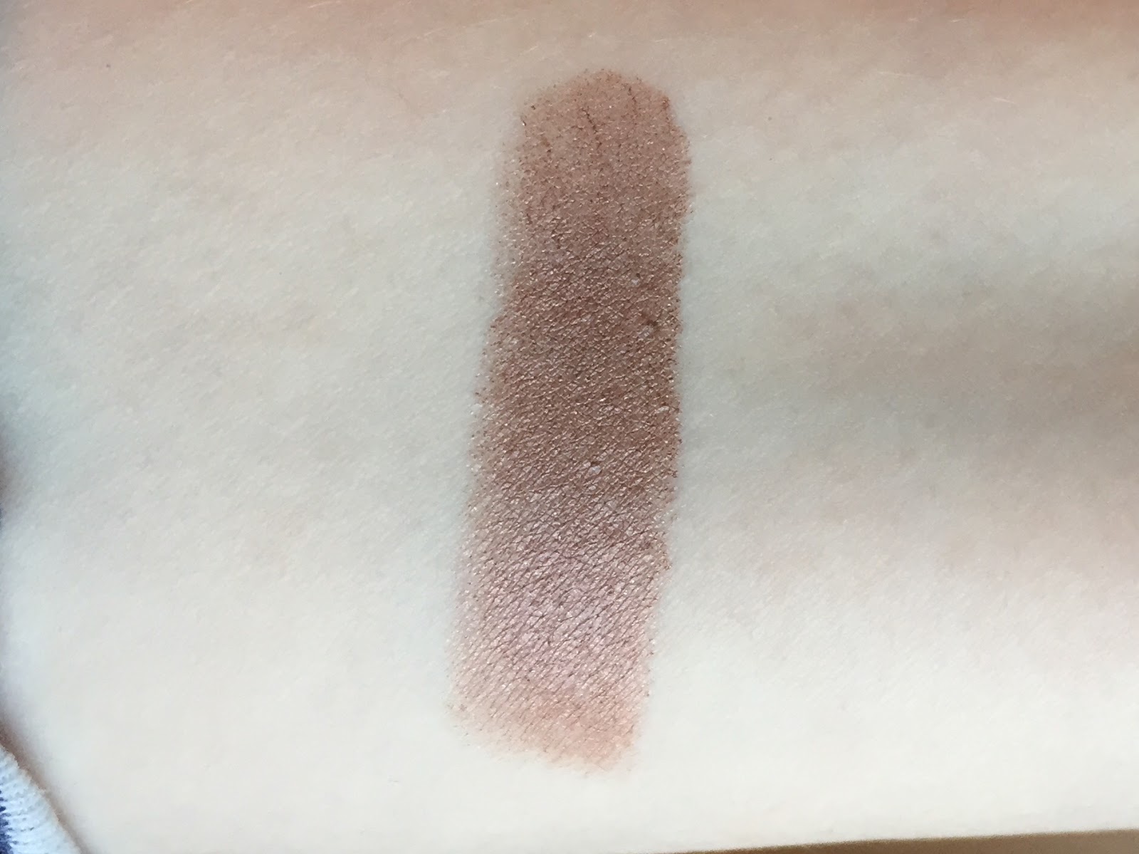
Roach was one of my favorite purchases of 2016, mainly because it achieves the near-impossible: it’s a playful metallic lipstick that manages to be almost neutral. I can wear it out of the house without feeling acutely self-conscious, but it’s far from boring. I also appreciate that it verges on taupe while still retaining an bronzey warmth:
I had no idea which of my lipsticks would make good comparison swatches, so here’s Roach between two other medium browns: MAC Whirl (L) and Revlon Fierce (R). As you can see, Whirl and Fierce are far redder than Roach, which looks almost yellow-based here.
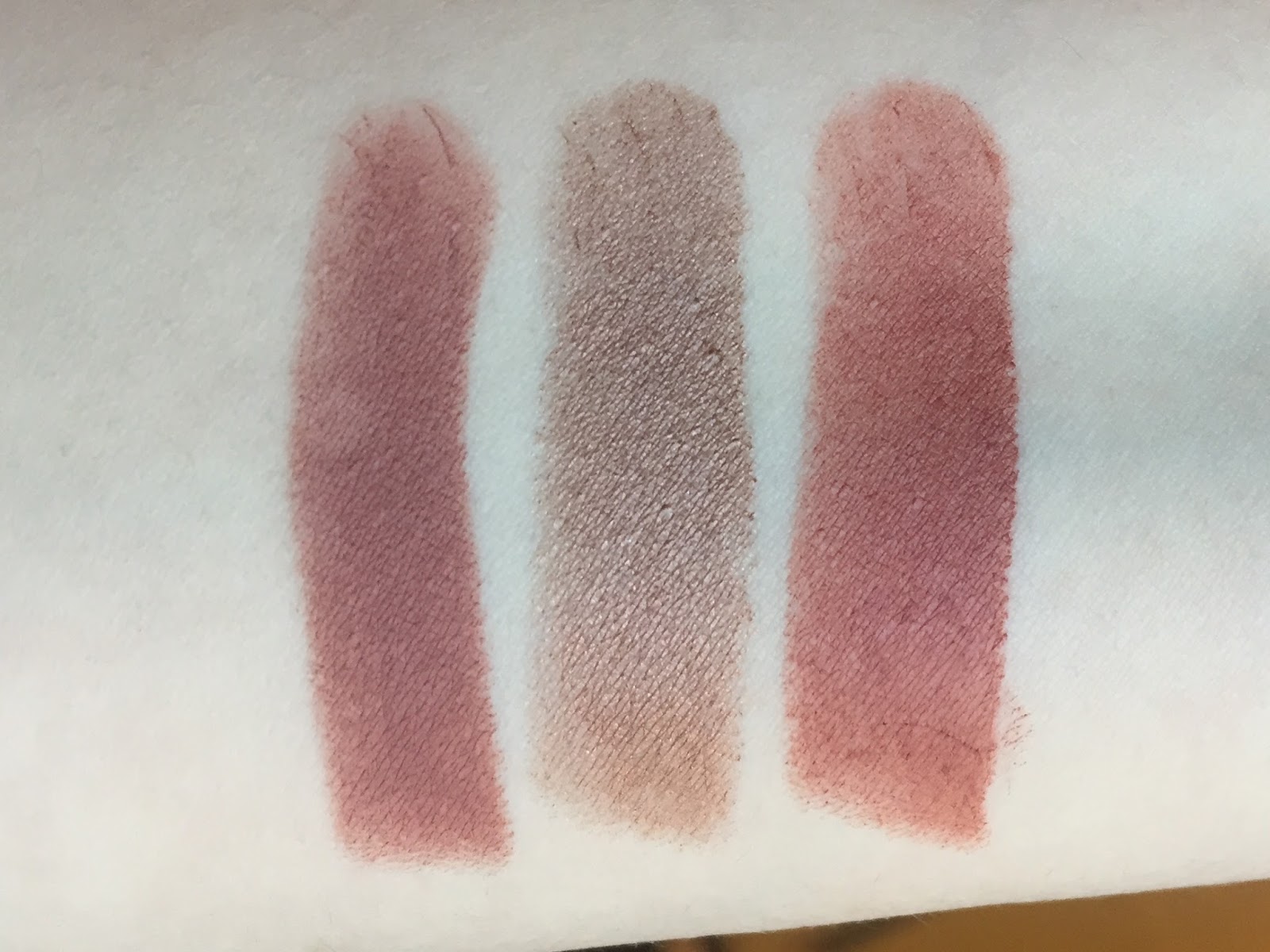
One coat of Roach provides almost full opacity, but I generally use two. The Vice lipsticks are scent- and tasteless, and Roach’s formula is comfortable and moisturizing without being slippery. Most metallic lipsticks these days come in more or less drying liquid formulas, so it’s nice to own a true metallic lip color in a more congenial formula. The color changes quite a bit depending on lighting, so I’ve done swatches in natural light (above) and fluorescent light (below).
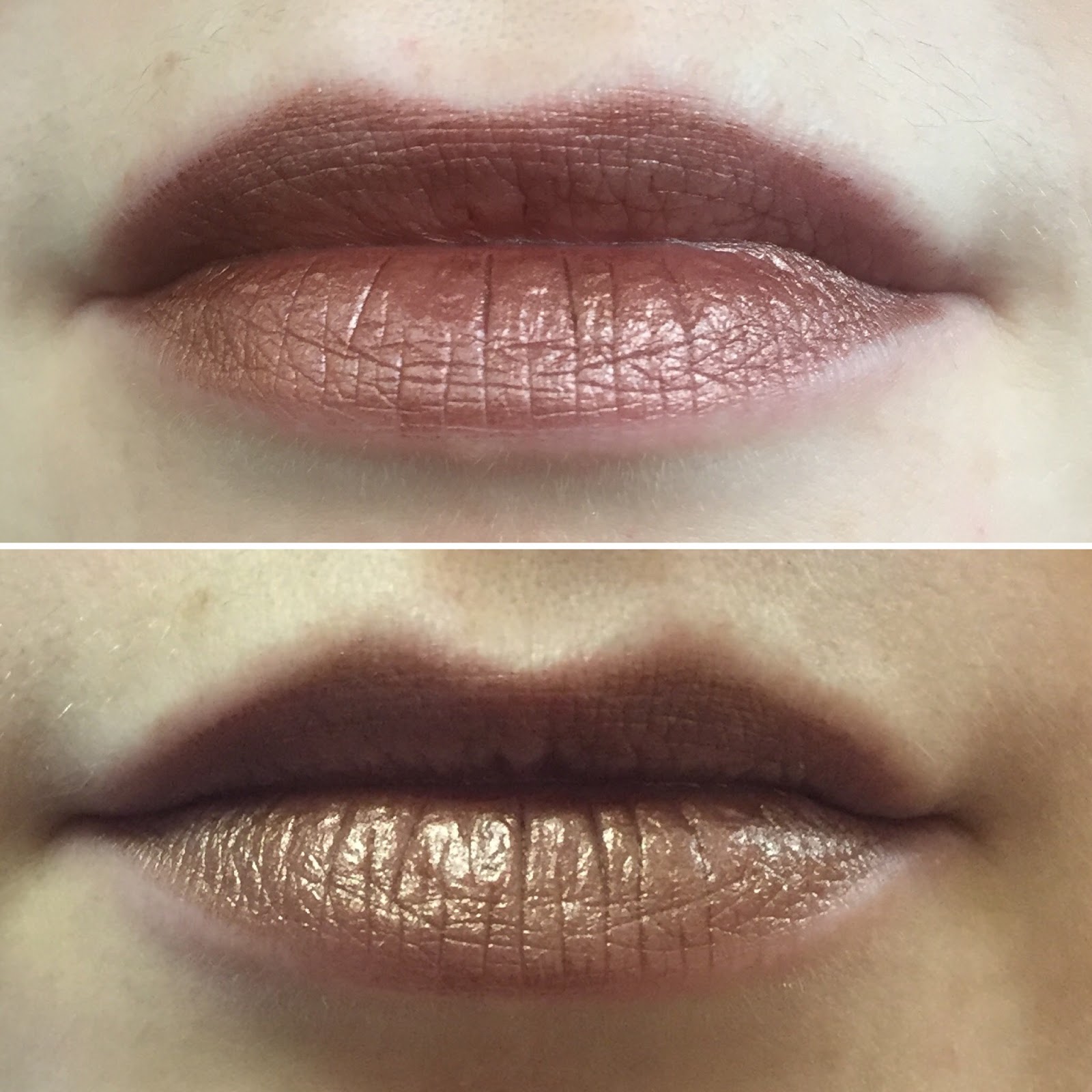
My makeup concept today was “shit I have ten minutes to do makeup before therapy and we’re just going to be driving around central Jersey in the rain after that,” so, uh, enjoy. I thought the NYX Jumbo Pencil in Iced Mocha would pair well with the plum half of the NARS Habanera duo, so I smeared Iced Mocha all over my eyelids and layered Habanera on the outer third. Unfortunately, the two colors blended into a muddy brownish wash and I had no time to improve the look, so I tightlined with Urban Decay eyeliner in Whiskey and called it a day. I’m also wearing Illamasqua cream blush in Zygomatic and ColourPop highlighter in Lunch Money.
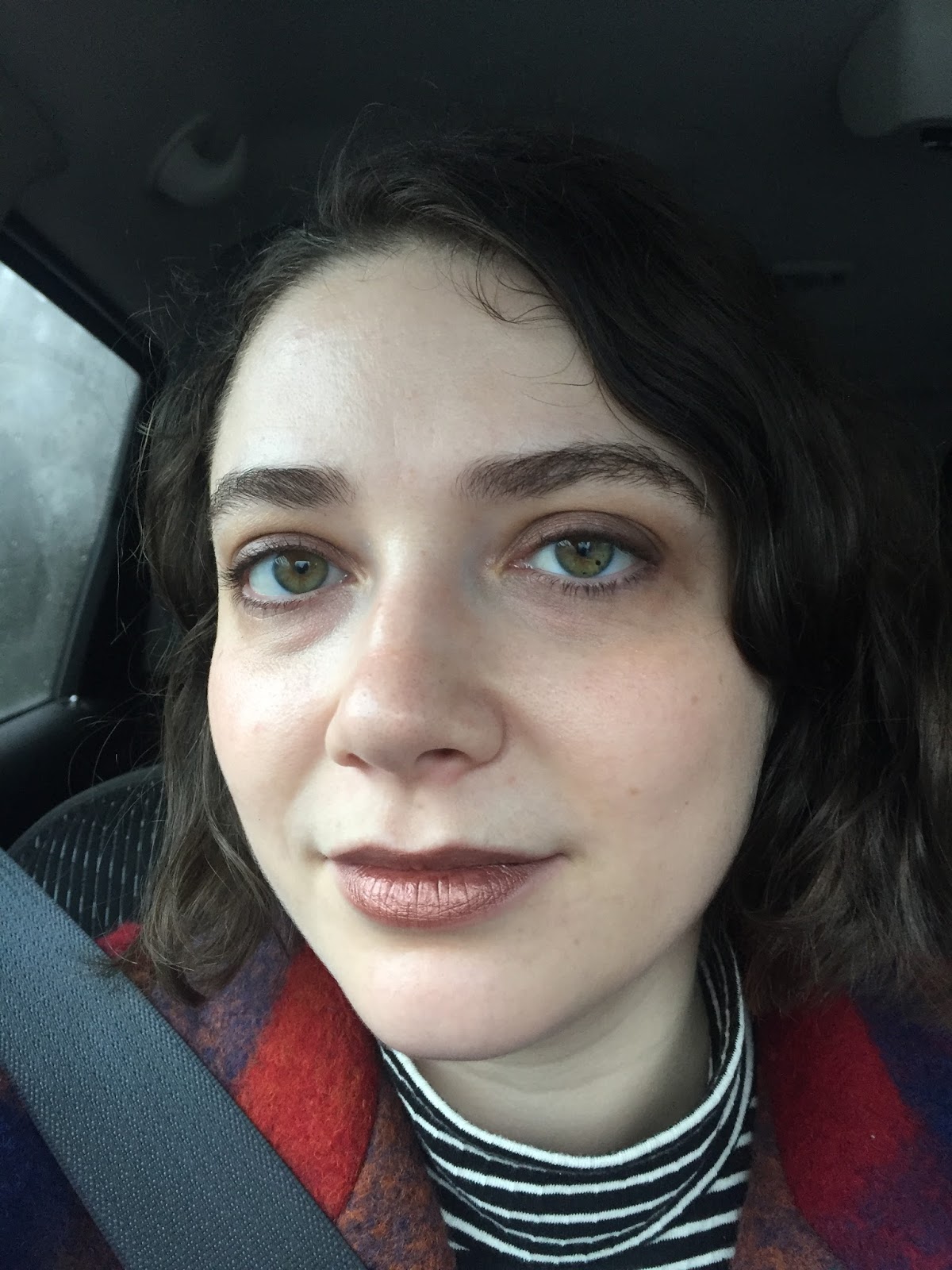
I scrolled through my photos to find slightly more inspired looks that incorporated Roach, but it turns out that I always pair it with boring neutral eyeshadow because I fear that a distinctive eye look will be Too Much with bronze lipstick. I think Roach would look beautiful with a Modern Renaissance pink/red eye, and perhaps one day I’ll do that and update this post. But sloppy brownish eyes and cheeks are certainly in the spirit of 1996, so let’s pretend that’s what I intended all along.

Your Roach swatches kinda look like Maybelline's Bad to the Bronze – which I LOVE!I am also, well, shocked at how wearable and flattering a metallic bronze lipstick looks.
LikeLike
I kind of love this lipstick and it's still in stock on Sephora Canada…it's wearable in an off-kilter way. 1996 was the year that the hospital I work in opened, so I walk into that year every day. It's oddly comforting, since my elementary school also opened in 1996, the year I started kindergarten, and the hospital has many of the same features as my school did.
LikeLike
It does look a lot like Bad to the Bronze! I've spent a couple of years searching for a dupe for it, and now I've found it…in a lipstick. I should probably just go ahead and repurchase Bad to the Bronze at this point.At this point in my lipstick addiction my bar for \”wearable\” is much lower than most other people's, so who knows how Roach actually looks to the general public, but I feel totally comfortable wearing it around town!
LikeLike
Oh hey, I just checked the American Sephora site and four of the vintage colors are still in stock there, too! I had no idea. The only ones left are two purples and two blues, though: Plague, Pallor, Frostbite, and UV-B.It strikes me that I have no idea what the distinguishing features of '90s architecture are. The only building that comes to mind when I think of the '90s is the stripey SFMOMA building that opened in 1995, a few months before we moved to San Francisco. https://en.wikipedia.org/wiki/San_Francisco_Museum_of_Modern_Art#/media/File:New_SFMOMA.jpg
LikeLike
In 1996 I was old enough to buy my own makeup but didn't know Urban Decay at all. I did buy an eyeshadow palette that had both Asphyxia and Oil Slick later on. It was a tiny palette with at least 8 of the bestsellers, and I remember being so excited about owning the coolest makeup in the market. I also had the Urban Decay X blush which I thought was a far better golden peachy pink than NARS Orgasm. Ah, the memories! :)I actually think the FOTD is prettily put together and looks very chic. Pairing Roach with MR palette sounds like a superb idea, though. Will look forward to. 🙂
LikeLike
Are you looking for a powder version of Bad to the Bronze? Bare Minerals Ready eyeshadow in \”A-Ha\” (which is in the Epiphany duo) is very similar. I've been meaning to swatch a bunch of powder shadows to compare to BTTB. That would make a good short blog post, maybe, since I am running low on motivation lately.
LikeLike
Urban Decay did a great job of distilling that late-'90s vibe. It took me a while to figure out how fun makeup could be because I came of age during the boring bronzer-and-nude-gloss era. I wish I had become aware of makeup slightly earlier!
LikeLike
[…] the most popular shade) and two in the Metallized formula. My first Metallized lipstick was Roach, a deep bronze from the LE 20th-anniversary collection last year. Oddly, many of my favorite beauty […]
LikeLike
[…] Below, I’ve swatched them next to two other shiny lipsticks: Urban Decay Roach and Milani The Ultimatte. Both of those shades have an even sheen that’s roughly the same […]
LikeLike
[…] Urban Decay Vintage Vice Lipstick in Roach […]
LikeLike