
Having devoted the better part of a decade to studying Renaissance (we in the biz prefer “early modern”) literature, I perked up when I heard that Anastasia Beverly Hills had released an eyeshadow palette called “Modern Renaissance.” The palette came out in mid-2016 and started a warm-neutrals trend that, as of February 2017, shows little sign of dying down. Despite my instant attraction to the name, I resisted Modern Renaissance for half a year, for a few reasons:
- I have a hipster distaste for any product that receives a tremendous amount of hype. (Preteen me held out on the Harry Potter novels for at least a year because everyone else liked them.)
- Historically, I’ve preferred eyeshadow singles to palettes: more travel-friendly, less visually intimidating.
- My skin, hair, and eyes are all cool-toned.
- I wear simple neutral eye looks almost every day and didn’t trust myself to use the bolder colors in the palette.
- I’d never tried anything by Anastasia Beverly Hills and had no idea what to expect from the brand.
- $42 was more money than I’d ever spent on a beauty product.
By the end of the year, though, I’d succumbed to the siren song of Modern Renaissance. I didn’t own dupes for most of the shades, I wanted to escape my sheer-wash-of-gray-eyeshadow rut, and I had a Sephora gift card burning a hole in my pocket. So I bought the palette in the last week of 2016, and I’ve worn it almost every day since. The hype is justified, and you have no idea how much it kills me to say that.
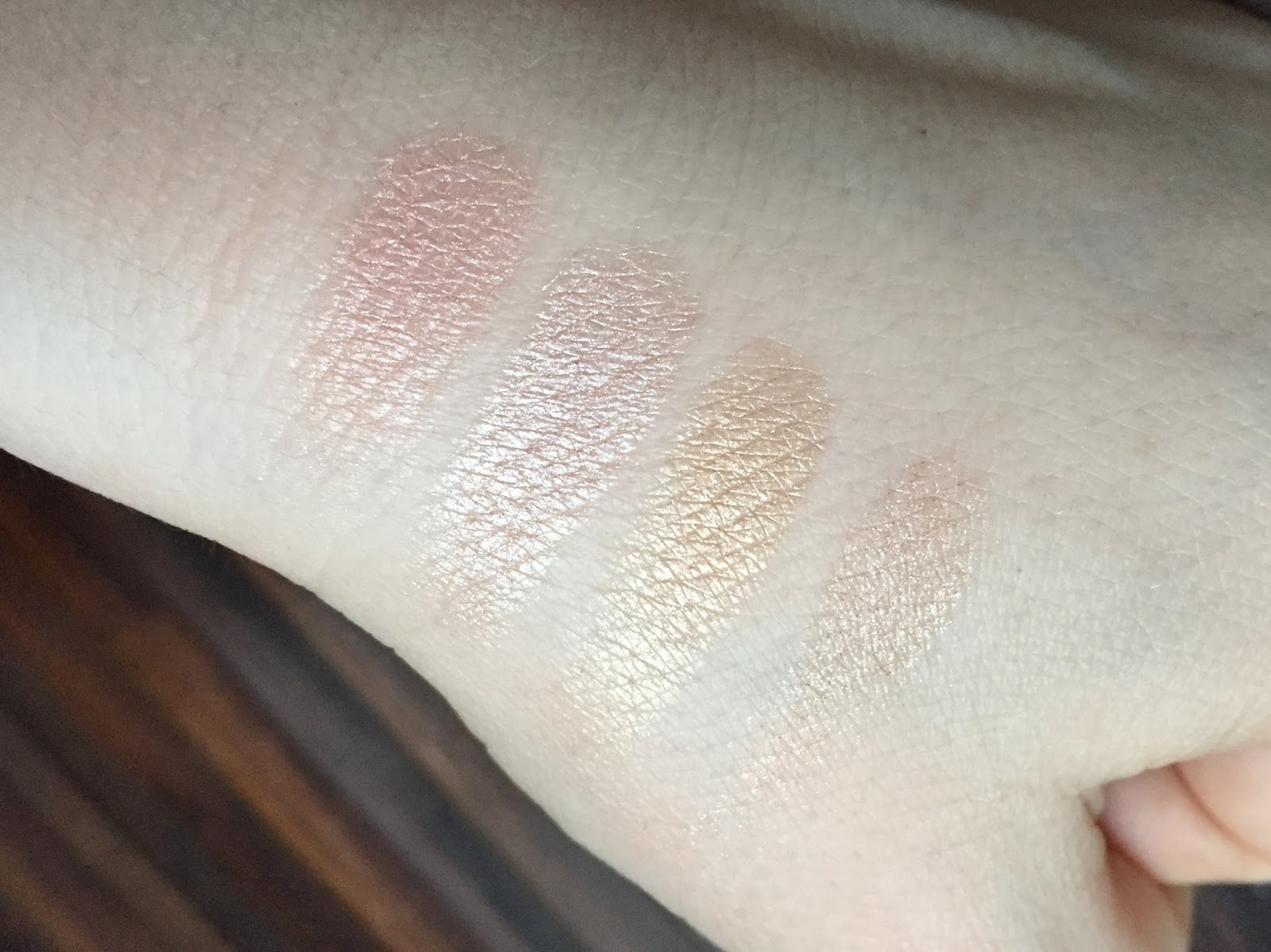
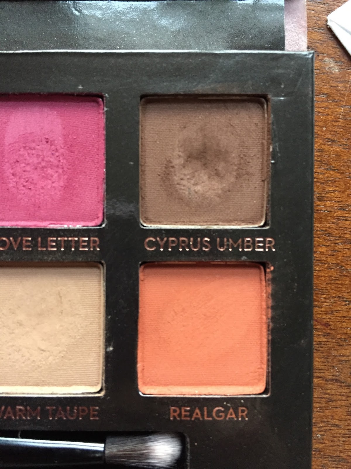
I was going to use a photo of my palette in its pristine state, but I thought it would be more interesting to upload one that reflects its current usage, since I love seeing how different people favor different shades. Just as every pedestrian draws her own map of a city, so every makeup user finds her own way through Modern Renaissance. Predictably, I’ve given the most love to the cooler-toned shades—Buon Fresco, Antique Bronze, Cyprus Umber, and Warm Taupe—but I’ve used every shade at least twice:

There are a zillion Modern Renaissance reviews on the internet, so I thought I’d make mine different by posing a question that I haven’t seen asked yet: How Renaissance is Modern Renaissance? Let’s begin with the outside, which features a blush-pink fuzzy felted surface with white lettering. I’ve done my best to prevent the pink felt from getting grubby (traveling with the palette in a Ziploc bag, etc), but as many reviewers have discovered before me, it’s a losing battle.

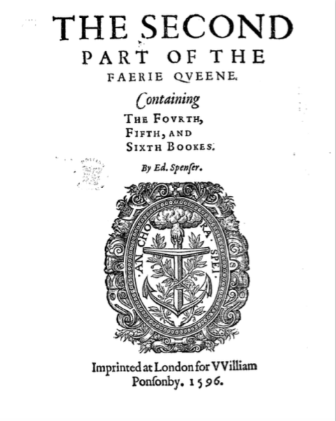
You know what isn’t remotely Renaissance? That boring white sans-serif typeface. Here’s a typical Renaissance title page:
Yes, this is a very trivial and nerdy quibble, but any of the typefaces above would have been more interesting than the one Anastasia used. If you’re going to name a palette “Modern Renaissance,” establishing conceptual continuity through little details like font is a good idea.
Now, how Renaissance is the overall color scheme? Let’s assume that the word “Renaissance” applies to the art produced between, say, 1400 and 1600 (the Renaissance began and ended in Italy much earlier than it did in northern Europe, including England). One of the shade names alludes to an iconic Italian Renaissance painting, Sandro Botticelli’s Primavera (c. 1482):
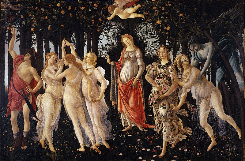
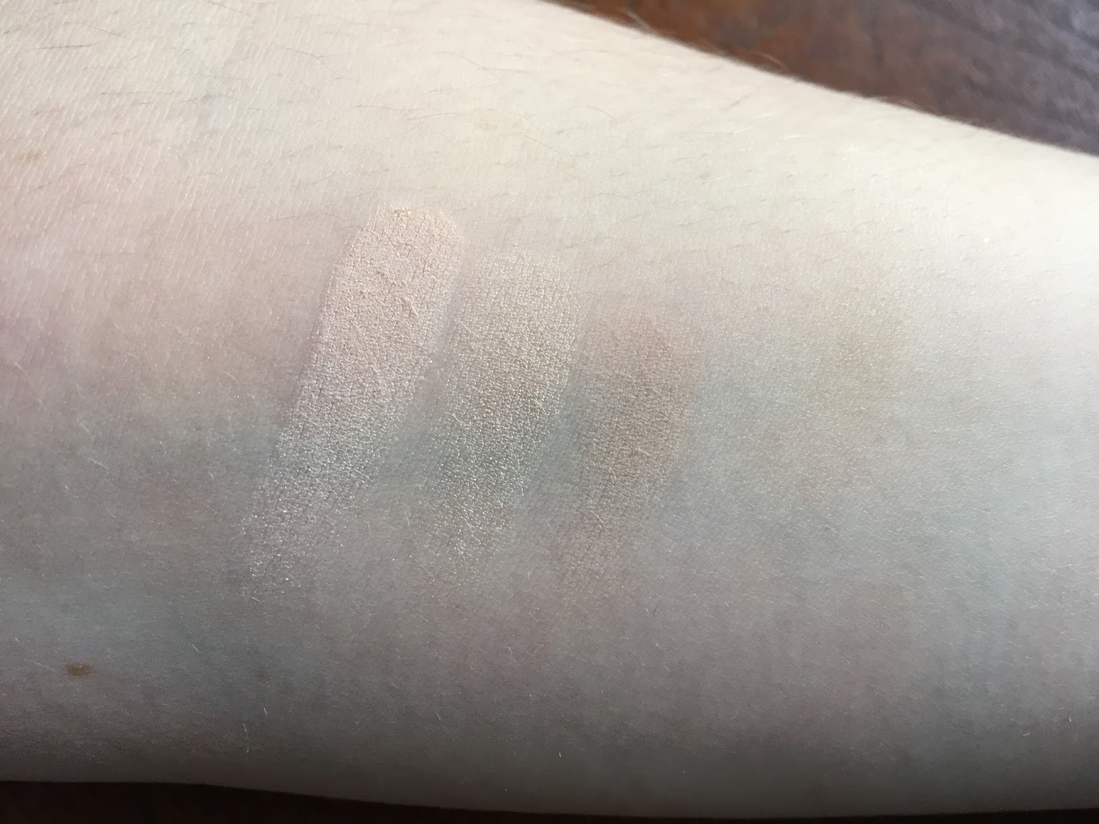
Modern Renaissance’s color story is a skillful adaptation of Botticelli’s, from the warm golden hair of the female figures (Raw Sienna and Burnt Orange), to the vivid orange robe (Realgar), to the leftmost figure’s drapery (Venetian Red) and sandals (Cyprus Umber). So far, so Renaissance; now for some swatches. I’ve made each swatch below by swiping my finger once across the pan and once across my arm.
Top row, L-R: Tempera (look closely!), Golden Ochre, Vermeer, Buon Fresco, Antique Bronze, Love Letter, Cyprus Umber:

Bottom row, L-R: Raw Sienna, Burnt Orange, Primavera, Red Ochre, Venetian Red, Warm Taupe, Realgar:
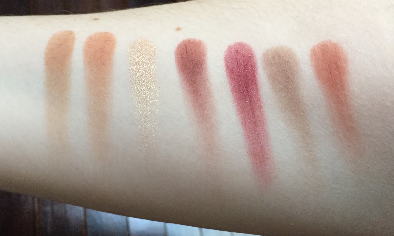
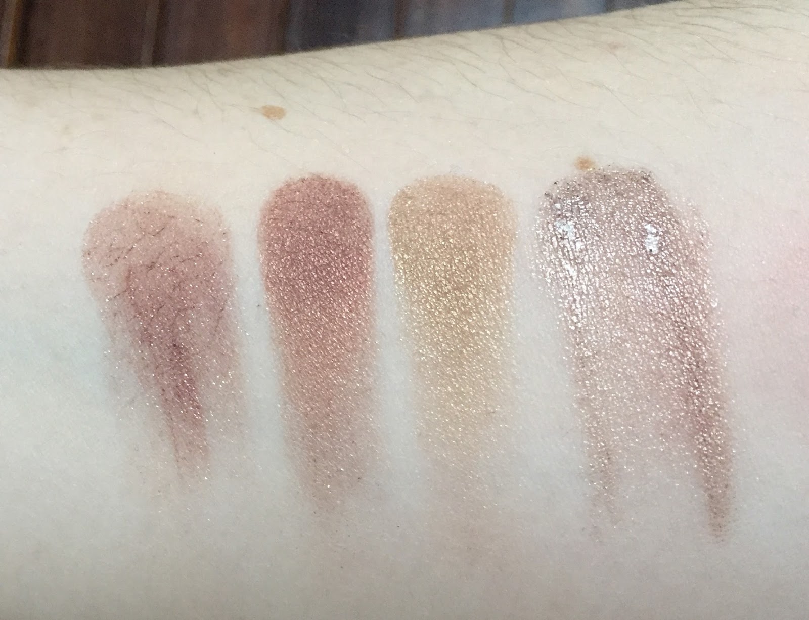
Most of the shades are mattes, with the exceptions of two dazzling shimmers (Vermeer and Primavera) and two subtler shimmers (Antique Bronze and Venetian Red).
Let’s turn to the individual shade names, most of which refer to paints and pigments. Many YouTubers who reviewed this palette last year made no effort to pronounce the names correctly, which kind of annoyed me. I don’t expect everyone to have a comprehensive knowledge of Italian art history (I certainly don’t), but if you’re sent an expensive palette for free, the least you can do is look up the pronunciation of unfamiliar words. One well-known beauty guru said, and I quote: “This palette was inspired by Renaissance paintings, and I’m sure these are probably named after some paintings, or some people who made the paintings—who fucking knows, to be honest.” Well, you might, if you did a 30-second Google search, but okay. I don’t want to come off as a snob (though I’m sure that ship sailed long ago), but one of the most appealing aspects of this palette is the narrative that ABH created through its colors and shade names. If you take no interest in the names, you’re missing out on part of the story, so I thought I’d introduce each shade with some information about its name. Not being an artist or art historian myself, I learned a lot while writing this post! Let’s start with the four colors on the far left:
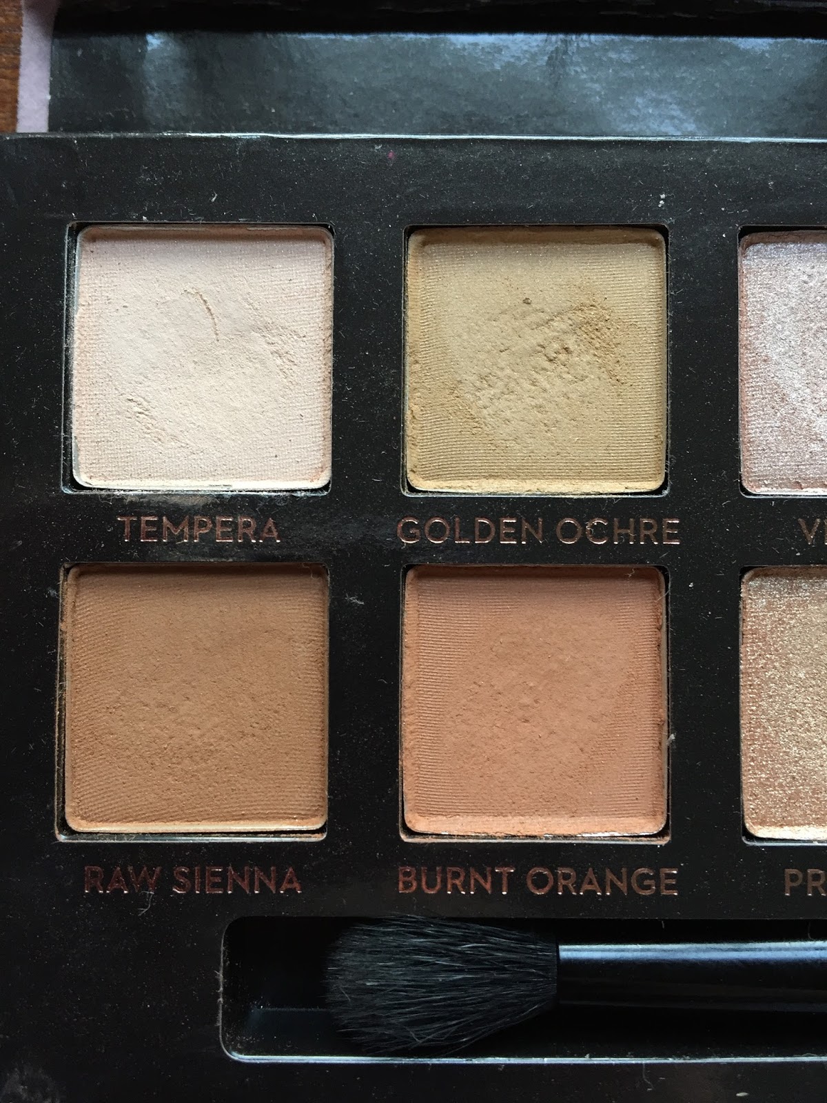
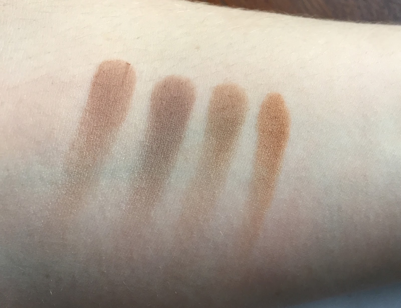
Tempera is a very pale beige that’s slightly lighter than my skin. It’s named after tempera paint, made by mixing pigments with a glutinous substance, usually egg yolk. Egg tempera dominated Renaissance art until the development of oil painting toward the end of the 15th century. Tempera is the one Modern Renaissance shade that falls short for me: it’s drier and more powdery than the other shadows, though certainly workable. Here it is at left, next to Urban Decay Skimp (center) and Stark, both from the Naked2 Basics palette. Tempera is the most opaque of the three, but also the chalkiest.
Golden Ochre is a pale mustard brown. Ochre (or ocher, in American spelling) is an earth pigment derived from clay containing hydrated iron oxide, which gives it a yellow, orange, or red color. Ochre has been used in art since Paleolithic times; Renaissance artists generally used it in frescoes, mural paintings executed on wet plaster. The word “ochre” comes from the Greek ὠχρός, or “pale yellow.”
Raw Sienna is a medium warm brown that looks darker and more orange on my lids than it does in the pan. Sienna is an earth pigment similar to, but darker than, yellow ochre. It takes its name from the Tuscan city-state of Siena, which was an independent republic from 1125 to 1555. The word “raw” distinguishes sienna in its natural state from heated or “burnt” sienna, which is darker and redder.
Burnt Orange is a light brownish orange. No real Renaissance significance to this name, alas.
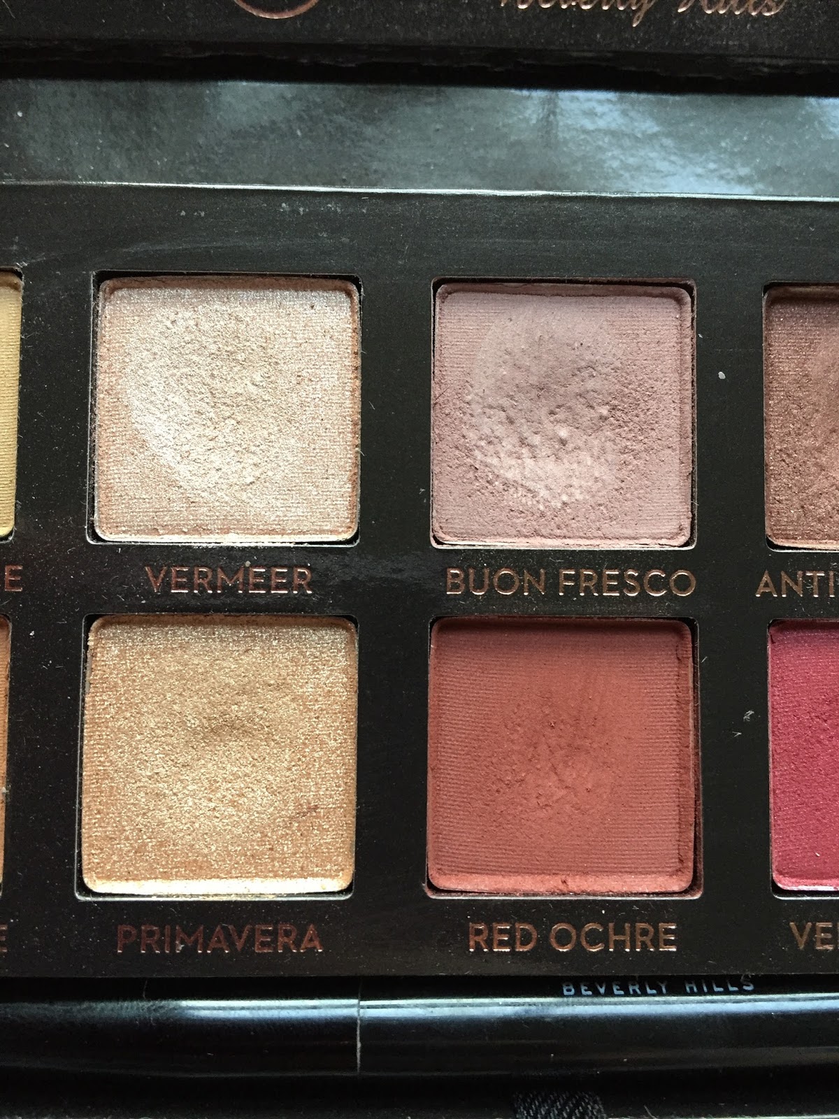
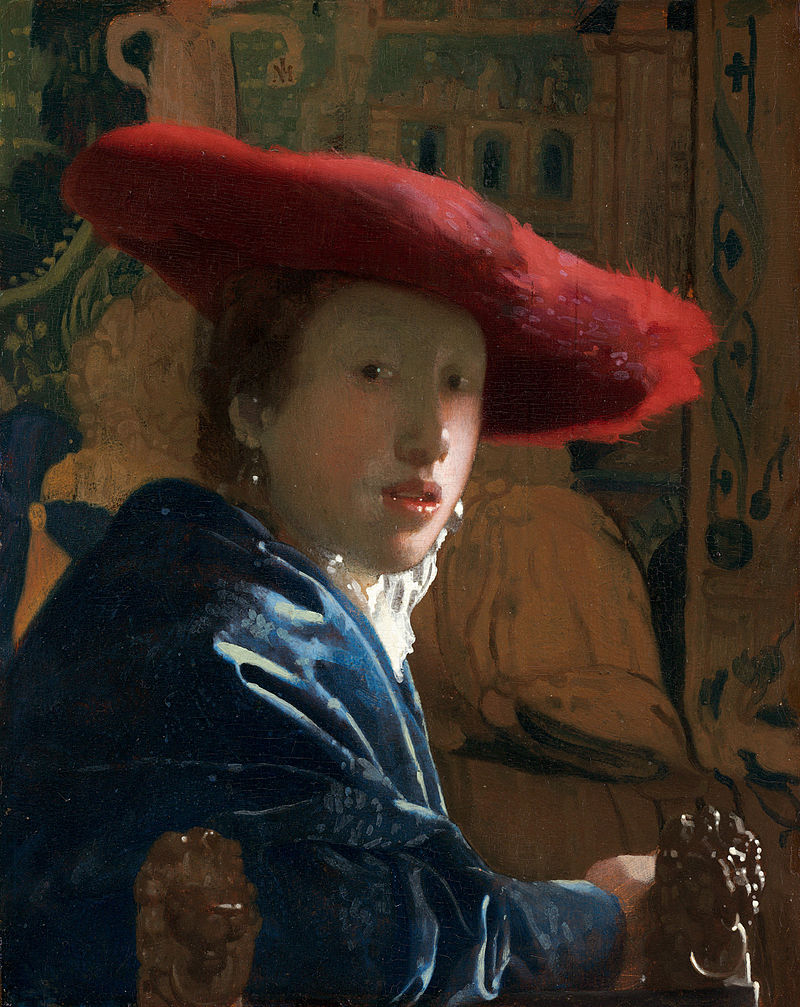
Vermeer is an opaque peachy-pink shimmer. The name refers to Johannes Vermeer (1632-1675), a Dutch Baroque—not Renaissance—painter. It’s bizarre that ABH named just one shade after a specific artist, and he’s not even from the right era. Vermeer is known for his judicious use of light, which may explain why such a dazzling eyeshadow received his name. Here’s Vermeer’s Girl with a Red Hat, painted in the mid-1660s:
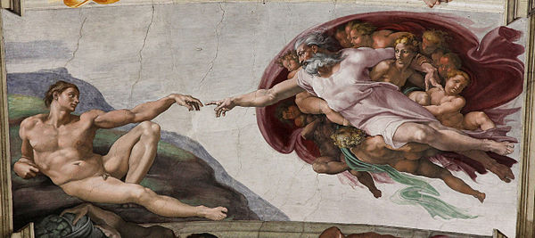
Buon Fresco is my favorite Modern Renaissance shade, a muted plummy browny pink reminiscent of ColourPop Bill. It’s also sold as a single eyeshadow, if you don’t feel like buying the entire palette but want a pink transition shade in your life. The term buon fresco refers to the Renaissance technique of painting on a wall of wet or “fresh” (fresco) plaster. Some frescoes are executed on dried plaster, but only wet-plaster painting is considered buon or “true” fresco. Michelangelo’s Creation of Adam on the ceiling of the Sistine Chapel is probably the most famous example of buon fresco:
Primavera is a pale gold named after the aforementioned Botticelli painting, which now hangs in the Uffizi Gallery in Florence. The title, meaning “spring,” was bestowed on the painting not by Botticelli but by the historian Giorgio Vasari four decades after Botticelli’s death. Though the woman in the center probably represents Venus, the symbolism of the rest of the painting has been debated for centuries. The superiority of Primavera and Vermeer to similar shades from theBalm Nude ‘tude, however, is less controversial. L-R: theBalm Stubborn, Vermeer, Primavera, theBalm Stand-offish:
Red Ochre is a deep reddish brown. The color of ochre varies depending on the minerals present in it; hematite turns ochre red. Red ochre has been used for cosmetics and body painting in many cultures and eras, including ancient Egypt.
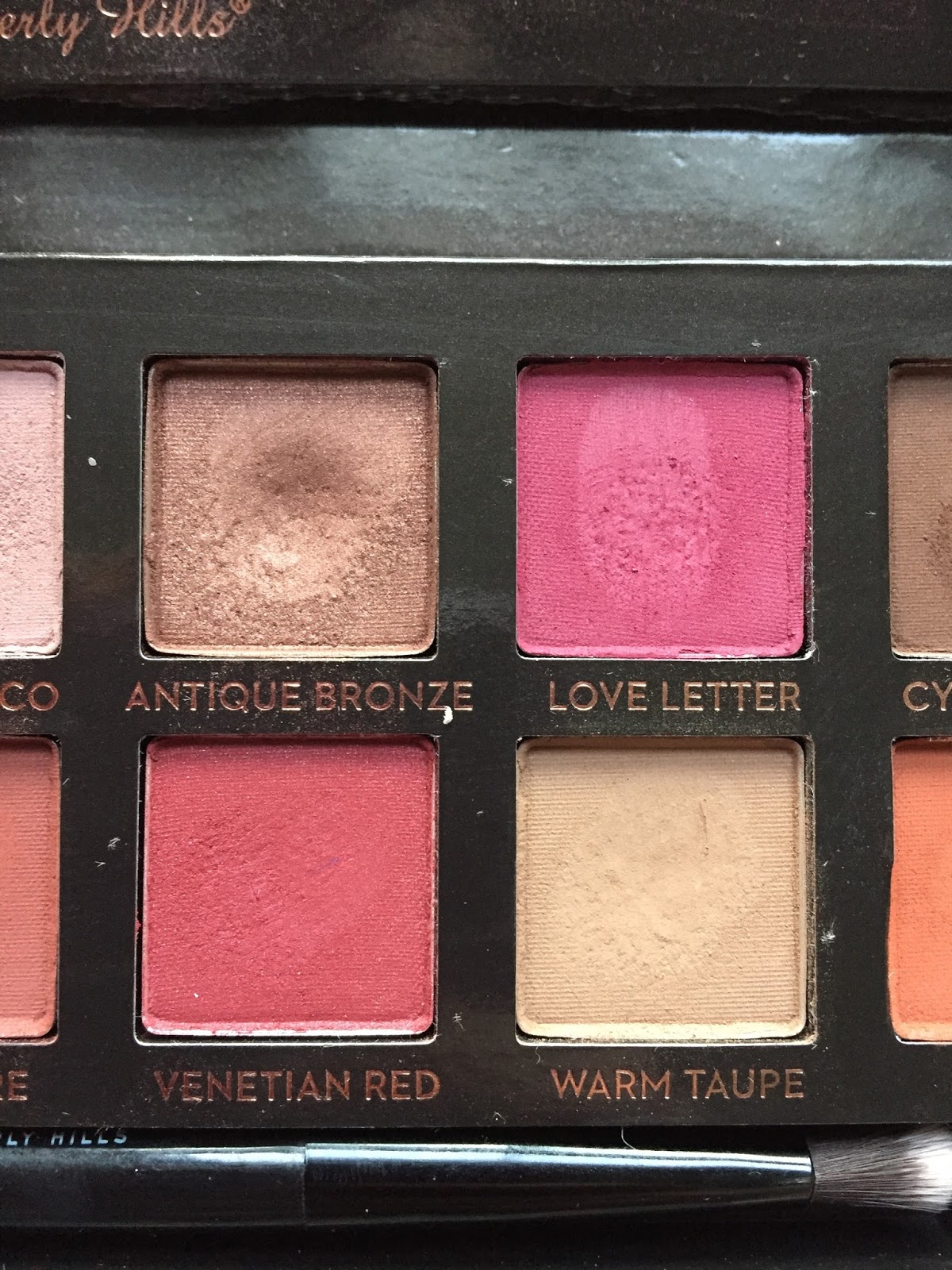
Antique Bronze is my second favorite shade, a shimmery deep bronze that pulls more red than any other bronze eyeshadow I’ve encountered. Blended across the lid and into the crease, this is a great one-and-done shade. As the Met’s website explains, the Renaissance interest in classical antiquities produced a craze for bronze sculpture, and “the lustrous reddish bronze of Florence set the standard.” Here’s a panel, depicting a mask of Medusa, from a 16th-century writing box:
 |
| Source: Metropolitan Museum of Art |
I love bronze eyeshadows, so I had a few on hand for comparisons. L-R: Maybelline Pomegranate Punk, Antique Bronze, theBalm Sophisticated (Nude ‘tude), Maybelline Bad to the Bronze. I was surprised to discover that Antique Bronze is closest by far to Pomegranate Punk.
Love Letter is a bright berry fuchsia. As my swatch indicates, this shade isn’t as opaque as most of the others. Frankly, I don’t mind: this is the sort of color that I prefer to build up gradually. “Love Letter” is another generic name, though Renaissance literature is full of love letters, including this stanza from John Donne’s “Valediction to His Book”:
Study our manuscripts, those myriads
Of letters, which have past ‘twixt thee and me;
Thence write our annals, and in them will be
To all whom love’s subliming fire invades,
Rule and example found;
There the faith of any ground
No schismatic will dare to wound,
That sees, how Love this grace to us affords,
To make, to keep, to use, to be these his records.
Venetian Red is a slightly shimmery berry red that looks warm in the pan but pinker on the lids. The name refers to a pigment derived from ferric oxide, i.e. hematite, the same mineral that colors red ochre.
Warm Taupe is actually one of the coolest shades in the palette, a light grayish tan that works well as an all-over lid color. No specific allusions here, unfortunately, but I’ve done some comparison swatches. L-R: Warm Taupe, Urban Decay Cover (Naked2 Basics), theBalm Sultry (Nude ‘tude), Raw Sienna:
Almost done!
Cyprus Umber is a cool dark brown, named after yet another earth pigment: umber, which is darker than ochre and sienna but similarly colored with iron oxide. The word “umber” is derived from the Italian region of Umbria. Like “Vermeer,” this shade name is slightly inaccurate: umbers appear less often in Renaissance paintings than in the darker, moodier art of the Baroque period.
Finally, Realgar (pronounced “ree-AL-gar”: yes, I had to look that up) is a rich orange with a hint of brown. Realgar is a bright red or orange arsenic mineral that was used in red paint from ancient Rome until the 18th century. Here, courtesy of Wikipedia, is a cluster of realgar crystals:
 |
| Source |
The Modern Renaissance shadows have a very soft and pigmented formula that kicks up a ridiculous amount of powder with the slightest tap of the brush. I feel wasteful every time I have to blow away excess powder, but so it goes; I suppose there’s a reason why people are hitting pan on these shadows so quickly. The pigment also clings very hard to my brushes, which I’ve had to wash weekly since I started using this palette. In general, I prefer semi-sheer eyeshadows that can be built up to opacity (NARS Lhasa is a good example), but I’ve been enjoying the Modern Renaissance formula as well. It blends out smoothly and evenly, giving the impression that I’m better at eyeshadow than I actually am. I do have trouble blending it into the deep creases that run across my lids, but I encounter that problem with almost every powder eyeshadow. Because they’re so pigmented, the MR shadows can collect in the creases instead of blending softly over and through them as my sheerer shadows do.
Maybe it’s because I have no experience of fancy brushes, but I really like the two-headed brush that comes with the palette. The larger head has long, floppy bristles that work well to blend out the crease, while the smaller head is good for packing shimmer into the inner corner.
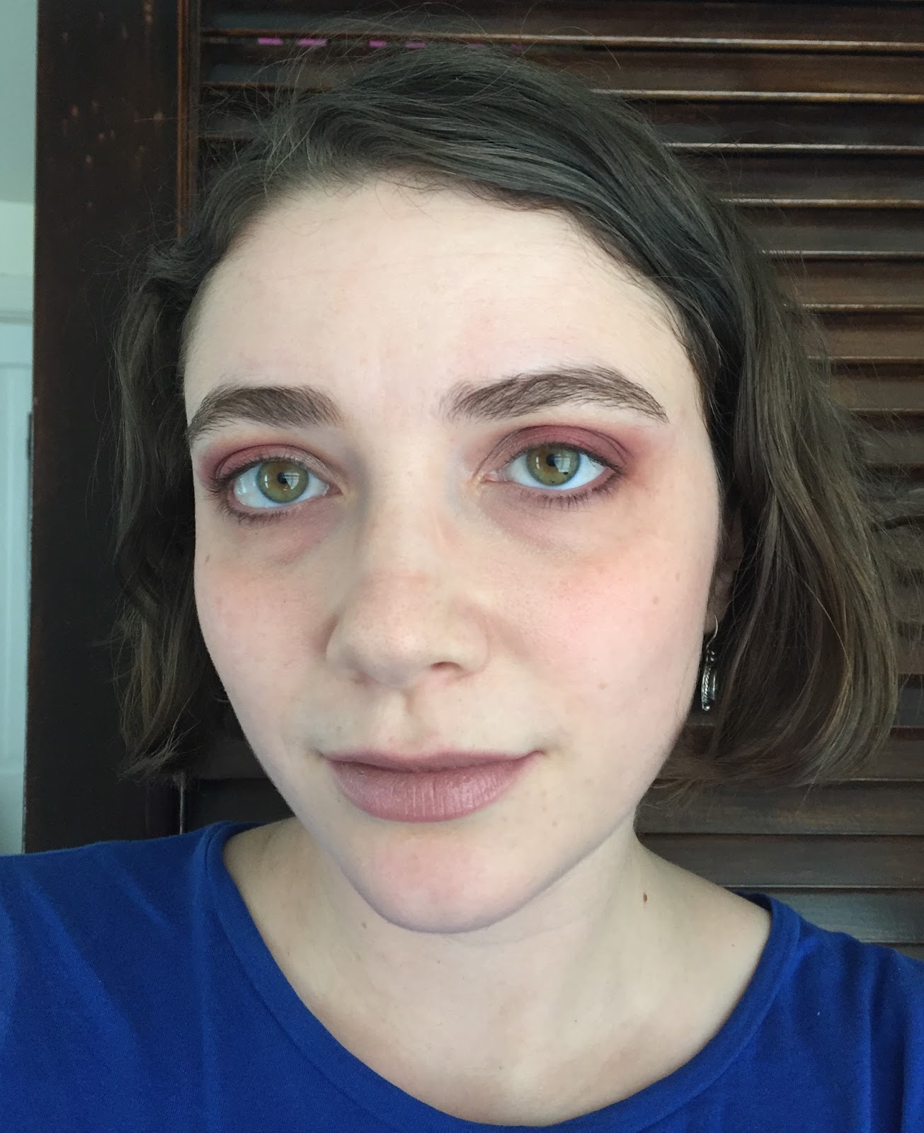
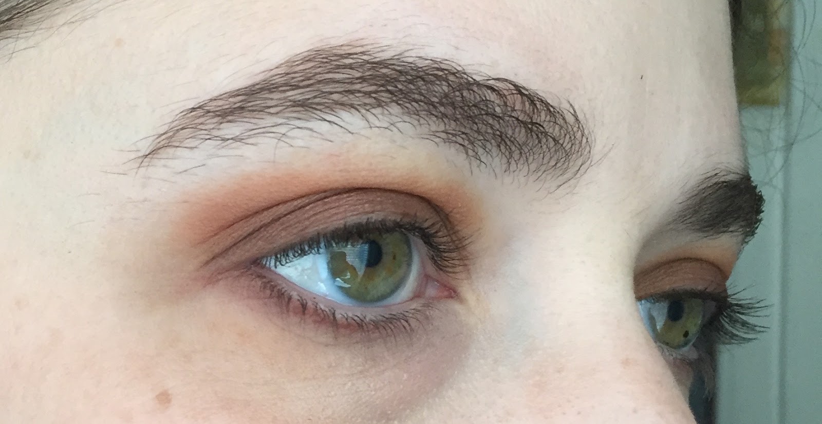
Having owned this palette for almost two months now, I’ve tried out more looks than I can feasibly include in one blog post, so here are my best attempts. I’m pleased to report that Modern Renaissance cooperates beautifully with my usual taste for boring, work-appropriate eye looks, though I’ve tried out some dramatic smoky eyes as well. First, here’s my Valentine’s Day look, featuring an all-over base of Tempera; Buon Fresco and Love Letter in the crease; a blend of Venetian Red and Love Letter on the outer half of the lid, with Cyprus Umber in the outer corners; Tempera on the inner half of the lid, with Vermeer in the inner corners; and more Cyprus Umber on the lower lashlines. Phew. My blush is Threesome from the NARS Pop Goes the Easel collection (more on that in a future post), and my lipstick is Bourjois Rouge Edition in Beige Trench. I’m still not totally satisfied with my blending skills, but I suppose that’s what practice is for. I made the mistake of wearing this look to Hidden Figures, which made me tear up no fewer than four times, and I’m not usually a movie crier.
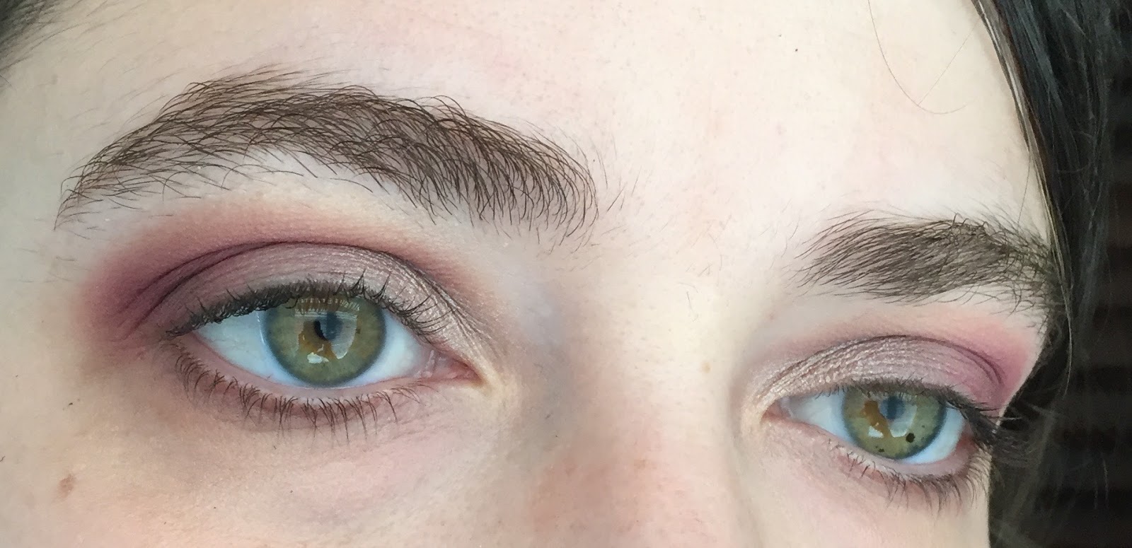
Closeup of an earlier iteration: same crease combination and inner-corner highlight, but with Love Letter and Cyprus Umber in the outer corner, Buon Fresco on the lid, and Antique Bronze on the lower lashline. I think I like this version better.
My first attempt at a halo eye: Raw Sienna in the crease, Red Ochre and Cyprus Umber in the inner and outer corners, and Primavera in the center, plus an annoying stray hair. In future halo eyes, I think I’ll concentrate the highlight shade on a smaller area of lid.
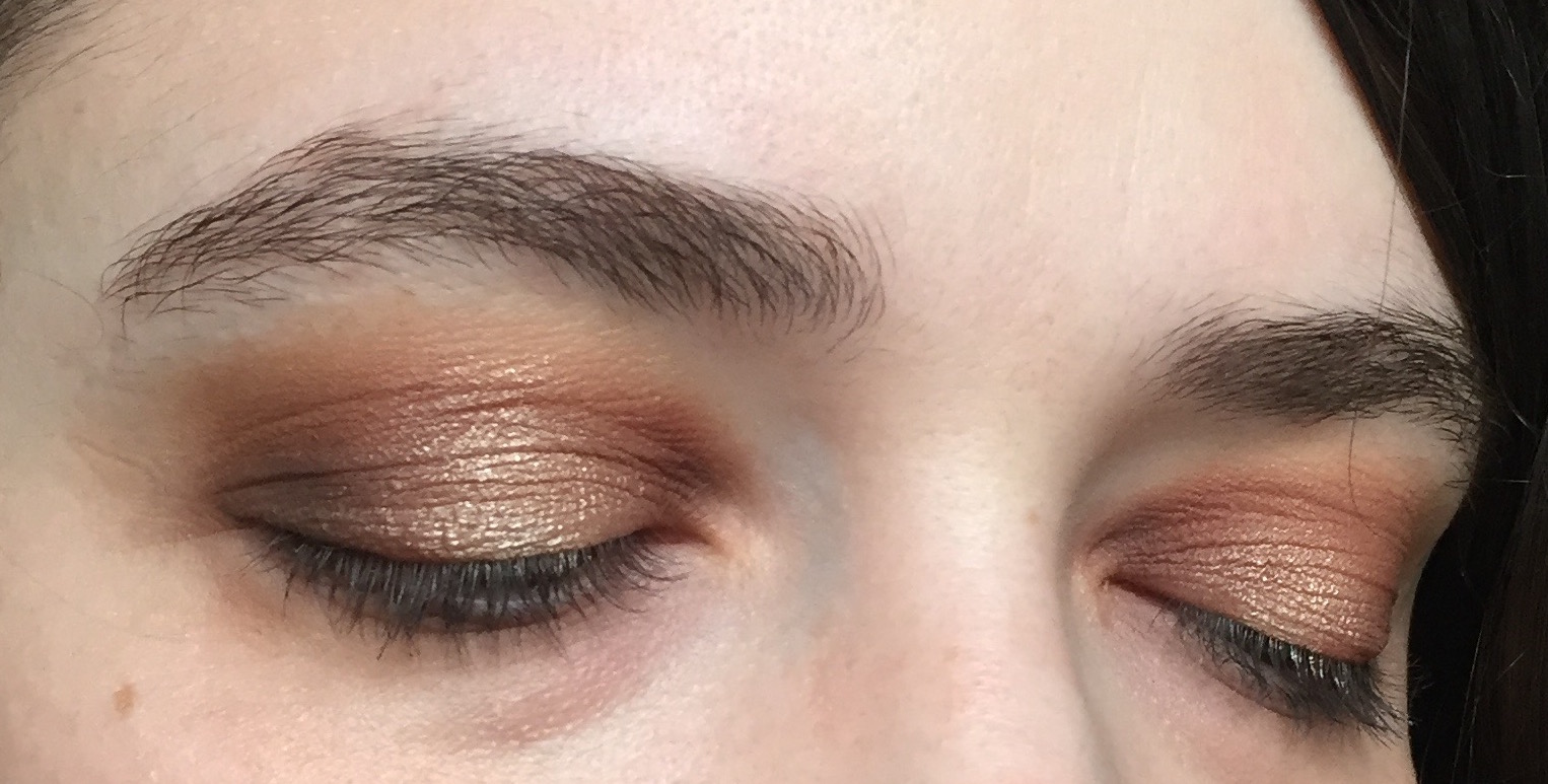
Burnt Orange and Realgar in the crease, Antique Bronze on the outer half of the lid and lower lashline, Raw Sienna on the rest of the lid:
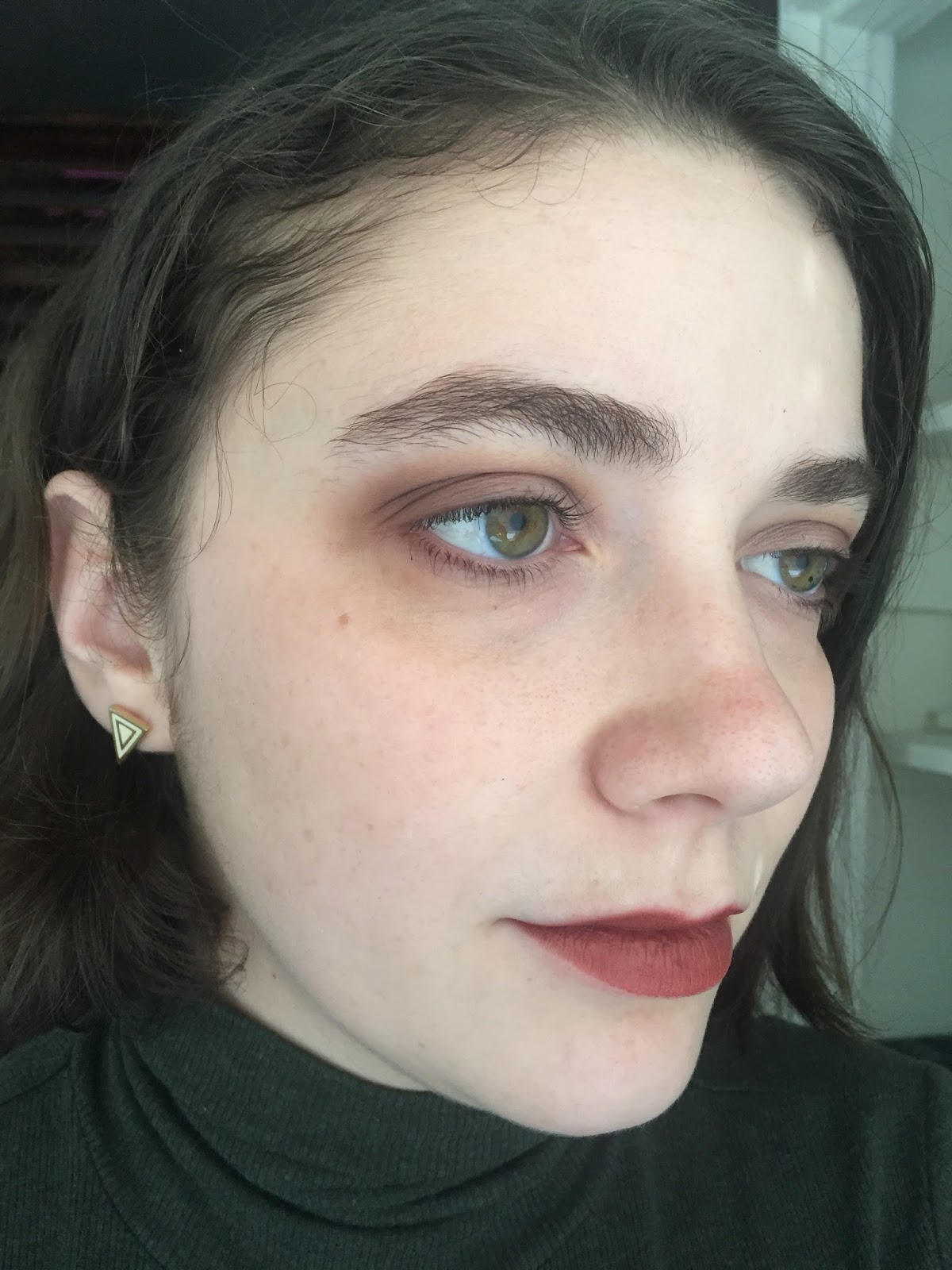
Finally, one of the subtler looks that constitute 75% of my use of this palette. Buon Fresco and Antique Bronze in the crease, Antique Bronze on the outer lid and lower lashline, and Tempera on the rest of the lid. My other color makeup is Illamasqua Zygomatic blush, ColourPop Lunch Money highlighter, and Revlon Matte Balm in Fierce.
Well, that took me forever to write. The main conclusions you should take from this post are that Modern Renaissance is 1) really great; 2) really Renaissance, though not as Renaissance as it could be; 3) never mind the rest, I just drank a huge French 75 and I’m pretty tipsy. Happy Valentine’s Day, everyone!

The entire theme of this review fills my nerdy heart with joy. And might be the tipping point to me wanting this palette (even though I don't wear eyeshadow, goddamn, self). It's pretty and mostly accurate! Vermeer is one of my favourite artists – I'm rather partial to Dutch artists through the ages, like Van Gogh, Vermeer, and Escher – but decidedly not Renaissance. It's a curious choice for a shade name, though definitely fitting with his work with light.The dips in your pans are so satisfying.
LikeLike
Whoa, Botticelli's Primavera is one of my favourite paintings (and actually the wallpaper on my computer) but I never made the connection that it has all the colours in this palette. Very cool! As always, this is an interesting and informative post and way better than all 97,000 other MR reviews out there. I'll probably review it on my blog too once I've photographed more of the looks I've created with it, and I will link this post for sure. I took a few art history classes in university (and totally regret not being an art history minor, actually) so the concept of this palette resonated with me as well. It's nice to have even more information on the specific shade names.Buon Fresco is my favourite shade in the palette, as well. Somehow it totally works in neutral looks but manages to be unique and interesting at the same time. I love your second to last look – those warm colours in the crease look great. I've always been all about taupes and cool to neutral medium browns in the crease, but I've been having a lot of fun with the warmer crease shades in this palette. All in all I totally agree with your review – it's conceptually fun and great quality, and the colour combination is killer.(By the way, I feel like I always check my feed reader when you've just posted! I have some good timing.)
LikeLike
I don't have any need for more eyeshadows (ever), but now I kind of want this palette just so that maybe more brands will do (largely) accurate themed products! I learned so much from this post, so thank you for doing the research 🙂 Think of all the amazing information people miss out on when they don't care about the nerdy details! (And, perhaps, how much more time they have in their lives. But at what price?!)
LikeLike
Great post! I read a lot of blogs but rarely, if ever, comment but I just had to make the effort this time :-). I hope ABH see this review – very well researched. You've created some great looks with this palette. I wasn't particularly tempted by it until now but you have me intrigued. Lisa F.
LikeLike
I'm still kind of shocked that such a trendy brand created such a nerdy palette. I expect themes like this from indie and niche brands like MAKE, not from YouTube-hyped ones like ABH. I'd love to see them create a Modern Rococo palette with cool-toned pastels!Baroque is my favorite era of art; I'm more partial to Italian Baroque painters like Caravaggio, but I love Dutch still lifes as well. But yeah, why not call the shade \”Michelangelo\” or something?I'm kind of disturbed at how quickly those dips have formed. No matter how hard I try, I end up wasting a bit of product with every use. But yes, satisfying indeed! I'm curious whether I'll hit pan faster on Buon Fresco or Antique Bronze.
LikeLike
Primavera is one of my favorite paintings too! I was lucky enough to see it in the Uffizi when my friend and I visited Florence during our year abroad at Oxford. My friend is a painter herself (now a professional one!), so it was a lot of fun to follow her around at museums. I never took a single art history course in college, which I now regret. My #1 college nemesis was an art history major, so I had a very juvenile bias against the whole department. Ah, late adolescence, what a time.I'd never experimented with warm neutrals before getting this palette, and I was shocked at how much I enjoyed them! I find that my coloring does better with warm eye looks than with warm lipsticks.
LikeLike
Haha, I certainly put off less-fun research of my own while researching this palette! If you're interested in makeup that's influenced by art history, you might enjoy MAKE Beauty. I've never tried anything by the brand (their products are weirdly expensive and seldom reviewed), but I enjoy how conceptual their palettes are.
LikeLike
Thank you for commenting! I think this palette is a great example of how a well-thought-out concept can elevate an already good product. I hope the shade names have inspired some consumers to investigate Renaissance art!
LikeLike
Perfect review for this palette. I'm impressed that they actually stuck with the theme and that the colors of the shadows really resemble their names in some way! I was thinking they should have gone with \”Burnt Umber\” instead of \”Burnt Orange\” (could be a sheered our version of it) to go with the pigments theme, but I guess they already had an Umber in there and ran out of ideas.Beautiful looks you've created, too! Your halo eye attempt is much better than mine have ever been. I think my mobile lid is just too small for the light and dark shades to be distinguished.
LikeLike
Oh but the exterior packaging is so out of sync with what's inside! Pale pink velvet? What? Even red or green velvet seems like it would make more sense, if they needed to coat it in such a disastrous material.
LikeLike
I want to know who did the research behind this palette, and whether there are jobs to be had in the historical-research-for-eyeshadow-palettes industry. Seriously. I think \”Burnt Umber\” would have been a fine name, given that there are two Ochres. The exterior packaging continues to baffle me. It does match Buon Fresco, at least, but a jewel-toned velvet would look so much more Renaissancey.
LikeLike
Have you read The Passion of Artemisia, about Artemisia Gentileschi? I don't remember the story very well, but there is one scene where she's looking at a woman in a brilliant green satin dress and thinking, could I put that in a painting? No, the only way to get that color is from [some stone], and you could never grind it fine enough to get that texture without dulling the color. Before I read that I'd never thought about how the color palette of Renaissance art, or any period's art, was dictated by what was physically accessible.
LikeLike
I've seen it at the Uffizi too – totally amazing experience. Actually, my art history classes were awesome because they illuminated a lot of the art and architecture I saw in Italy.And I'm the same re: eyeshadows vs. lipsticks. I shy away from warm lipsticks for the most part, but I'm learning to accept warm eyeshadow.
LikeLike
It's stealth nerd, which is even better, though you do end up with the BGs who can't be bothered to do their jobs and look some stuff up before hopping on camera to ramble…
LikeLike
Hands down the best review of the MR palette! I don't know anything about art history, so I truly appreciate this review because of the added value to my meagre knowledge of European art 🙂 I'm mostly attracted to Buon Fresco because of how often I see it used in your IG posts, considered getting the whole palette for the colour too. But I think I'm gonna get just the single, I didn't even know ABH sell single eyeshadows!
LikeLike
OMFG I LOVE THIS REVIEW YOU ARE MY FAVOURITETHIS IS HOW YOU GET THINGS DONE!!!
LikeLike
Bravissimo!
LikeLike
I haven't read it, but I've heard of it! (Now that early modern literature is my job, my tastes in pleasure reading run toward the futuristic dystopian.) And that's a great point: it's easy to forget that painterly taste wasn't the only thing (or even the primary thing) that dictated the color palette of an era.
LikeLike
Aww, thank you! Certainly the nerdiest review, I suspect. 😀 Buon Fresco is well worth getting. I considered buying the single myself, but since I didn't have dupes for most of the MR colors, I decided it would be wiser to buy the whole palette. Certainly not a decision I regret!
LikeLike
lol thanks!!
LikeLike
*Renaissance courtly bow*
LikeLike
Now that I think about it, I prefer stealth nerd to the indie \”LOOK HOW GEEKY THIS MAKEUP IS\” variety, which tends to rely more on nerd appeal than on the quality of the products. It's cool that MR appeals both to nerds and to people who just want a good eyeshadow palette.
LikeLike
This is absolutely my favourite review of this palette. I've been waiting to see someone actually look at whether it lives up to its historical and artistic name. I'm STILL debating this, if you can believe, and am trying to figure out if I don't have good dupes of most of the colours. What I've discovered thus far is that I don't have a lot of dupes for the reds, which I guess isn't surprising, since they are a lot less common than neutral shades. I love the looks you've done, and as a devotee of a quick neutral eye myself, I can appreciate the desire to fall back on the \”safest\” shades in this kind of palette. Still nice to have the options, though.
LikeLike
Thanks for this comprehensive review! I have a theory why this palette is Renaissance-themed–because of the Lime Crime Venus palette. I.e., there was huge consumer push for a Venus-like red palette that was NOT by Lime Crime. I can't count how many times I saw people online saying \”Damn, I want that Venus palette but don't want to give my $ to Lime Crime.\” Anastasia saw that niche and filled it by \”out-venusing\” LC Venus, and Modern Renaissance became more popular than Venus ever was.
LikeLike
Wow, that is a brilliant theory! When I wrote this post, I'd totally forgotten that Lime Crime released a warm neutral palette before ABH did. I was certainly one of those people who felt tempted by Venus but didn't want to patronize Lime Crime. Props to ABH for releasing a more comprehensive and wearable palette and doing a little more research into art history, but LC should probably get credit for the initial idea.
LikeLike
I suppose it all depends on how often you think you'll wear reds and oranges. I confess I haven't worn the really bold colors very often, and I'd probably regret buying the palette if I had dupes for the more neutral shades. As it is, I've acquired a really nice set of warm neutrals that I didn't have before, and now I know I can wear them!
LikeLike
Excellent review. After reading this review I appreciate the palette even more. To be honest I had not even thought about the theme so much as I just fell in love with the color scheme and did not have dupes for any but one of these. I held out buying this as well as I don't like buy into so much hype either, but when I found it on sale I went for it. Some of the names of the colors that aren't theme related are in ABH's regular shadow lineup like the Burnt Orange, and Warm Taupe. I must say it is a versatile palette for day time minimal as well as more vamped up looks for special occasions. I never really have found brushes that come with palettes very useful or of good quality. This one is an exception. I was pleasantly surprised with the brush and I use it often for blending when I overdo. I agree there is quite a bit of kick up, a big pet peeve. I have returned other palettes for the same reason but loved the shades, pigmentation and wear of the shadows that I just had to have this one.
LikeLike
[…] a rosy taupe that looks like the baby of Buon Fresco and Warm Taupe, two of my most-worn shades in Modern Renaissance. Slated is a silvery beige glitter shade with an almost clear base; it feels similar in formula to […]
LikeLike
[…] CeraVe moisturizer and cleanser, Urban Decay eyeliners in Whiskey and Demolition, the ABH Modern Renaissance palette—were favorites from previous years. A majority of my purchases in 2017 fell into the […]
LikeLike
[…] the 93,458th orangey-red eyeshadow palette since mid-2016. Plus, it shares a weakness with the ABH Modern Renaissance palette: several of the medium-saturation shades look very similar to each other, which will make […]
LikeLike
[…] I like it as a retro-futuristic variation on an ordinary MLBB. Here I am wearing Pale Rose with a Modern Renaissance “smoky eye” that got almost entirely lost in my eyelid crease. I’m wearing Warm […]
LikeLike
[…] eye look will be Too Much with bronze lipstick. I think Roach would look beautiful with a Modern Renaissance pink/red eye, and perhaps one day I’ll do that and update this post. But sloppy brownish eyes […]
LikeLike
[…] Heather, described as a “neutral rose.” Almost five years ago, Buon Fresco from the ABH Modern Renaissance palette initiated my love affair with rosy eyeshadows, and I’ve since found that almost any eyeshadow […]
LikeLike
[…] pumpkins in the image above are much closer to sienna than the lipstick is. As I explained in my Modern Renaissance post, the word sienna refers to an orange-brown earth pigment traditionally used in paint. It does not […]
LikeLike
[…] I’ve never been much of an eyeshadow person (unless you count my questionable dalliance with Modern Renaissance in 2017), but even I was alarmed to find out from my friend Lena that the canonical True Winter eye […]
LikeLike