
(Note & disclaimer: This is the second of my seasonal color analysis posts. I’d recommend reading my first post, on my session with Kigo Color & Style back in August, for context. Lena is a personal friend and generously gave me a free session; she also helped me figure out the seasons of some of the products in this post. Thank you, Lena!)
After my session with Lena in the Bay Area, I returned to Philadelphia with the knowledge that I was a True Winter and the determination to round up and swatch all my corresponding beauty products for a blog post. During the sorting process, I ended up getting rid of several non-TW products that I hadn’t worn in ages, but the main point of the project was to appreciate what fell into my best season, not to purge what didn’t. (Madame Greige is going nowhere!)
Here’s my full collection displayed on my dresser, which was made in the ’30s or ’40s and is 100% haunted. The palettes are in that nifty built-in compartment.

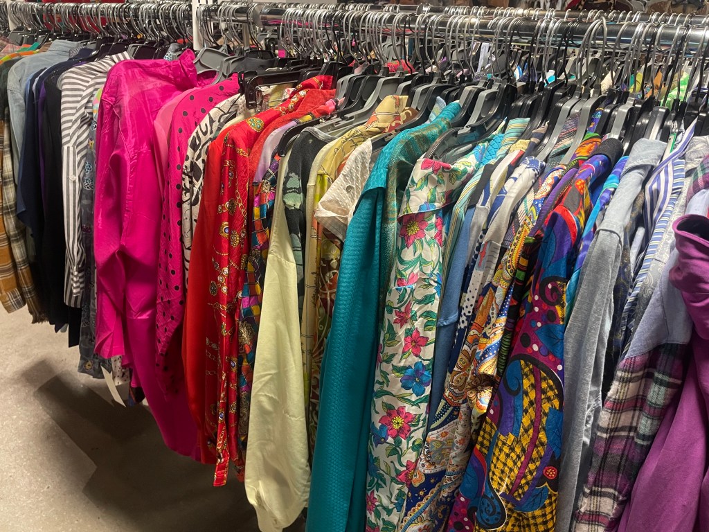
As a reminder, True Winter people should wear bright (but not too light), cool-toned, high-contrast clothing and makeup. We benefit from the pairing of black and white (ideally with a pop of color somewhere) more than any other season does, and we can walk into the ’80s section of a vintage store and find an array of fuchsias, teals, purples, and sharp-edged, high-contrast patterns to suit us:
For more modern inspiration, check out last month’s Marni RTW show in Milan, a True Winter fantasia (take or leave the eyebrows):

According to Lena, the best makeup look for a True Winter is the one that I’ve favored for over a decade: clean, simple eye makeup (a medium-to-dark eyeliner, a wash of silvery white shimmer, or just some mascara), paired with bolder cheeks and lips. According to the email she sent me after our session, “TW makeup is minimal and impactful. You can wear a lip ultra-sheer or very strong, and as long as the color is cool and vivid, it will be great. For you, I see two major tones that will be your go-to colors: cherry and berry. Cherry is that intense true red that sheers out to pink. Berry is a violet-toned beet red that sheers out to a wash of violet pink. You also have the option to wear hot pink/fuchsia.”
My lipstick and blush colors, therefore, would come mainly from columns 4 through 7 (excluding the yellows) on the card below:

However, it’s not as simple as dividing products into “True Winter” and “not True Winter.” As Lena reminded me while I was writing this post, just because a shade falls into a given season doesn’t mean that everyone in that season will find it equally easy to wear. Each season encompasses multiple ethnicities. Some True Winters have darker skin than mine; others have more yellow in their complexions; others have lighter hair. All of us benefit from the combination of brightness, cool tones, and medium saturation, but not all of us benefit from all of those things in equal measure.
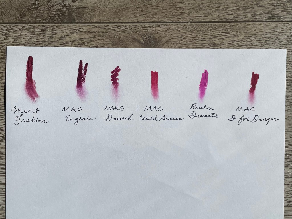
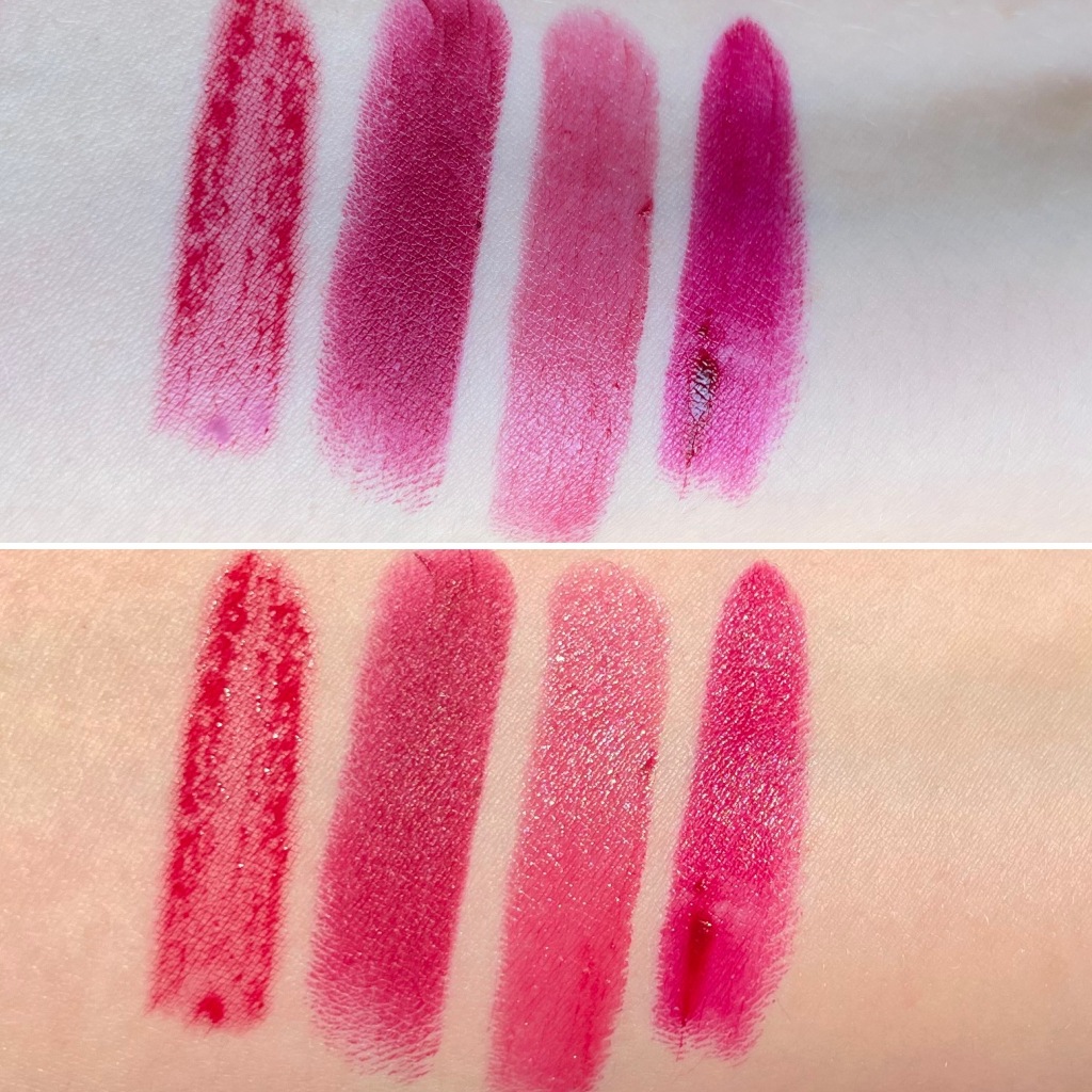
Take one of my oldest lipsticks, MAC Eugenie, a dark reddish violet. It’s the swatch second from left in this photo, which I sent to Lena to consult her about the “edge cases” in my lipstick collection.

Lena confirmed that Eugenie “is cool enough to be True Winter,” but that “it’s one of those shades that will read VERY dramatic on a pale skinned true winter, due to its depth. But it’s a candidate for a perfect lipstick on a dark skinned true winter! I imagine this lipstick would work great on you (Zoe) when you’re wearing heavier makeup, but that on bare skin it might give a fatigued or heavy look to the eyes and any other shadowed places on the face.”
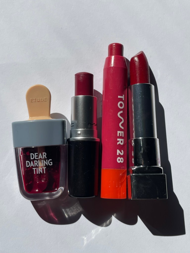
Another important caveat: some makeup products have layers and will work better for a given season when they’re sheered out than when they’re applied at full strength. A good example is MAC D for Danger, the farthest-right swatch above. In Lena’s opinion, this shade’s “‘top layer’ can skew almost dirty looking on some TWs. As a stain, it would be a great bright raspberry.” You can see this phenomenon more clearly below, where I’ve swatched the shades on white paper and smudged out the bottom half of each swatch.
But we’ll take a closer look at my lipsticks later. First, let’s check out my blushes and highlighters!
Cheeks:
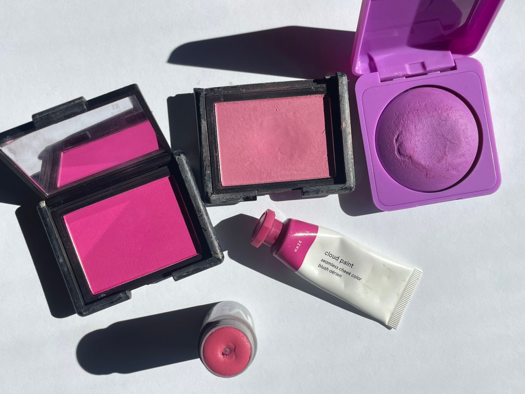
Surprisingly few blushes on the market are cool-toned and saturated enough to suit the TW palette: for instance, most of the cool-toned bubblegum pinks that were trending last year are too light. Here are the blushes I own that are acceptable or (one of Lena’s favorite words) plausible for a TW look. Clockwise from left: NARS Coeur Battant, NARS Mata Hari, About-Face Score, Glossier Haze, Milk Rally.
Swatches, L-R: Coeur Battant, Mata Hari, Rally, Score, Haze (direct sunlight on top, indirect on bottom):

Swatched on white paper along with Glossier Cloud Paint in Spark, a bright red that’s just a touch too warm to be TW:

What’s missing from this lineup is a raspberry red or pinky red blush. I’m nearing the end of a two-month makeup no-buy, and once that’s over, I’ll probably pick up Milk Lip + Cheek in Flip, which I tried on at Lena’s studio, and/or Milani Blushing Berry. Until then, I can achieve a passable raspberry by mixing equal parts of Haze and Spark.
I don’t wear highlighter often anymore, but when I do, I usually reach for either MAC Strobe Cream in Pinklite (I like mixing a drop into my morning moisturizer) or Glossier Haloscope in Moonstone:
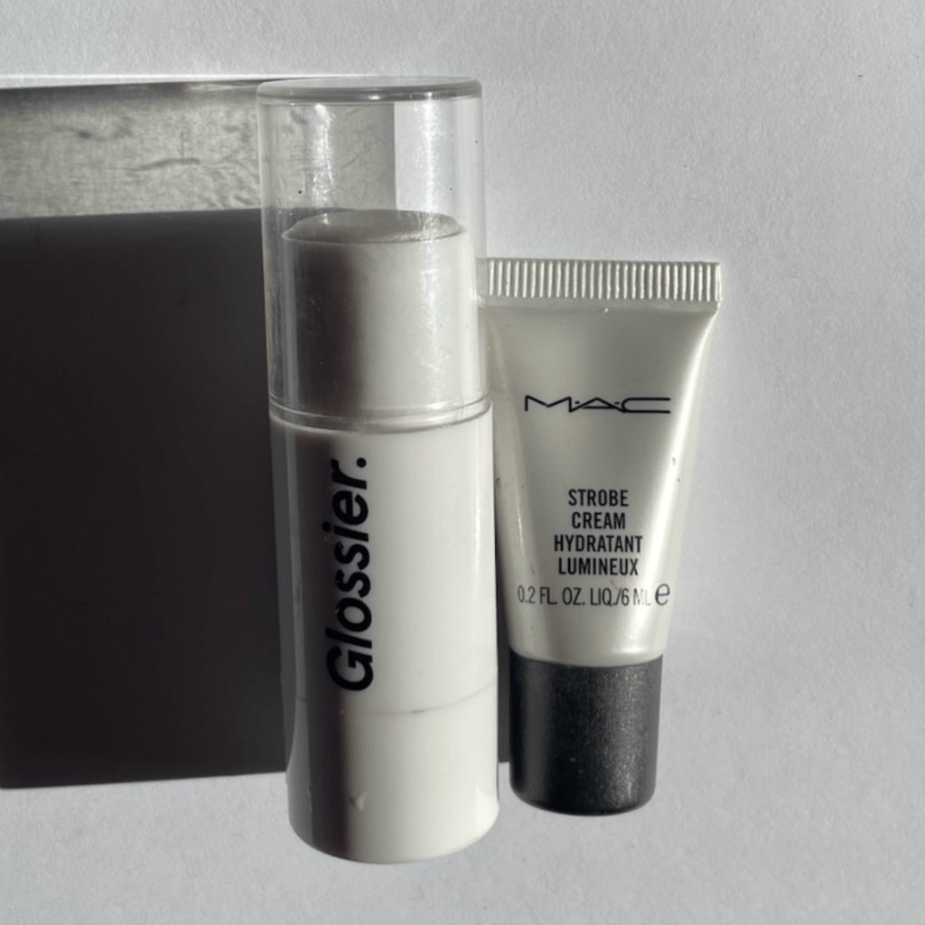
Both are sheer white creams, but Pinklite is (obviously) pinkish, while Moonstone leans more blue. In the photo below, Pinklite is on top and Moonstone on the bottom. The color difference is very subtle, I’ll admit:

Lips:
This took me forever, guys. If you’re wondering why my second post on seasonal analysis is coming two months after my first, well, this is the reason. I own seventy colored lip products, including four that I bought after my color analysis. And because I’ve known since my earliest lipstick-wearing days that bright, cool fuchsias, magentas, and berries are my most flattering lipstick colors, a significant percentage of those seventy lipsticks, glosses, and tints are either True Winter or pretty damned close.
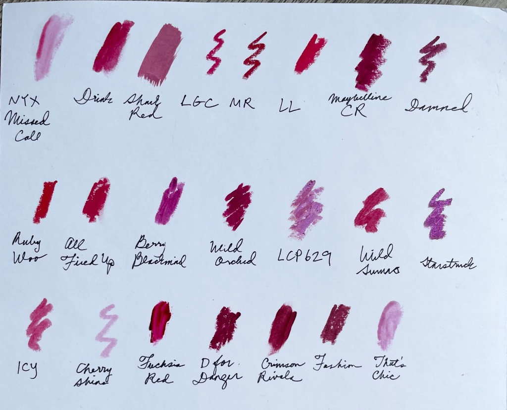
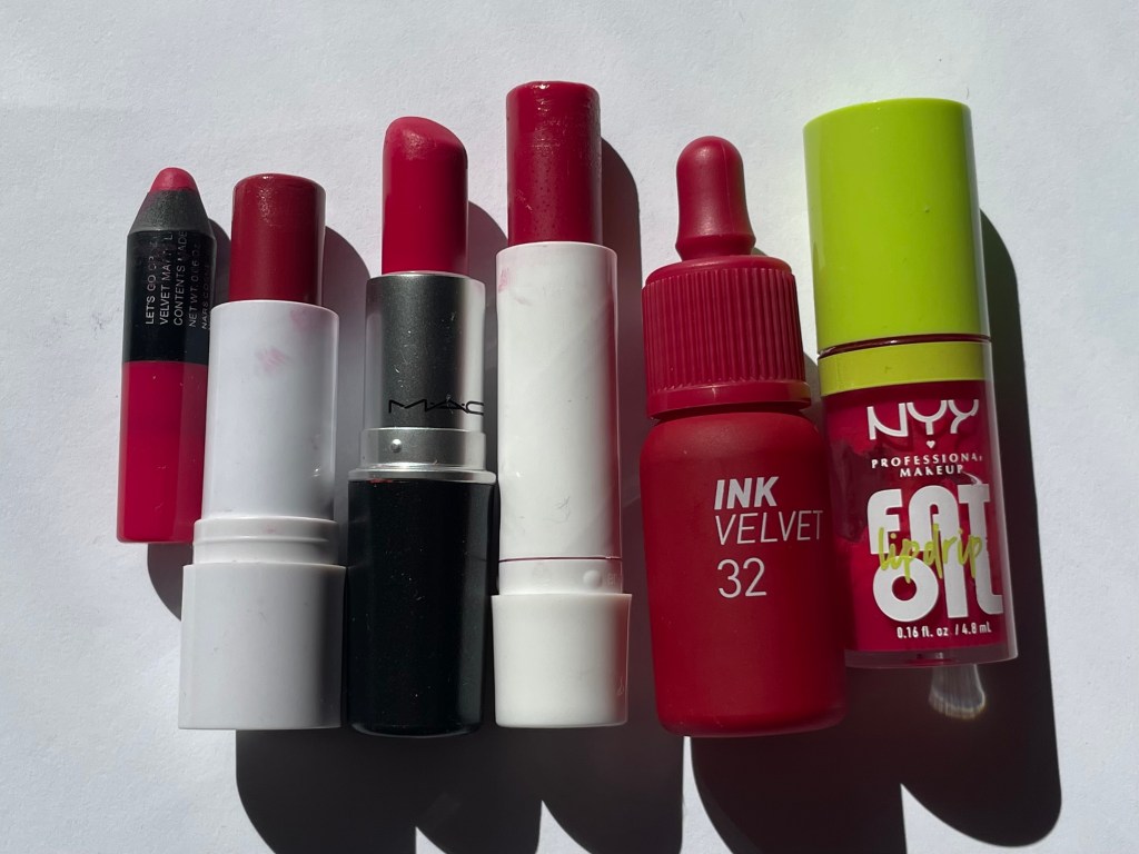
First, I made a big swatch sheet with all the colors that, to my eye, fell into the realm of plausibility. Here are the shade names so that you don’t have to decipher my shorthand, plus links to my reviews:
First row, L-R: NYX Fat Oil Lip Drip in Missed Call; Tower 28 JuiceBalm Tinted Balm in Drink; Etude House Dear Darling Tint in Shark Red; NARS Velvet Matte Lip Pencils in Let’s Go Crazy and Mysterious Red; MAC Amplified Lipstick in Lotus Light; Maybelline ColorSensational Lipstick in Crimson Race; NARS Velvet Matte Lip Pencil in Damned.
Second row: MAC Retro Matte Lipsticks in Ruby Woo and All Fired Up; Maybelline Shine Compulsion Lipstick in Berry Blackmail; Bésame Wild Orchid; Kryolan Lipstick Pearl in LCP 629; MAC Powder Kiss Velvet Blur Slim Stick in Wild Sumac; MAC Kiss of Stars Lipstick in Starstruck.
Third row: CoverGirl Clean Fresh Tinted Balm in I Cherry-ish You; Nivea Lip Care in Cherry Shine; Peripera Ink the Velvet in Fuchsia Red; MAC Matte Lipstick (old formula) in D for Danger; YSL Tatouage Couture in Crimson Rivals; Merit Signature Lip in Fashion; NYX Fat Oil Lip Drip in That’s Chic.
After some further cogitation and some back-and-forth with Lena, I eliminated several of the above, and sorted the rest into four color categories: true red, berry red, pink/fuchsia, and plum/violet.
True Red, L-R: NARS Mysterious Red, MAC Ruby Woo, MAC Lotus Light.

Arm swatches, same order, in indirect (top) and direct sunlight:

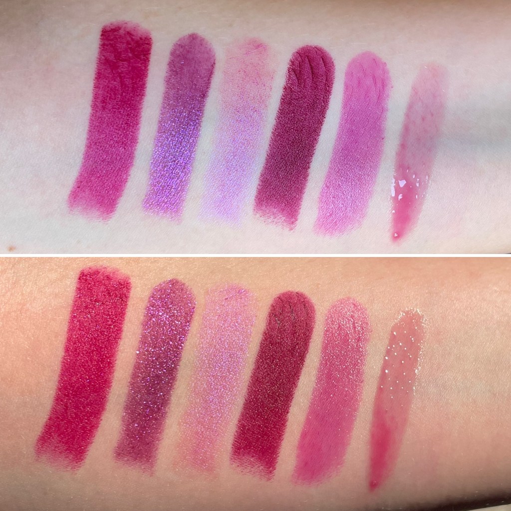
Berry Red, L-R: Etude House Shark Red, MAC D for Danger, Tower 28 Drink, Maybelline Crimson Race:
Pink/Fuchsia, L-R: NARS Let’s Go Crazy, CoverGirl I Cherry-ish You, MAC All Fired Up, Nivea Cherry Shine, Peripera Fuchsia Red, NYX Missed Call:

Plum/Violet, L-R: Bésame Wild Orchid, MAC Starstruck, Kryolan LCP629, MAC Eugenie, Maybelline Berry Blackmail, NYX That’s Chic:

Finally, here are some of the many TW (I think!) lipsticks that I’ve reviewed over the past decade but no longer own: ColourPop Bee’s Knees, ColourPop Let’s Play, MAC Rebel, Maybelline Divine Wine, Maybelline Vivid Rose & Brazen Berry, Milani Sangria, Revlon Cherries in the Snow, Revlon Fuchsia, Revlon Raspberry Pie, Urban Decay 69, Wet n Wild Missy & Fierce, Wet n Wild Nice to Fuchsia, Wet n Wild Stoplight Red, YSL Belle de Rose, YSL Rouge Gouache.
Final Thoughts:
As I said in my first post, I approach seasonal color analysis as one of many tools in my aesthetic toolbox, not as a blueprint for completely transforming my style. (Not that my style would change dramatically if I used the True Winter palette as a blueprint, given how many TW colors and patterns I already own!) When I assemble an outfit or a makeup look, I consider what will flatter my complexion and facial structure, but I also think about my mood, the weather outside, the ’90s makeup ad I just saw on Pinterest, and so on. I’m not going to give up colored eyeshadow or peach lipstick because they don’t fit the True Winter palette; however, I’m more likely to reach for TW colors when I’m dressing to impress (i.e. engaging in Girls’ Capitalism).

In an ideal world, knowing myself to be a True Winter would moderate my consumption habits and shrink the size of my makeup collection. Has that really happened in the nearly three months since my color analysis? Yes and no. Yes, in the sense that knowing my season limits my roving eye and helps me “filter” my search for new makeup: when a brand releases a huge lineup of lipsticks, I can immediately eliminate a majority of the shades instead of viewing each one as a potential future purchase. And the exercise of identifying TW products in my collection has given me a new appreciation for some products that I don’t wear often, such as NARS Coeur Battant and Bésame Wild Orchid.
However, perfectionistic types—and if you’re interested in seasonal color analysis at all, you’re probably something of a perfectionist—can slip into the compulsion to acquire the True Winter red or Bright Spring coral or Dark Autumn plummy brown. I’m noticing this tendency in myself already: Glossier Spark is a versatile red blush that I wear often, but Milk Flip would be that tiny bit better. MAC All Fired Up is a brilliant, vivid fuchsia, but is it a touch too warm? That way lies madness, or at least dragons and an extensive wishlist.
In my third post in this series, I’ll feature a few True Winter makeup looks, so that you can see some of my dragon’s hoard on my actual face. See you again sooner than two months from now, I hope! In the meantime, what’s your season (if you know or suspect)? And who are your tripleS biases? (Mine are Sohyun and Kaede.)

Thanks for this write up, super interesting as a fellow Winter (not sure what type exactly). One thing I didn’t realise before was that True Winter corresponds to a style of makeup look rather than just the selection of colours. Looking forward to seeing your TW looks in action!
LikeLike
That was a surprise for me, too! I assumed that, say, gray or purple eyeshadow could fit into a TW look, but that’s apparently not the case (though TWs can wear those colors as eyeliners). When heavy eyeshadow was in fashion several years ago, I could never get it to look quite right on me even when I used flattering colors; I thought that was a lack of skill on my part, but it makes sense in retrospect that the technique itself was fighting with my coloring and facial structure.
LikeLike
[…] not misremembering: my first post about my True Winter makeup collection did include eyeshadows and eyeliners. However, I realized […]
LikeLike
[…] a cream blush applies and blends, the more quickly it fades. My about-face Cheek Freak blush in Score, a bright purple, stays visible on my cheeks all day. Le Bonbon is almost as bright as Score, but I […]
LikeLike
[…] own an embarrassing number of lip colors in this purplish-reddish-berry category, so I had plenty of options for comparison swatches. L-R: […]
LikeLike
[…] is a little too warm to be my most flattering pink, but (if you care about seasonal color analysis) True Winter is considered a “bright season” and can pull off bright warm shades if they’re […]
LikeLike
[…] so it should be part of my interview look. According to my seasonal color analysis, I should wear a True Winter lipstick, but I can’t shake the feeling that even on me, those colors read as LIPSTICK!!! to […]
LikeLike